Crafting a seamless cake shopping experience with FB cakes
Improving the online cake shopping experience for FB Cakes through user-centric design
Why I created this App
During my college days and for family events, my friends and I often ordered cakes from FB Cakes. However, over time, I noticed a few pain points in the online experience:

No cake scheduling option
Poor user experience on the current website
No mobile app available
To understand more, I personally visited 2–3 FB Cakes branches and had conversations with their staff. I asked them:
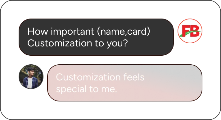
How do customers request customized cakes?
They shared that most of these requests happen in person, over a phone call, or via a custom message during online ordering.
I also noticed that the physical stores offer more than just cakes-such as toppings, birthday party supplies, and other celebration essentials-which are not listed online. This seemed like a missed opportunity to grow their online sales and reach.
So, I began my research and design journey to bring this idea to life.
Role
As a budding UI/UX designer, I took charge of the entire design process from conducting user research and defining user personas to creating wireframes, building interactive prototypes, and testing the designs to ensure a seamless and user-friendly experience.
Goals
Business goals

Increase conversions through easy, personalized orders.

Enhance brand reputation through quality products and exceptional customer service.

Attract new users through targeted marketing and regional outreach.
User goals

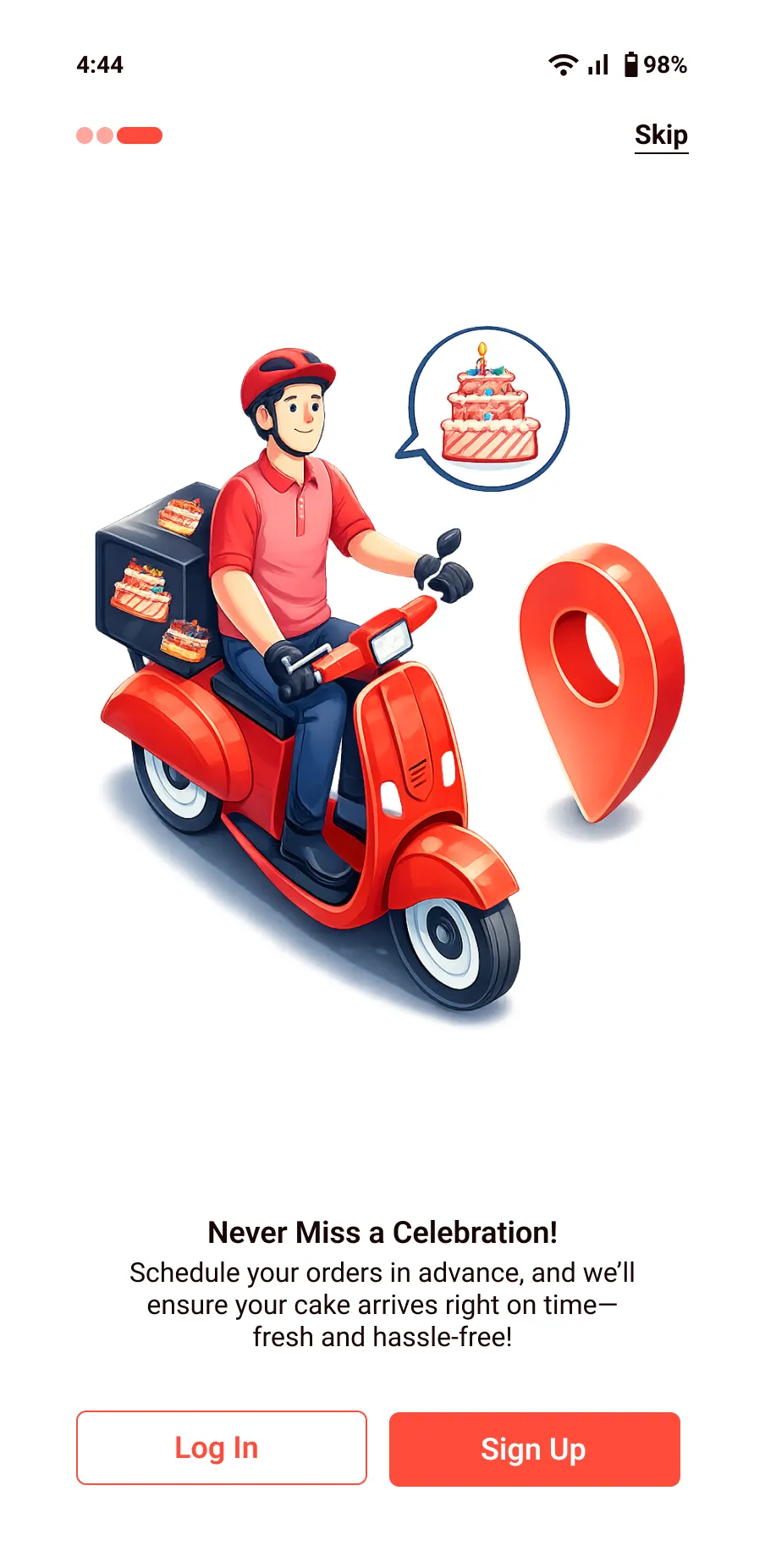
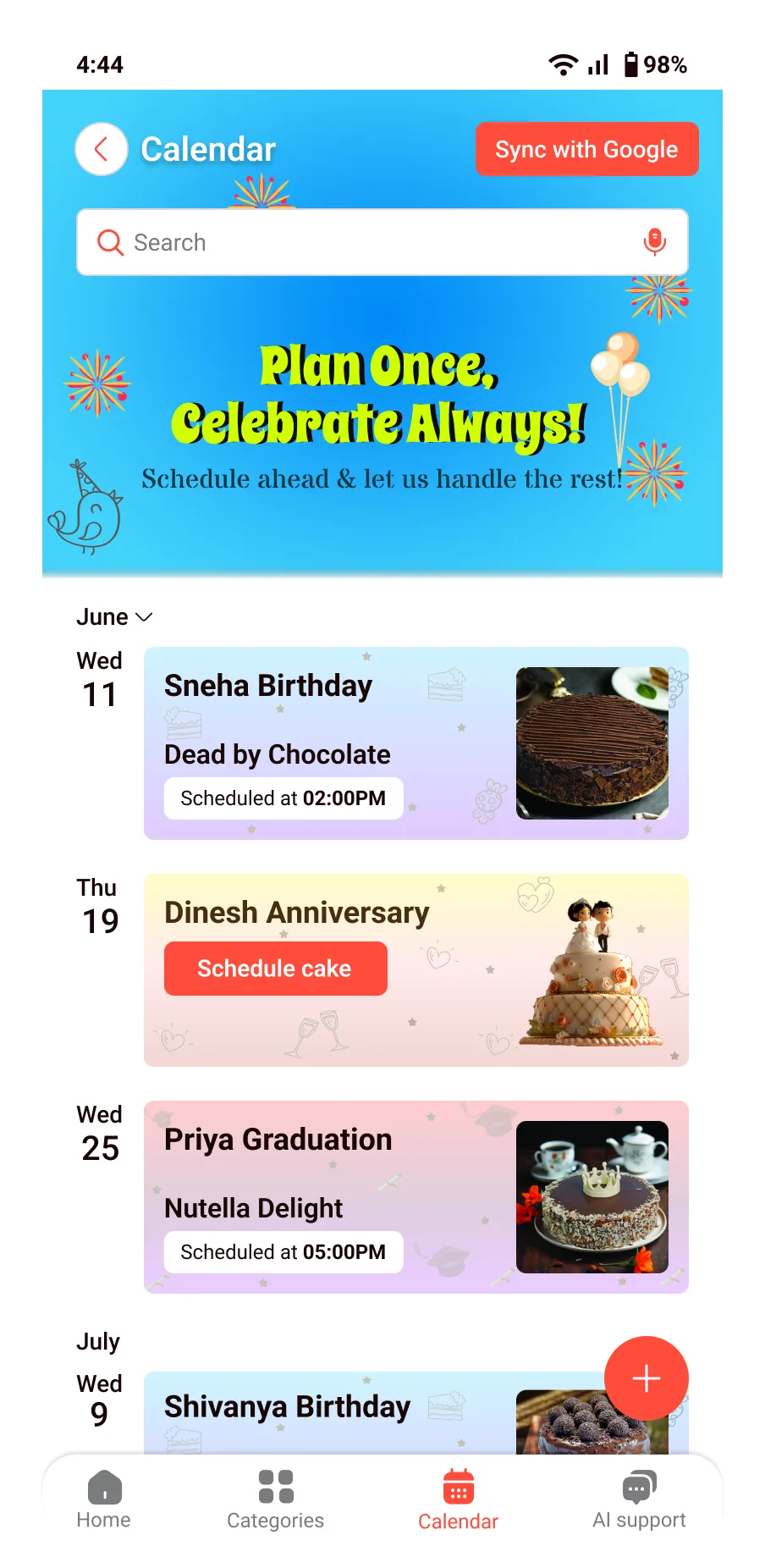
Event Planning & Scheduling by syncing calendars and setting reminders.

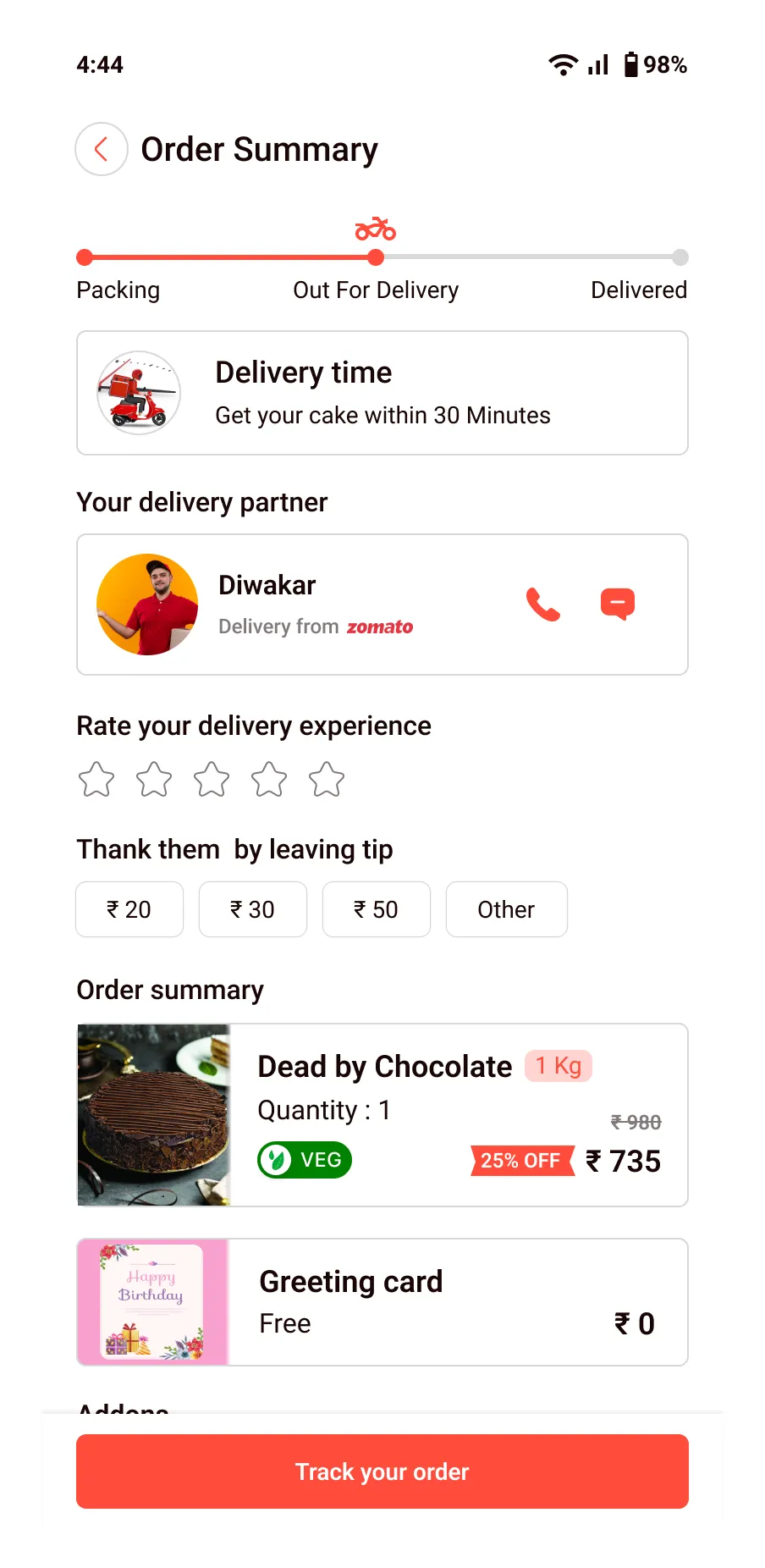
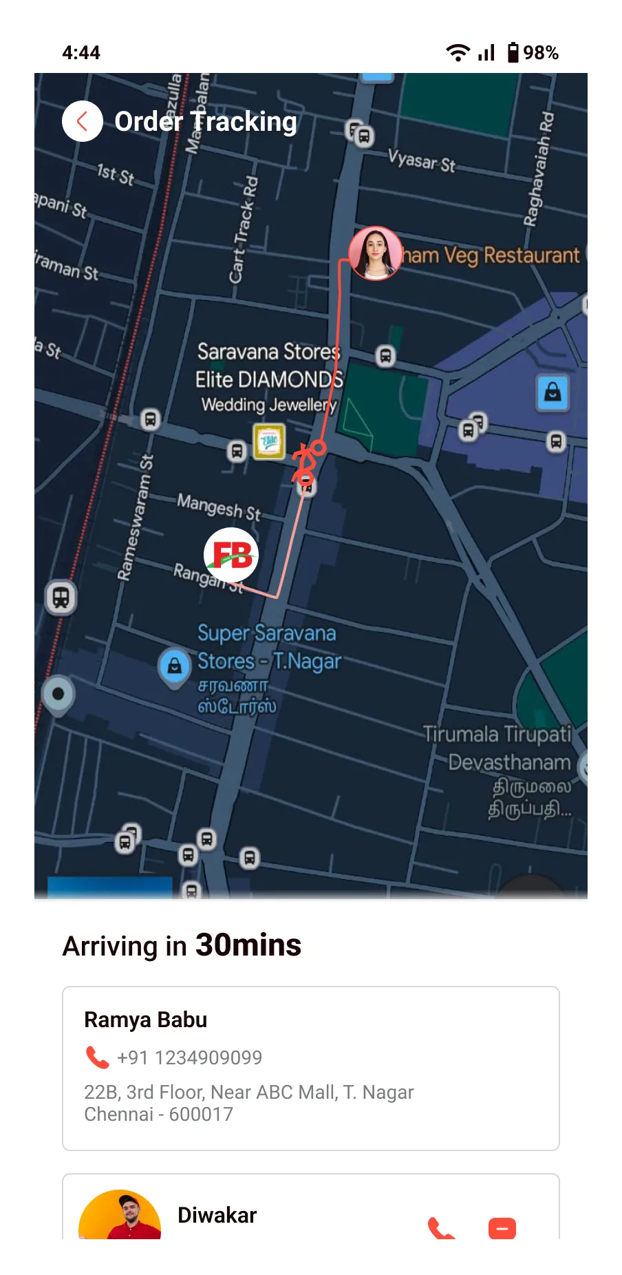
Timely Delivery with accurate estimates and reliable service.

Real-Time Order Tracking from baking to doorstep for complete visibility.
SWOT analysis
I conducted a SWOT analysis for FB Cakes, highlighting its strengths in brand recognition and customer loyalty, while identifying opportunities for online expansion and the need to address seasonal demand fluctuations and competition. This analysis offers valuable insights to guide strategic growth.
-
Makes beautiful and tasty custom cakes
-
Loved by local customers
-
Strong social media presence
-
Manual tracking, no live updates
-
Customers prefer ordering through the FB Cakes app instead of third-party
-
Offer app-only discounts or loyalty rewards
-
Collaborate with event planners or cafes
-
Sell different add-ons
-
New bakeries and home bakers entering the market
-
Ingredient costs can go up unexpectedly
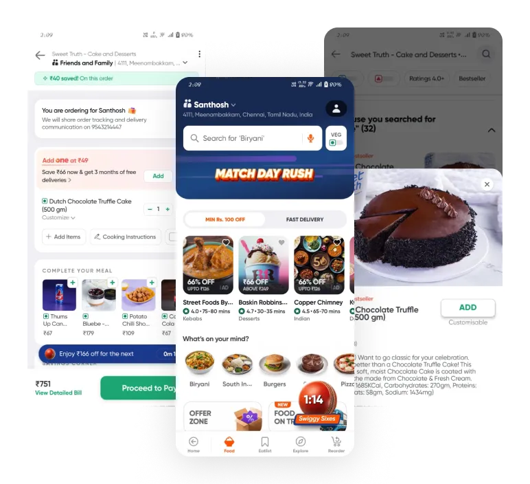
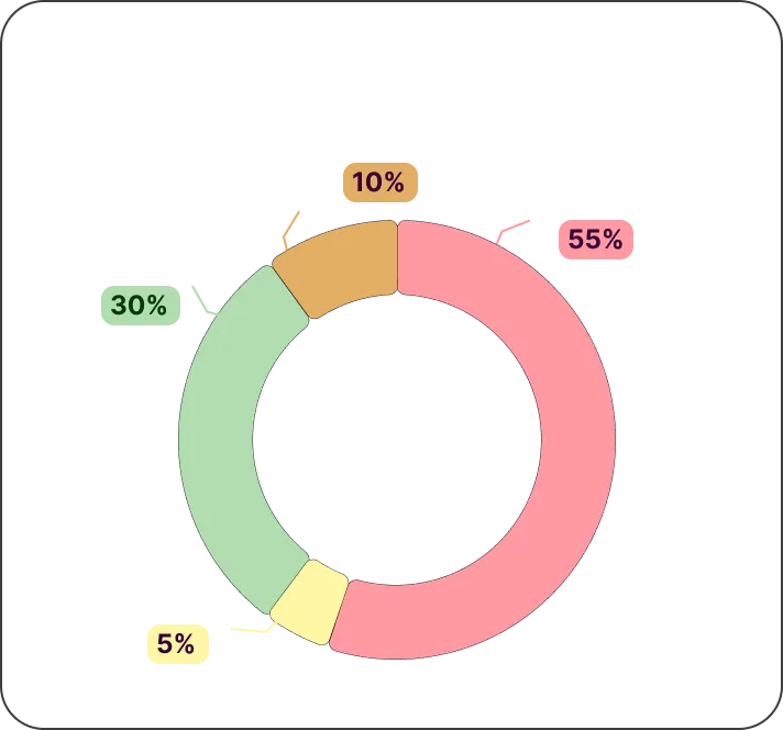
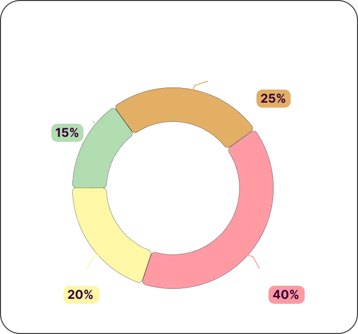
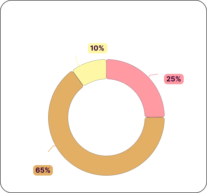
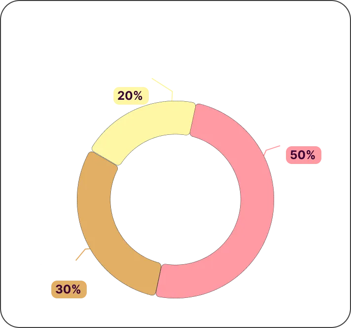
Competitive analysis
Competitor analysis is one of the important steps during the research process.It helps to understand our competitor and the issues faced by the competitor.

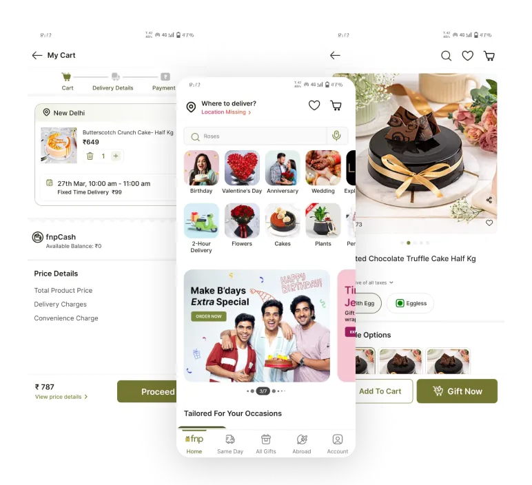

Neat interface for easy navigation
Clear delivery details for easy planning
Quick links simplify finding occasion-based products.

Crowded central panel may overwhelm small screens.
Missing tags reduce urgency and buying cues.

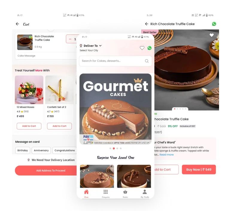
Varied products meet different preferences.
Gourmet section boosts brand image.
Homepage balances promos and navigation well.
No upfront delivery time estimate shown.
Category UI feels dull and less intuitive.

Tags like “60% Off” add excitement to browsing.
Cart shows delivery time, setting clear expectations.
Cart layout is neat and great for quick review.
Promotions overshadow cake discovery on the homepage.
The cake card lacks flavor, weight, and ratings.
User research
Issues highlighted in reviews of FB Cakes
Asked friends about FB Cakes

Quantitative research
These are the missing features in all apps


Enhanced Features Based on App Analysis
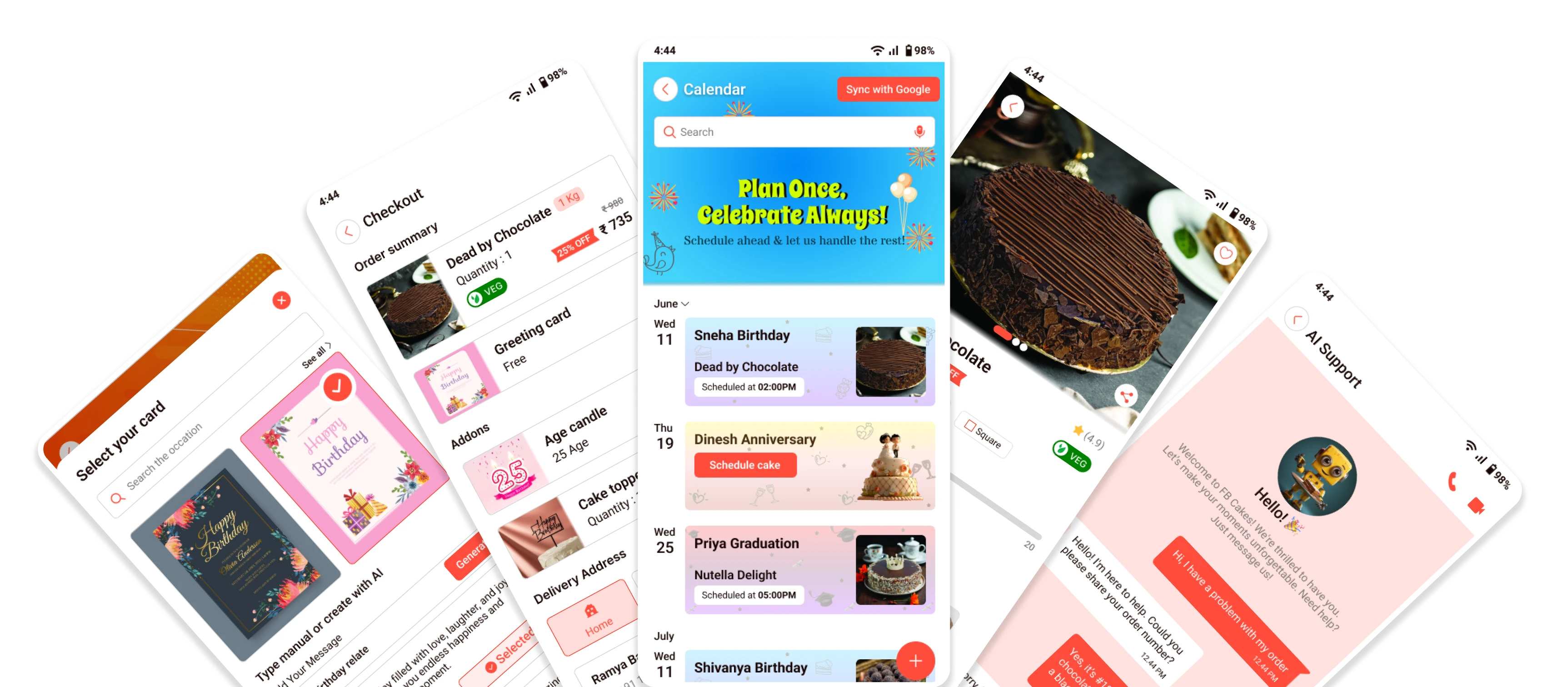
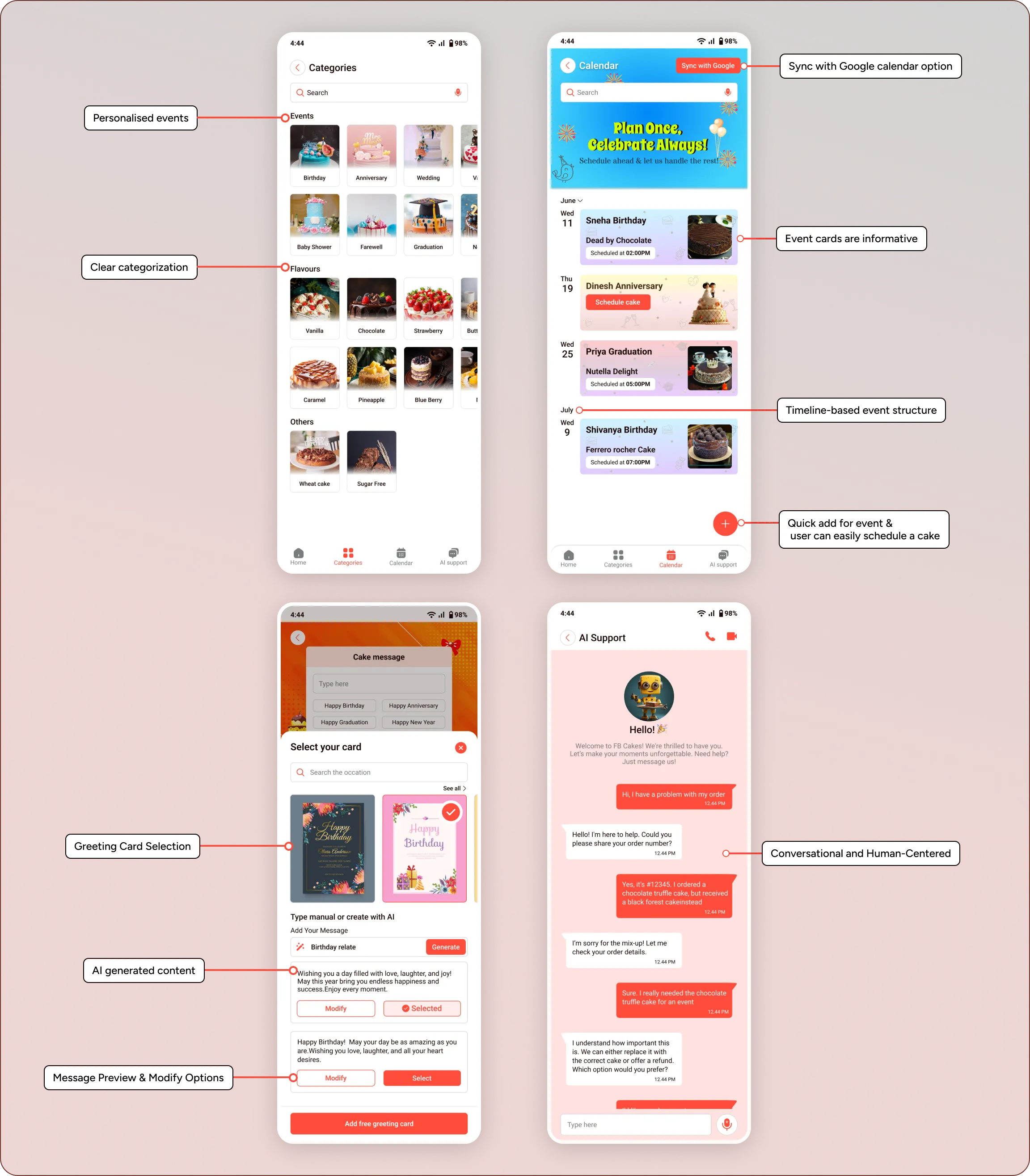
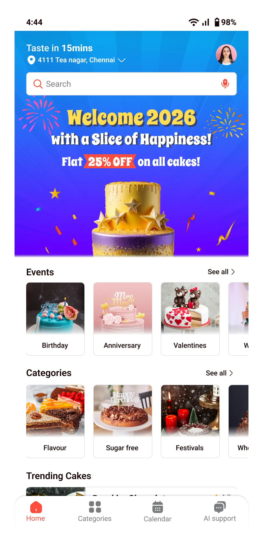
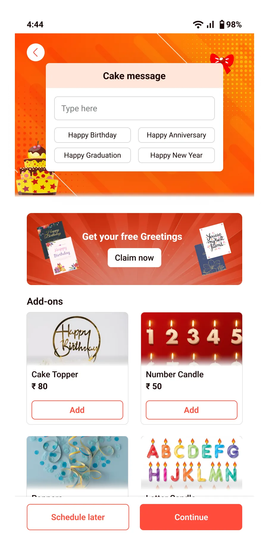
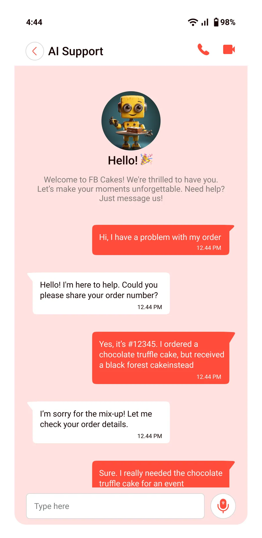
After analyzing competitor apps and their feature gaps, I’ve included options like schedule order, calendar sync, AI support, cake portion calculator, and AI greetings in the design

Initial research results
As the carried-out research shows, there is a growing demand for cake delivery apps with features like customization, scheduling, and reminders. Users prefer seamless ordering experiences with timely delivery and personalized options.
User persona
I collected multiple user personas to understand users’ skills, behaviors, attitudes, goals, barriers, and interests, along with the applications they use often. These insights helped me shape the product experience around real user needs. Below is one example persona from my research.
The Busy HR Manager

Sarah ,35 years old


Sarah handles employee engagement and office celebrations. She needs an easy, time-saving way to order cakes without interrupting her busy schedule.

-
Order cake for office events on time
-
Schedule order advance

-
Forgetting upcoming events
-
Lack of delivery timelines

-
Calendar sync and get reminder
-
Pre order cakes
These are the missing features in all apps

Sarah was so stressed
Sarah's schedule is packed-and now, she has to order cakes too.

She forgot
Another celebration… and she forgot the cake -again!
Hear about FB cakes
That’s when she hears about FB cakes, the stress-free way to order cakes for any office event.
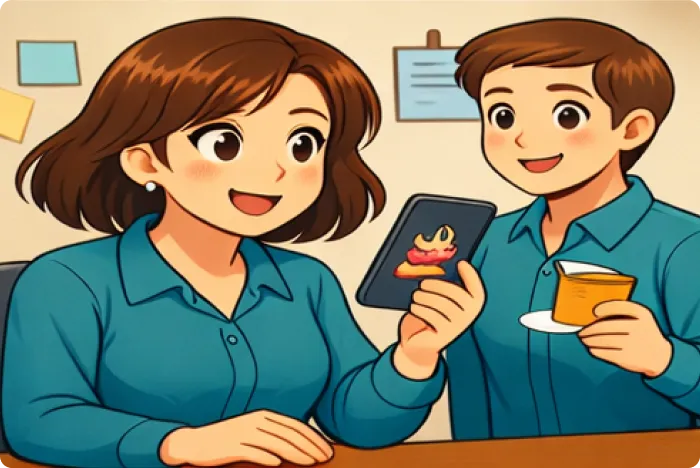
Schedule order
She received remainder 12 hrs before and the order confirmation.

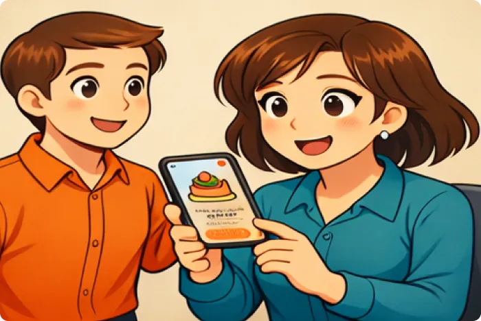
Celebration
She track the order and receive the cake and gift.
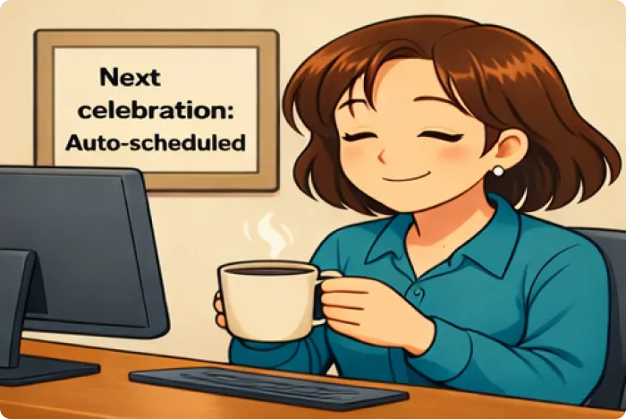
Stress free
Now she doesn’t have to stress about the celebrations.
Empathy mapping
As a budding UI/UX designer, I took charge of the entire design process from conducting user research and defining user personas to creating wireframes, building interactive prototypes, and testing the designs to ensure a seamless and user-friendly experience.
Says
-
I need the cake delivered quickly and without hassle.
-
I hope the cake looks exactly like the photo.
-
I want to customize a message easily.
-
I hate calling multiple bakeries.

Thinks
-
Will the cake arrive on time?
-
What if the quality isn’t good?
-
Is this price fair?
-
Can I trust the app for a special event?

Does
-
Compares delivery times and pricing.
-
Scrolls through multiple cakes, checking ratings.
-
Adds extras like flowers or candles.
-
Tracks delivery once ordered.

Feels
-
Anxious about timing and reliability.
-
Excited for the surprise.
-
Frustrated if the checkout process is complicated.
-
Relieved when everything goes smoothly.

Pains
-
Unclear delivery timelines cause anxiety.
-
Limited quick delivery options for last-minute needs.
-
Confusing navigation or too many steps at checkout.

Gains
-
Fast, reliable delivery with real-time tracking.
-
Easy customization of cakes with personalized messages.
-
Smooth checkout with saved payment details.

Time to start designing!
Once I understood the needs and cravings of my sweet-toothed users, it was time to start sketching out the first user flows and initial low-fidelity wireframes, followed by a clickable prototype to bring the cake shop experience to life.
Information architecture
It is a combination of users, content and context .which is the design connect the users with content and context .
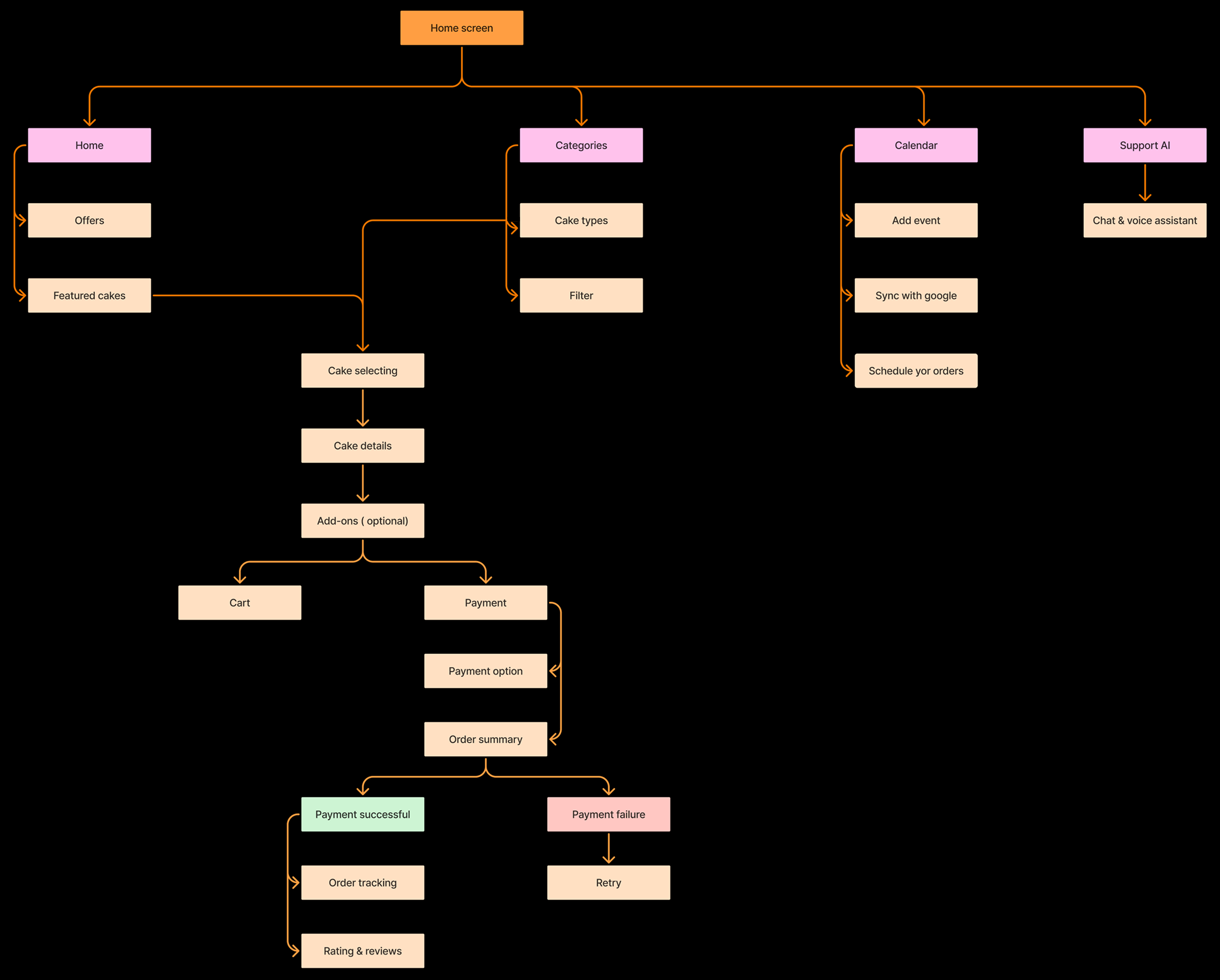
I learned how to structure content clearly and logically to enhance user navigation and experience. IA helped me think from the user’s perspective to reduce confusion and improve engagement.
User flow
User flow looks at the overall user experience and it is user-centered
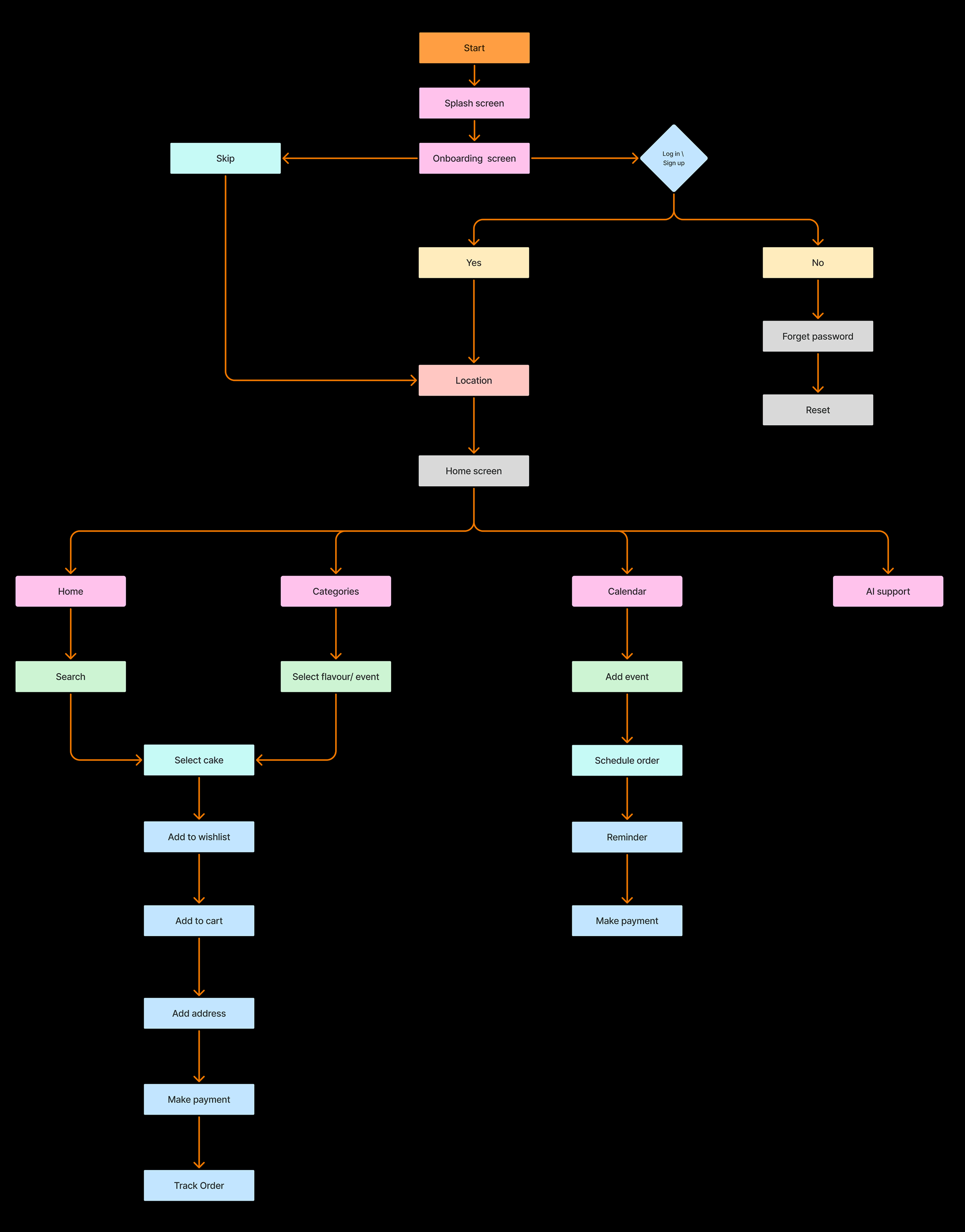
From creating user flow, I learned how to map out the user's journey step by step, identifying key actions and decision points. This helped me understand user needs better.
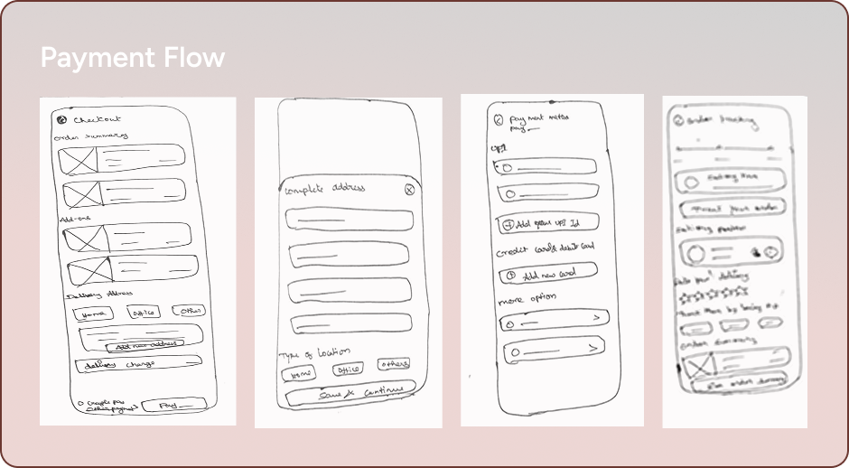
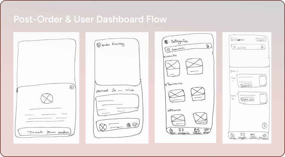
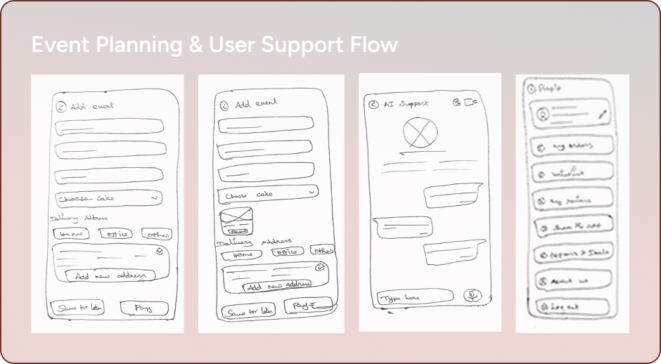
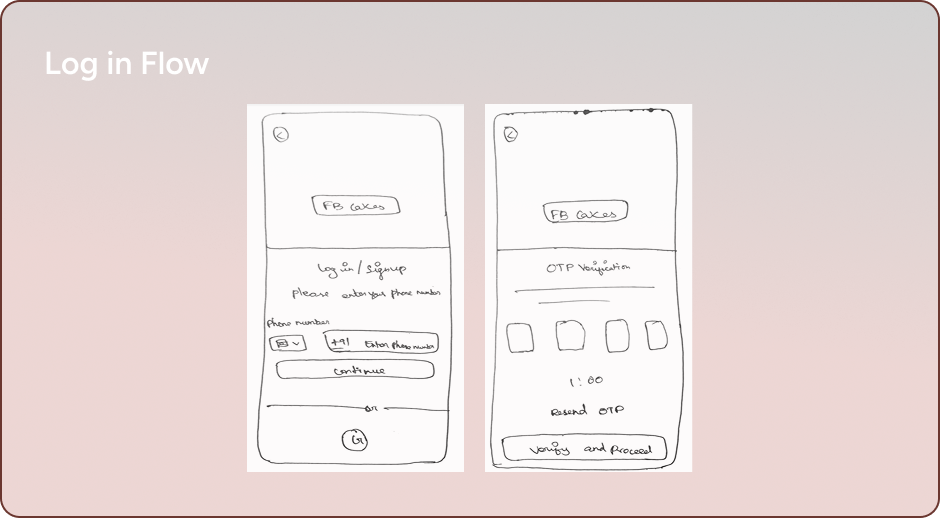
Sketch fast, iterate faster
Sketching helped me quickly explore layout ideas and refine the overall flow before committing to detailed wireframes. It allowed me to experiment freely, capture initial concepts, and shape the foundation for a clearer, more structured design direction.
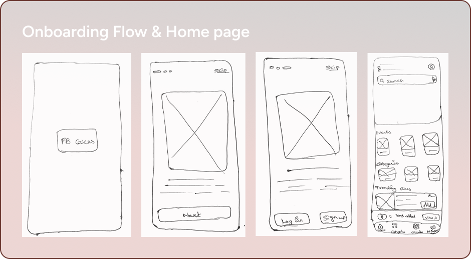
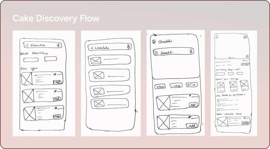
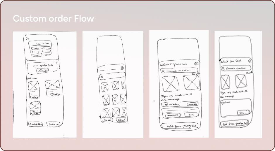
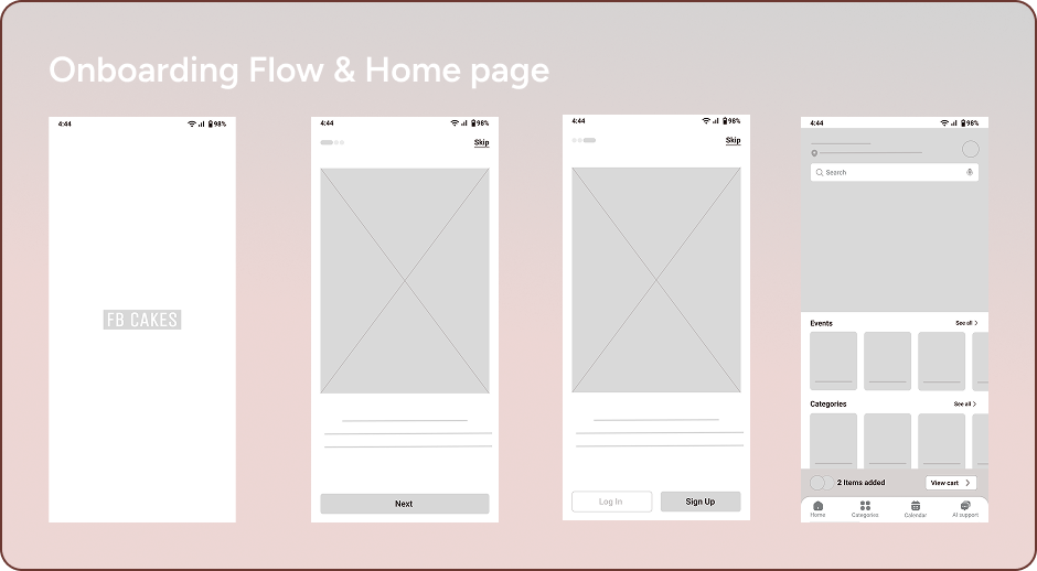
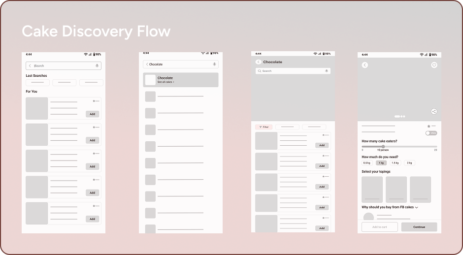
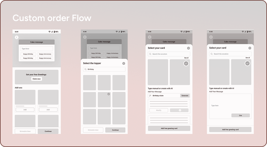
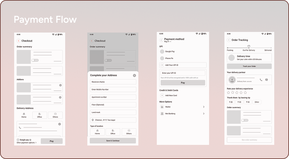
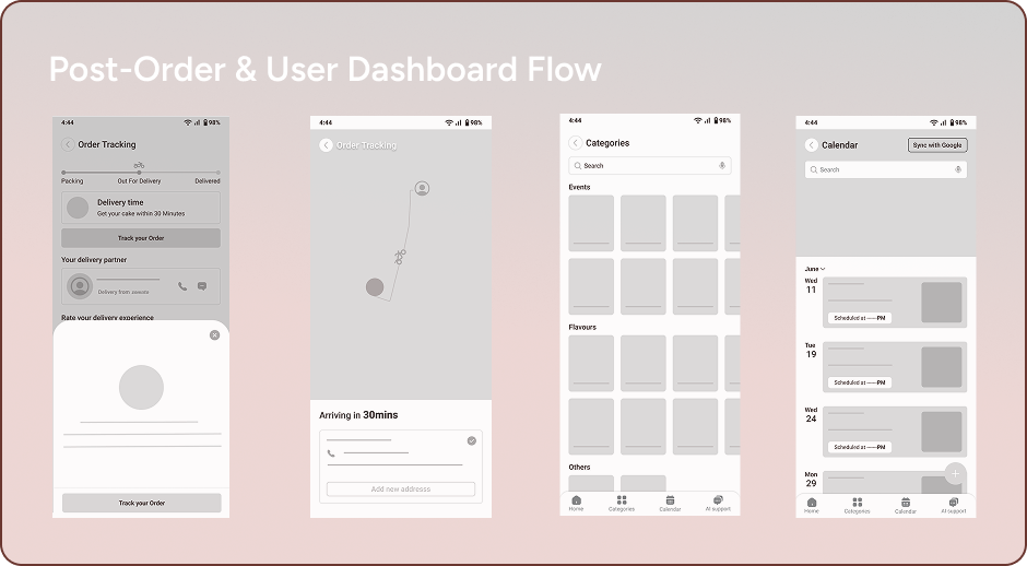
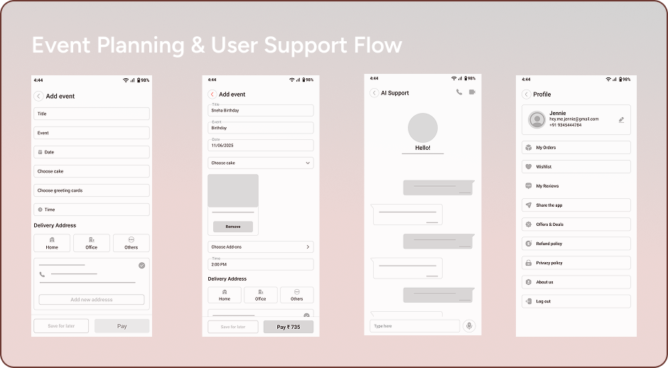
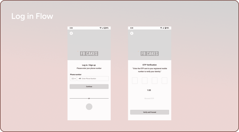
Wireframes and initial insights
Wireframes helped me focus on structuring the layout and navigation flow to ensure a smooth user experience. They allowed me to visualize user interactions early, identify usability issues, and refine features before moving into high-fidelity design.
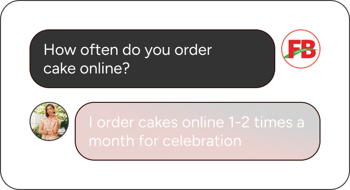
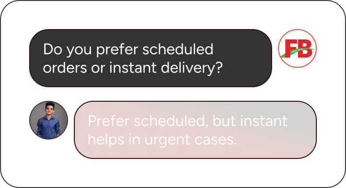
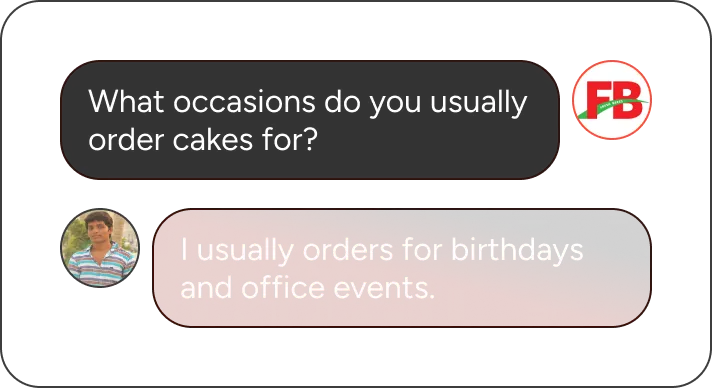
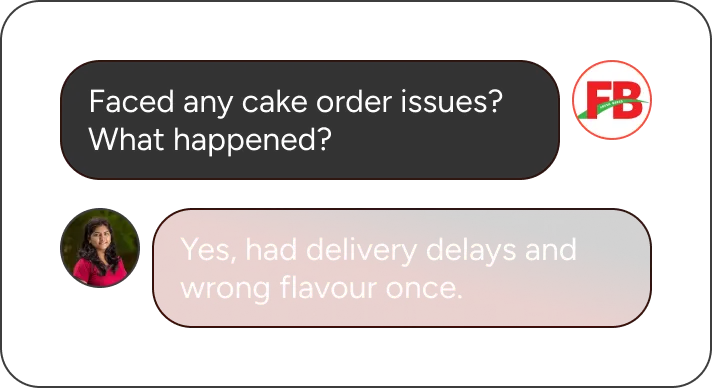
User research
Through user interviews and observations, I gained actionable insights into user frustrations and motivations. This foundation allowed me to refine features, prioritize needs, and shape a user-centered design approach.
From landing to ordering, the steps feel logical and progressive. As a user, I never feel lost in your wireframes.

This feature is gold. Being able to pre-order for a birthday or celebration is super convenient.

Love that I can browse based on mood or what’s popular—it saves time and helps decision-making.

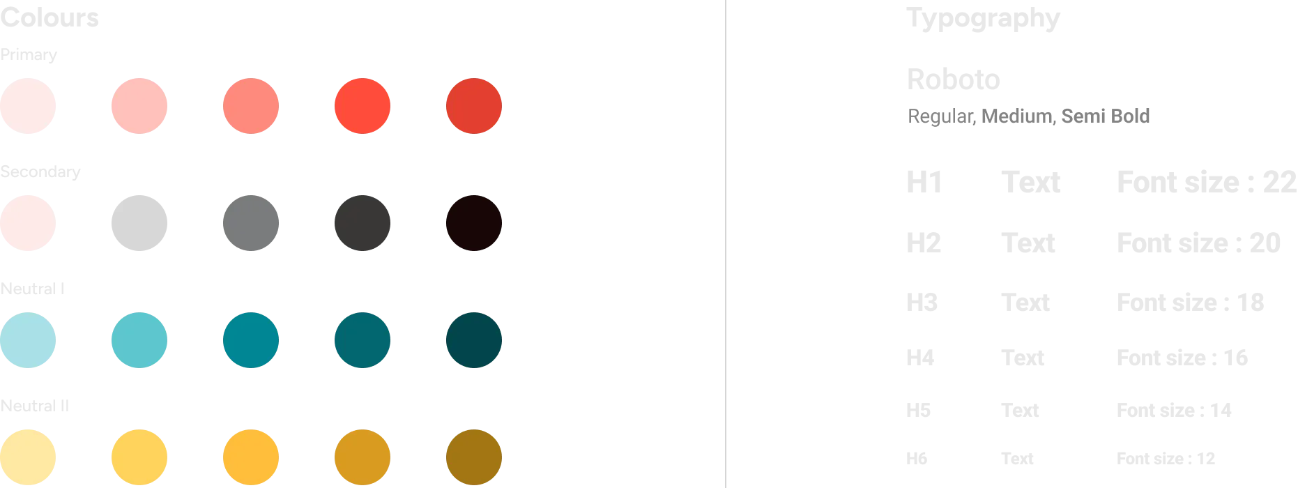
Design system that I followed
Icons library and components used
The wrongs of the previous designs
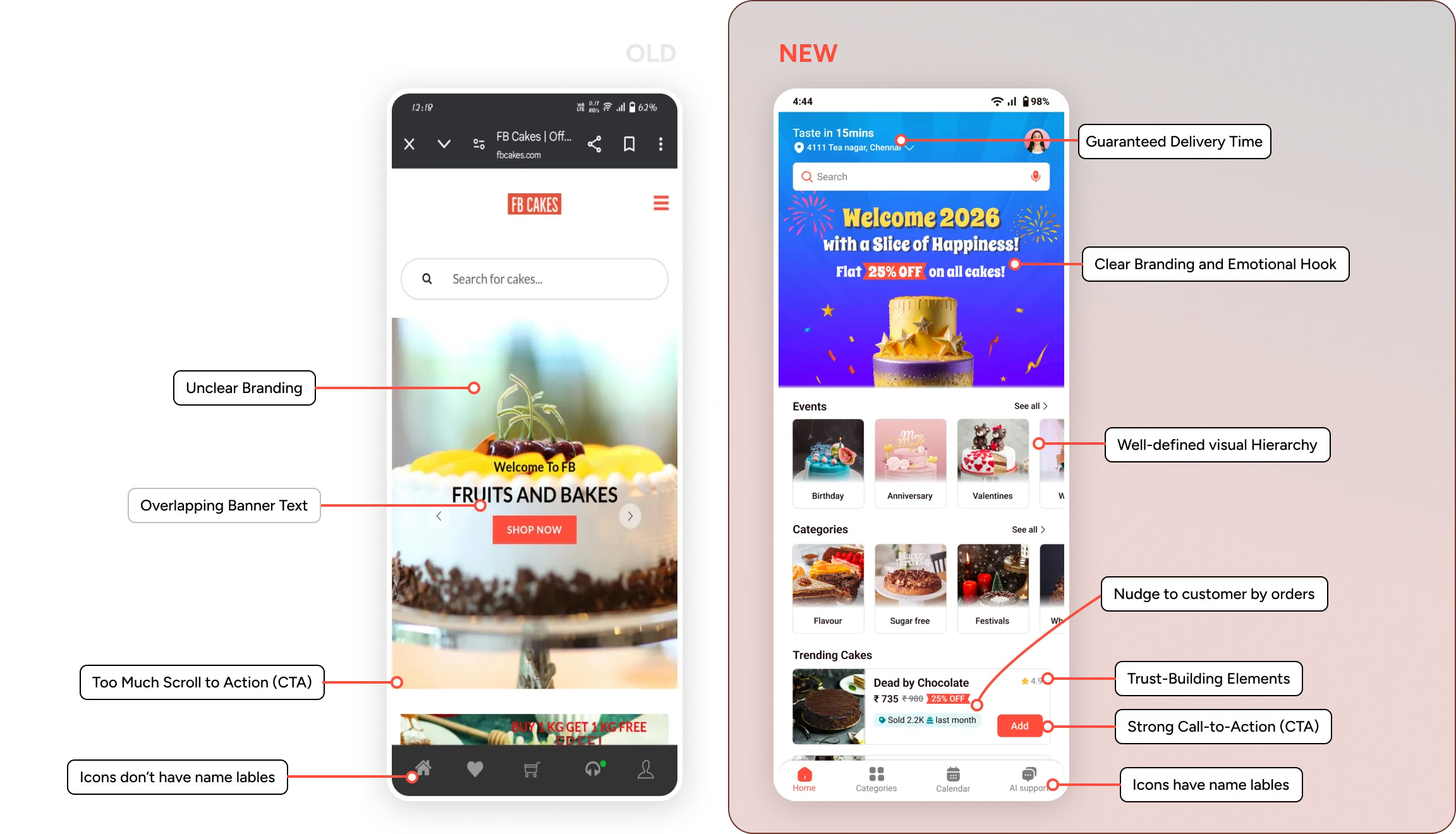
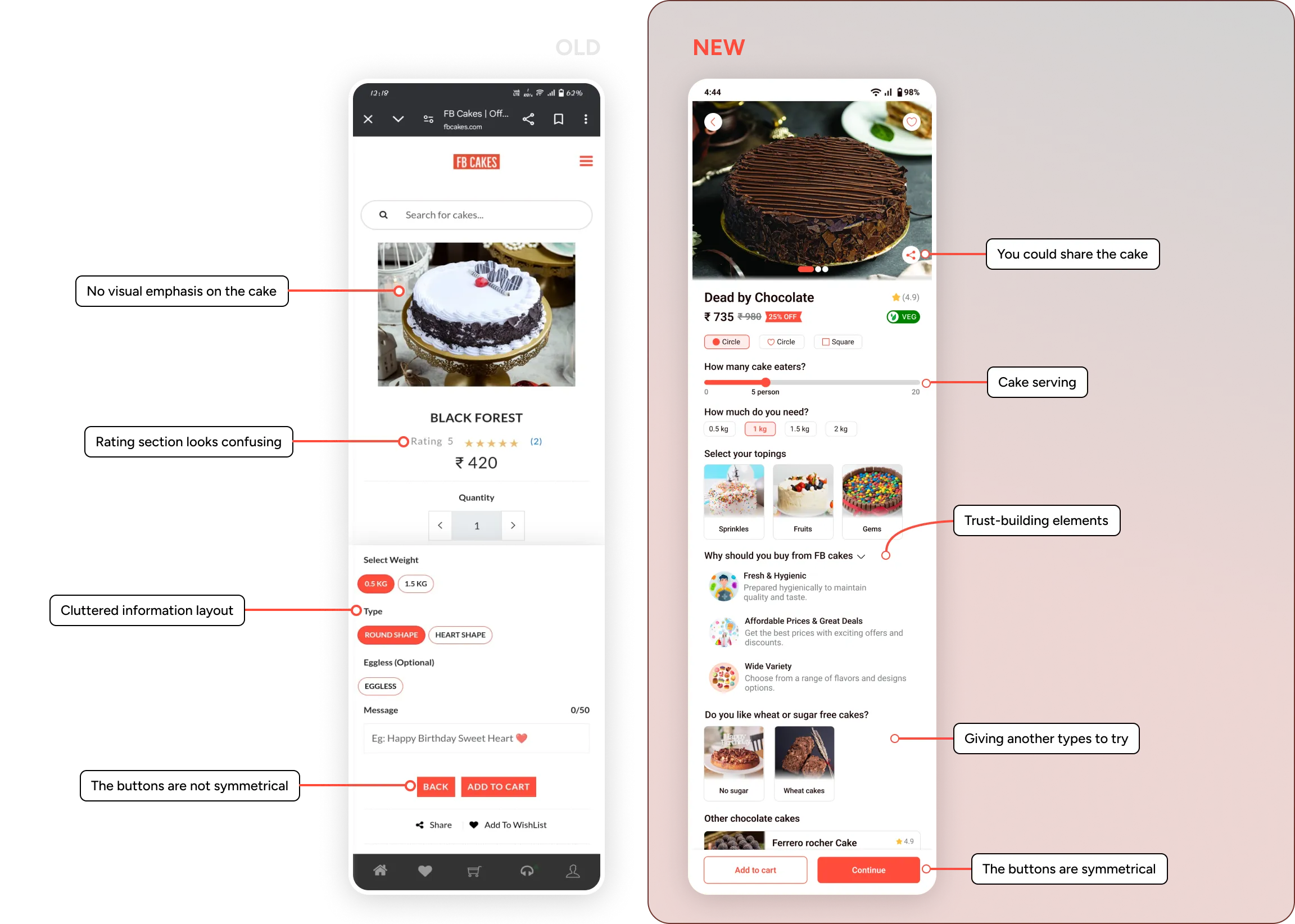
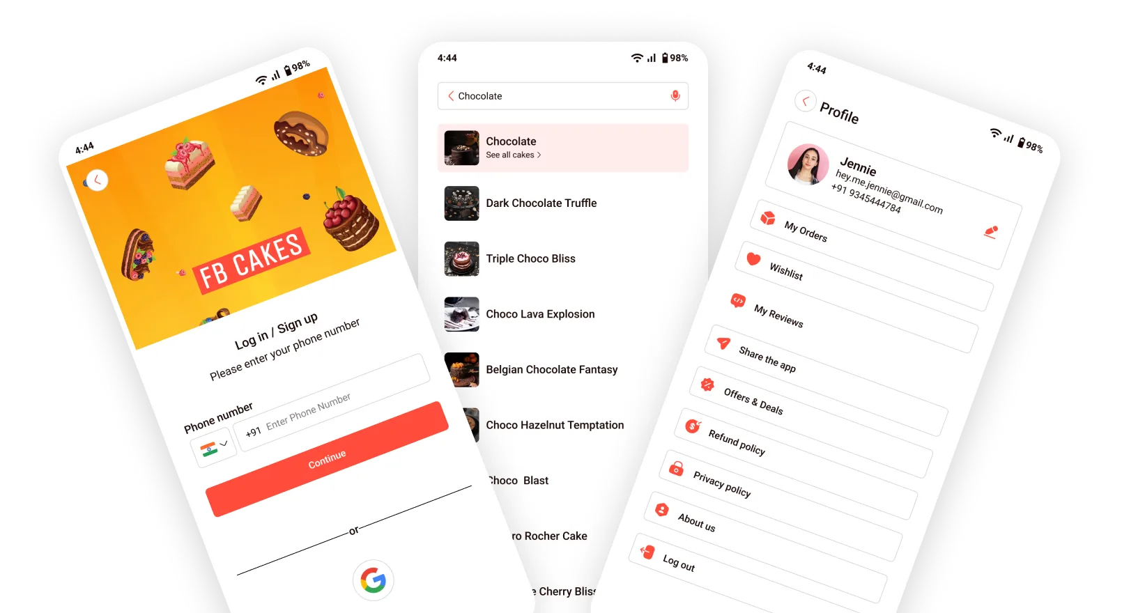
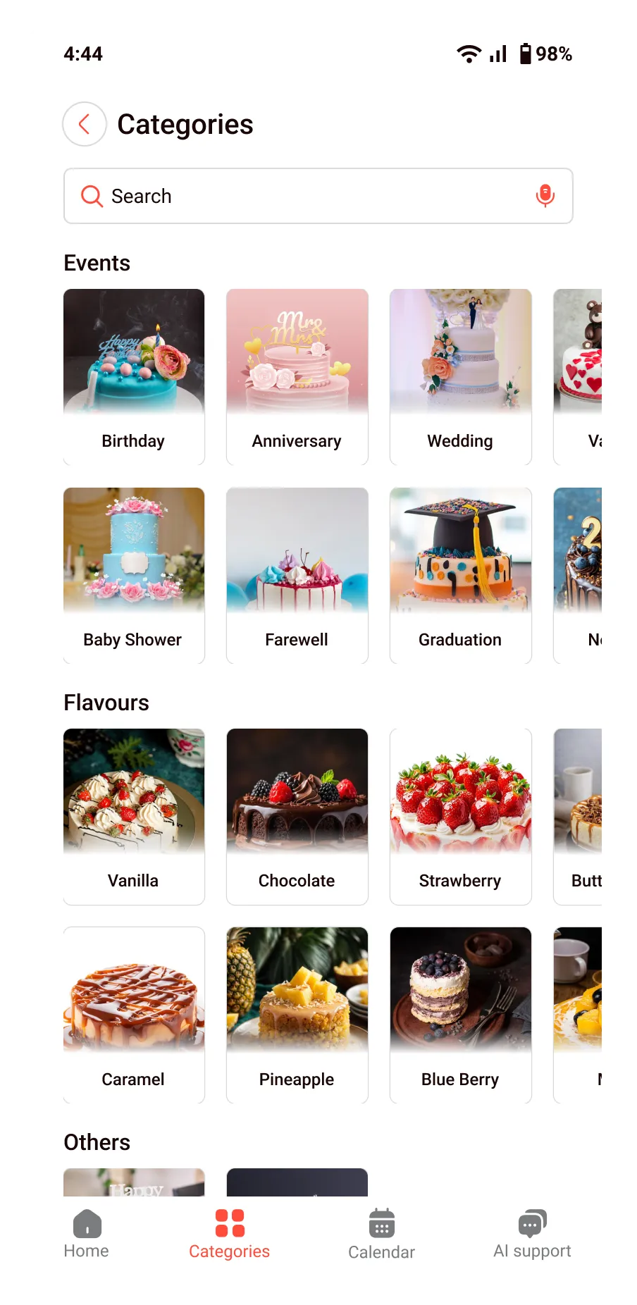
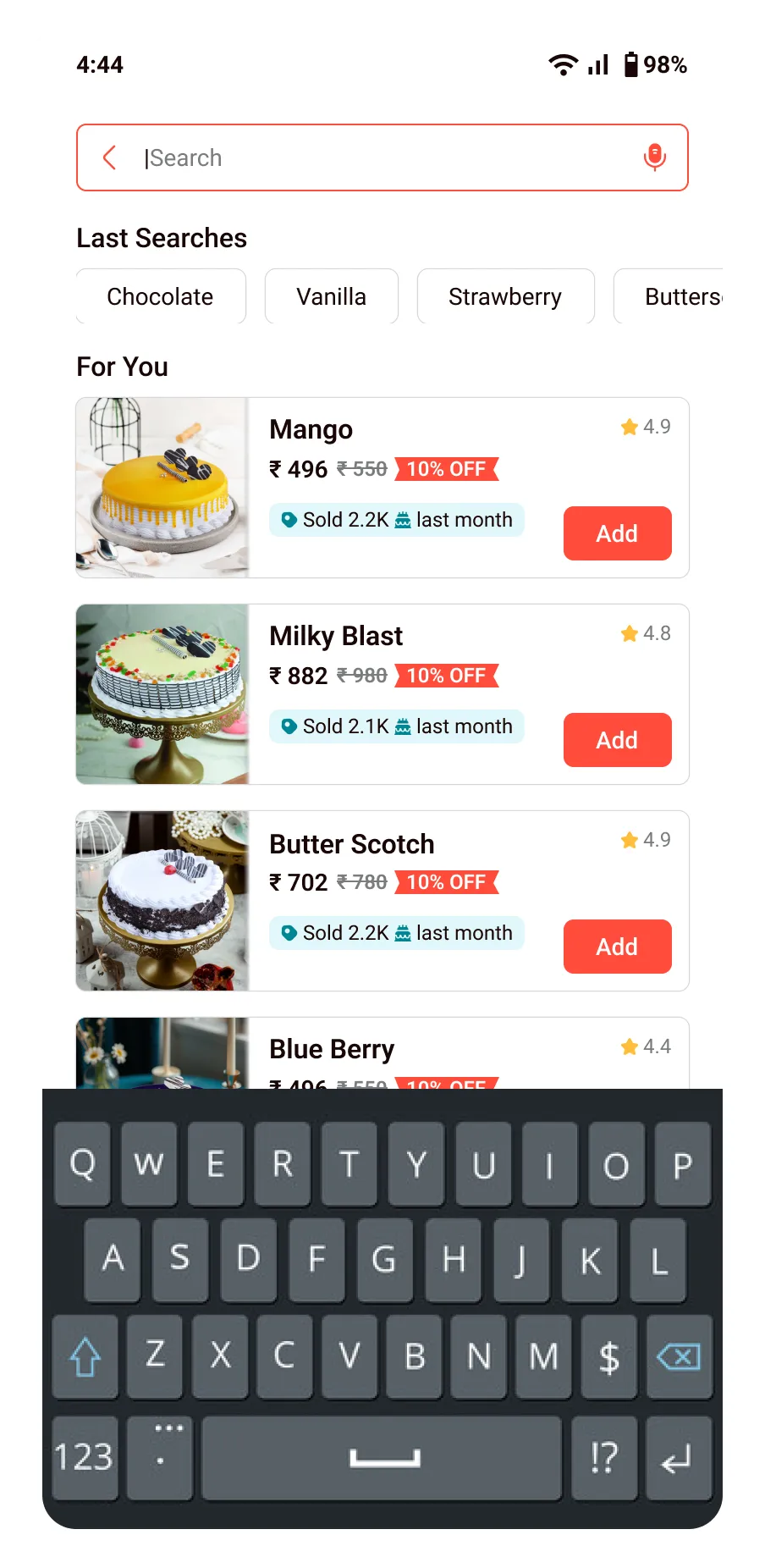
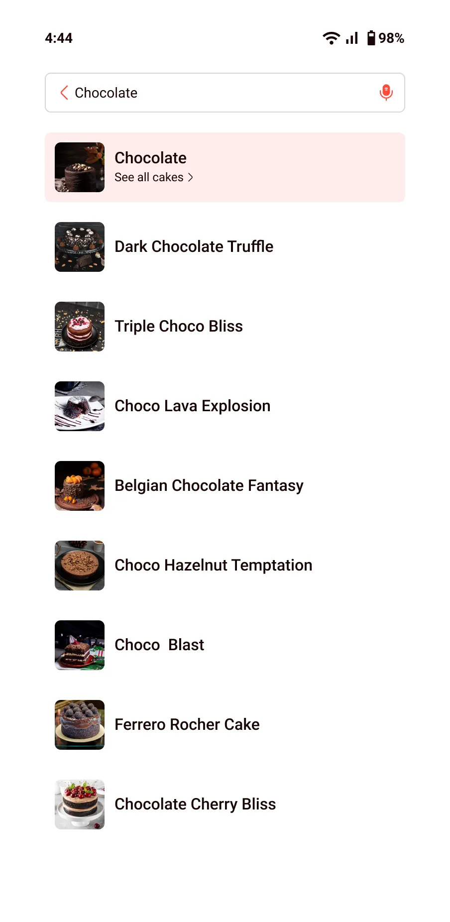
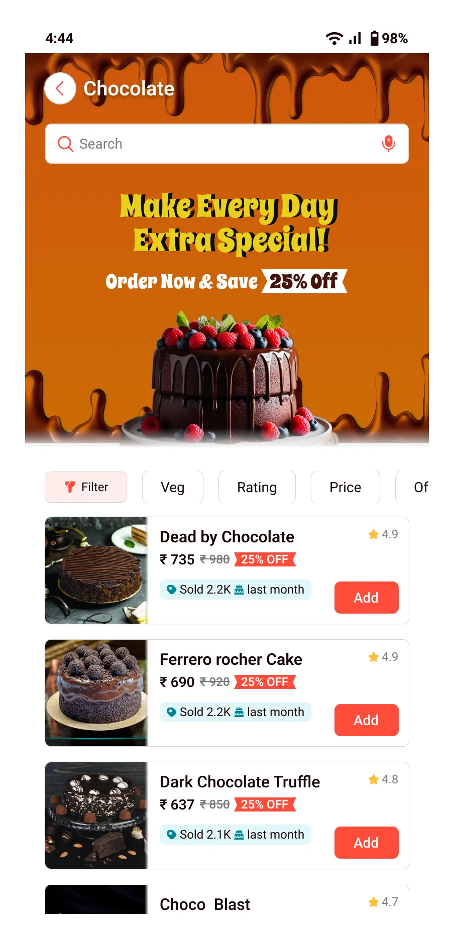
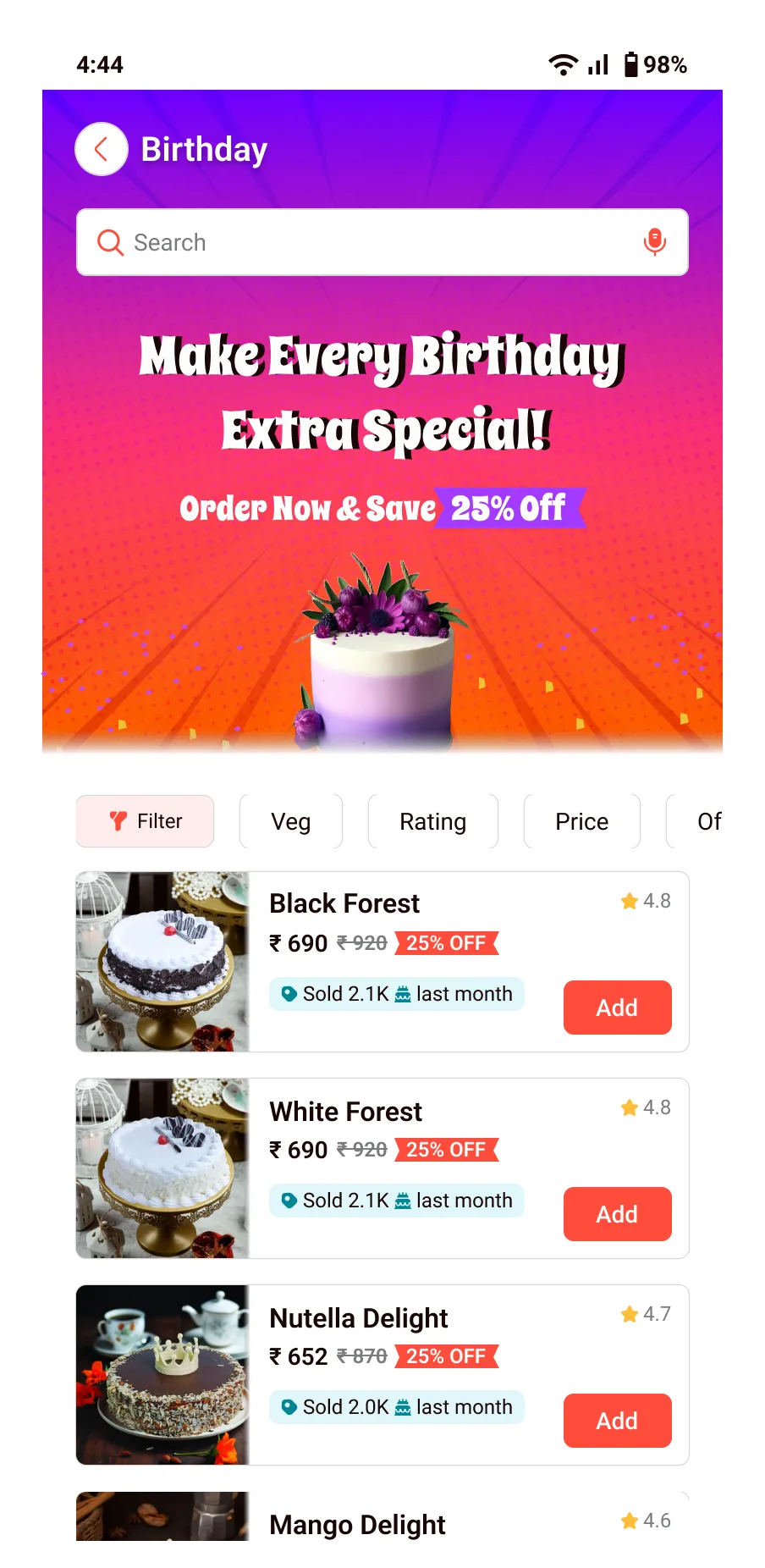
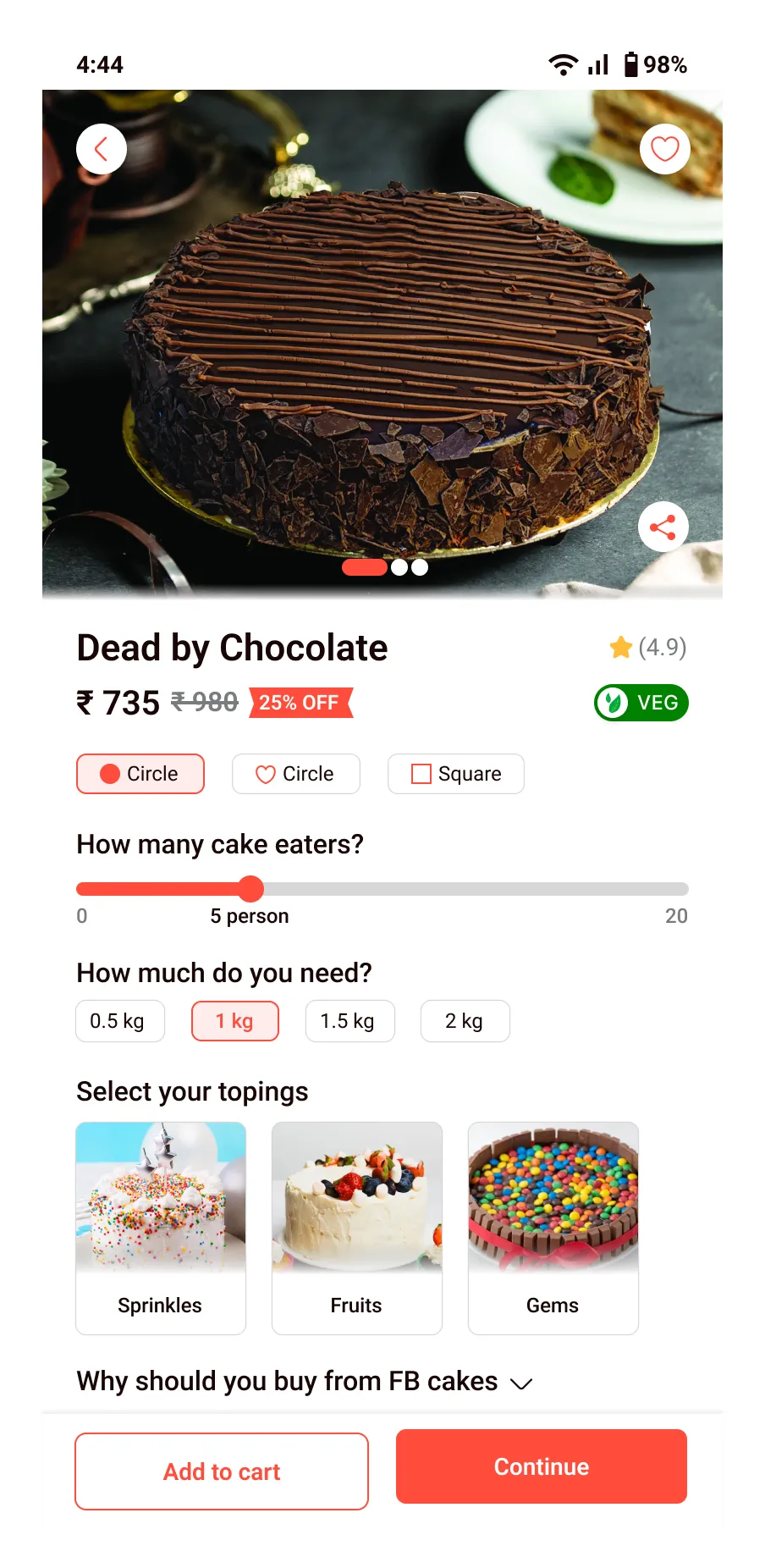
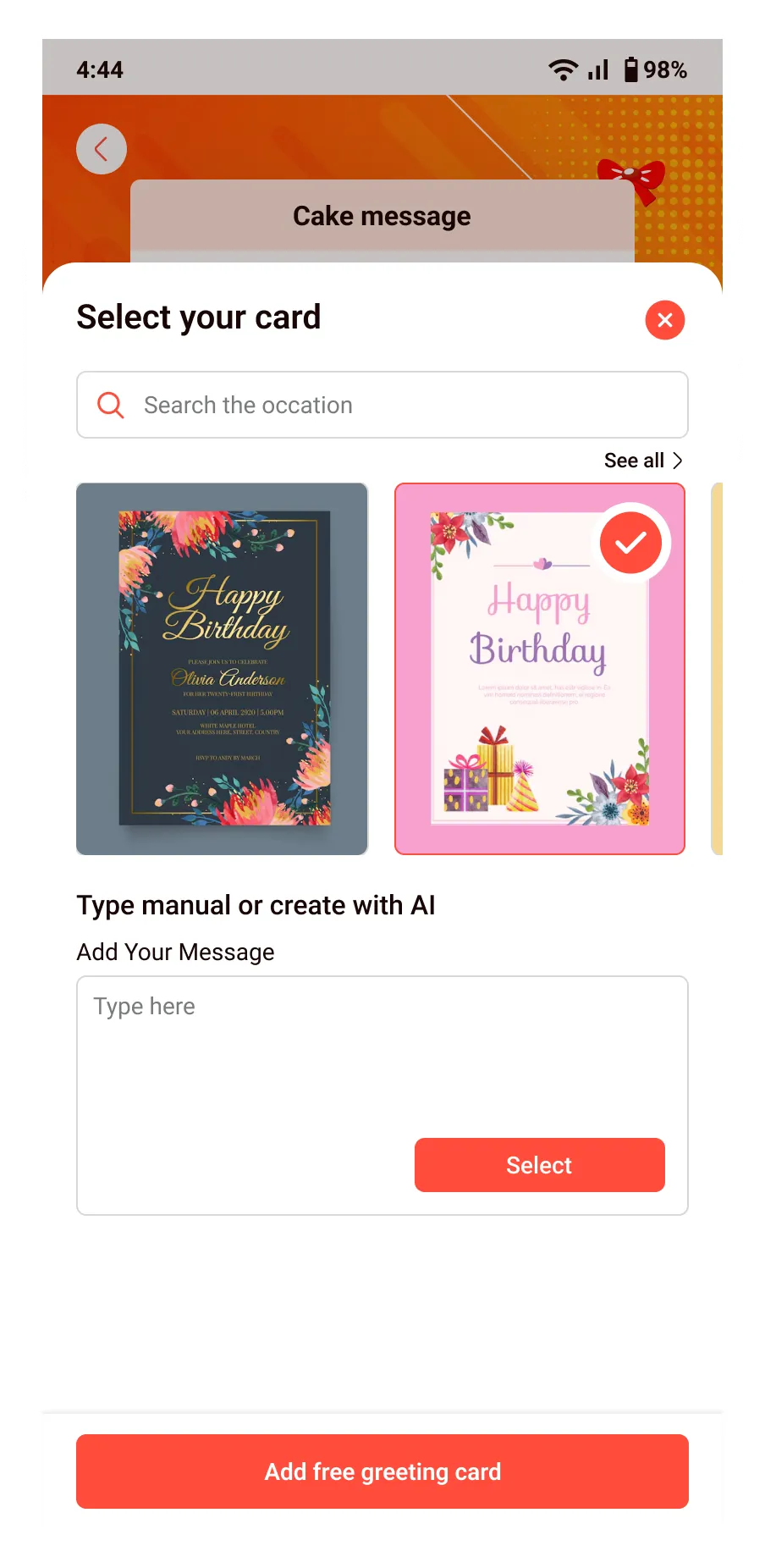
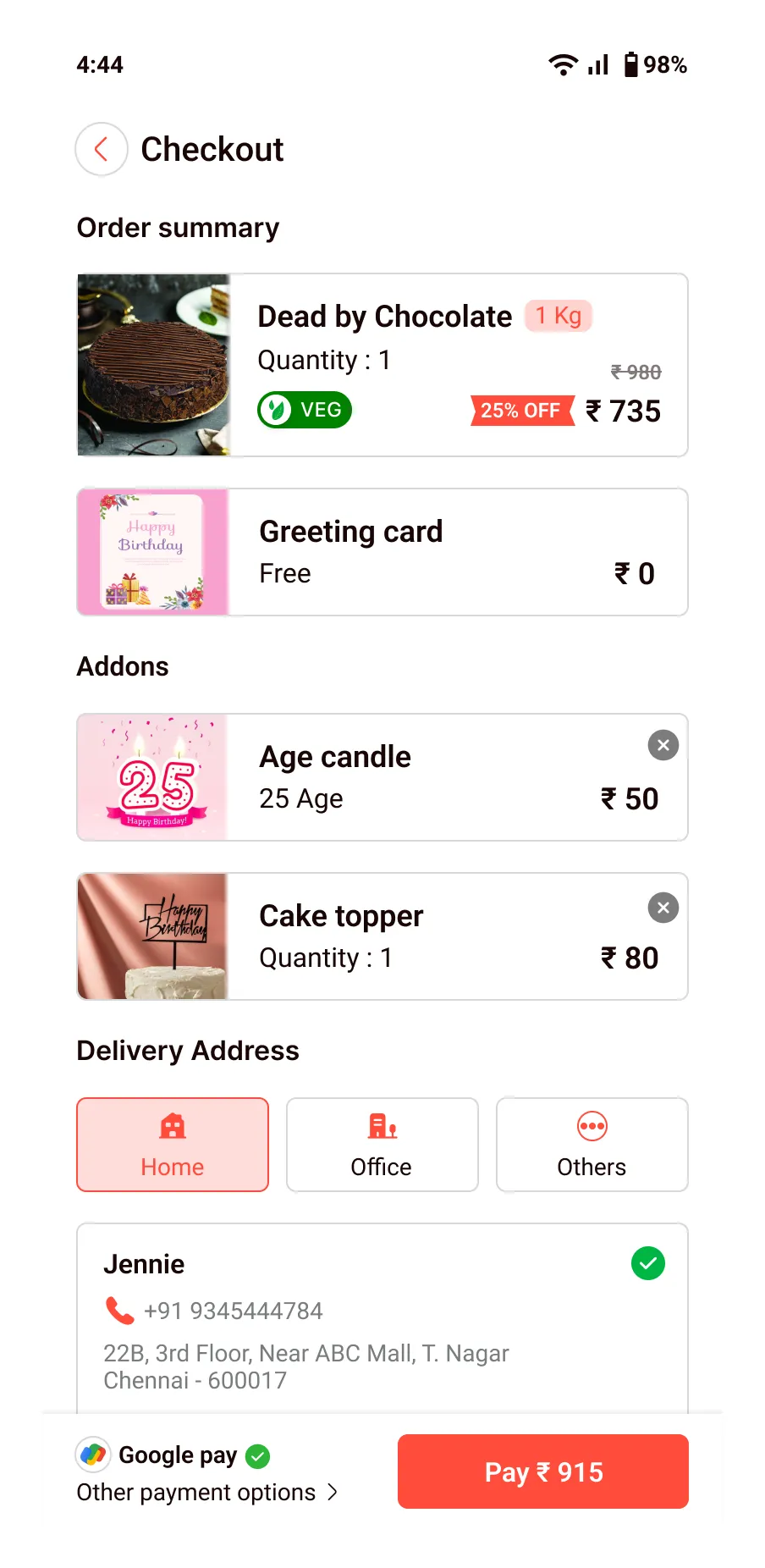
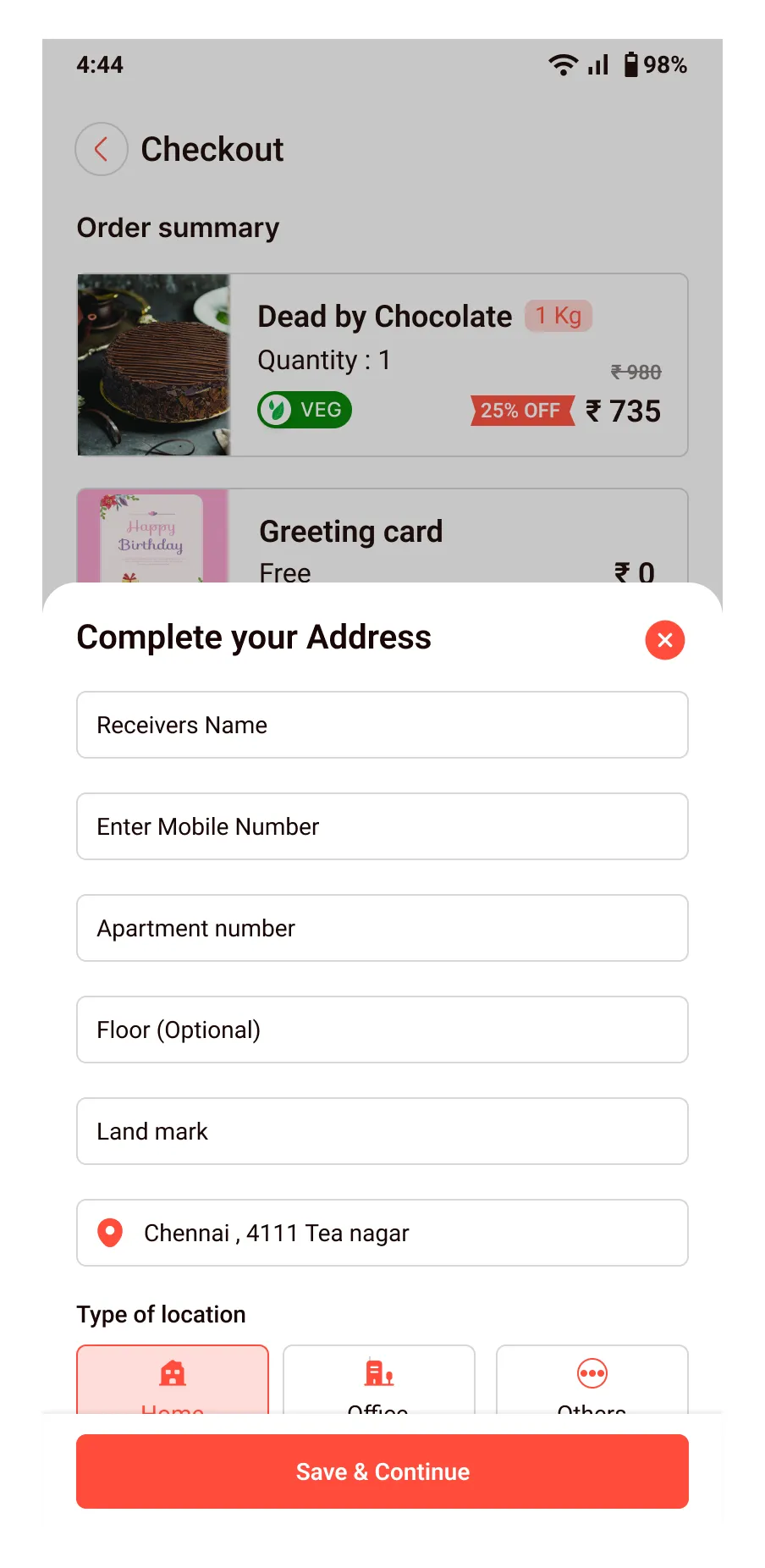
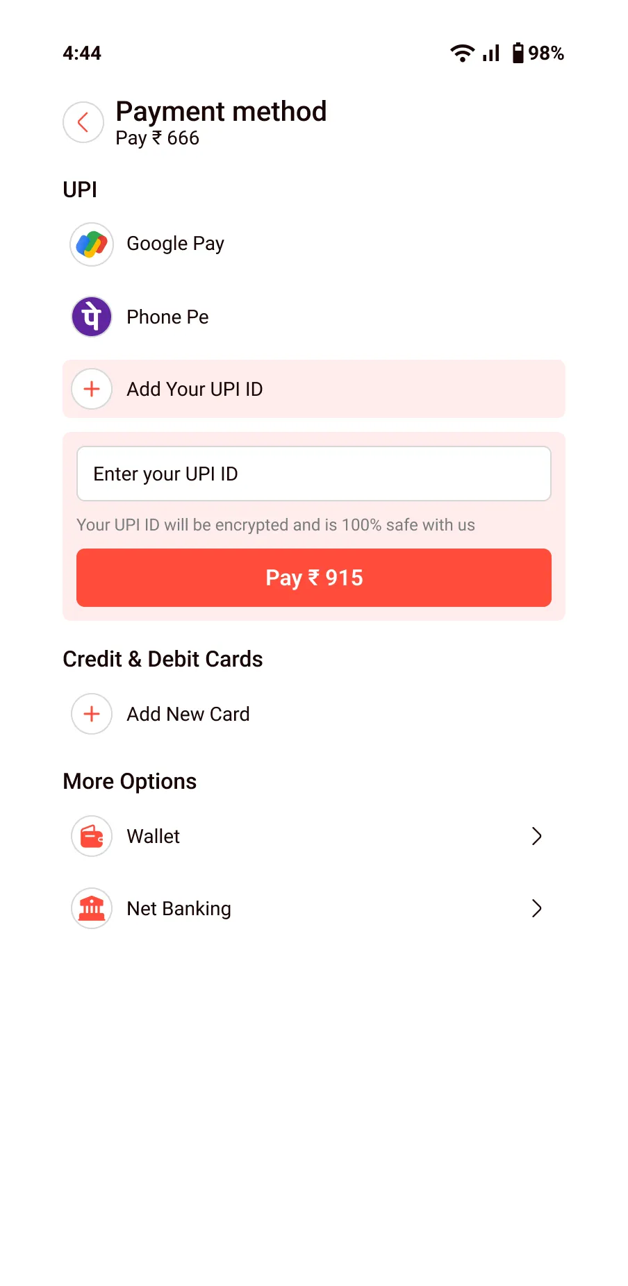
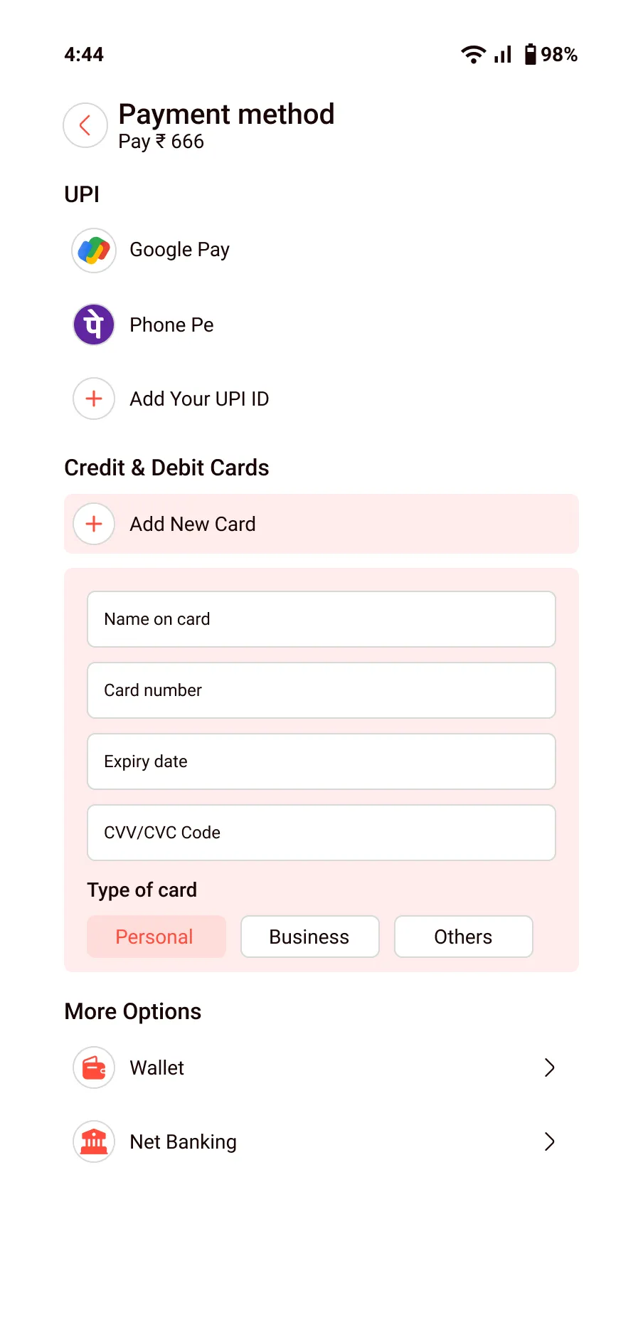
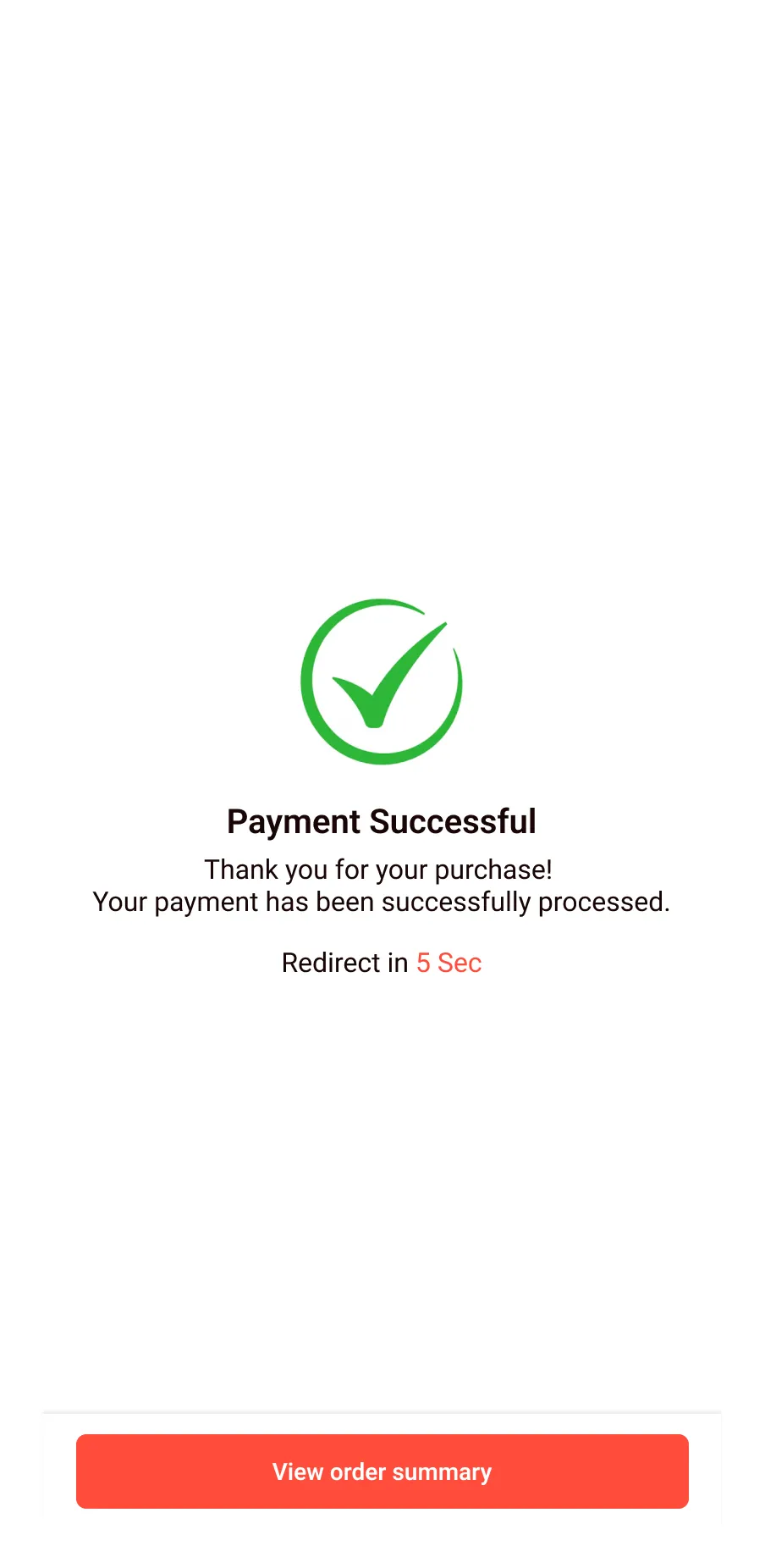
The features & screens I included
Project summary
I designed a smart cake-ordering app to simplify office celebrations. From user research to lo-fi wireframes and hi-fi UI designs, I built and tested a prototype with features like scheduling, personalization, and AI message generation. It was a valuable learning experience with lots of potential for future growth.
I really appreciate you taking the time to check out my case study. I’d be grateful to hear your feedback.