Designing a Unified Customer 360 Intelligence Experience
A UX case study on building a Customer 360 analytics experience for unified customer insights.
How I Started This?
Customer data today exists across multiple platforms - orders, support tickets, marketing platforms, analytics dashboards, and more. While businesses collect large volumes of customer data, teams often struggle to understand customers in a holistic and meaningful way.
This project explores building a Customer 360 Dashboard can unify scattered customer data into a single, insight-driven experience. The goal is to help e-commerce teams quickly understand customer behavior, reduce manual effort, and make faster, more confident decisions across support, marketing, and business functions.
Thinking louder!!
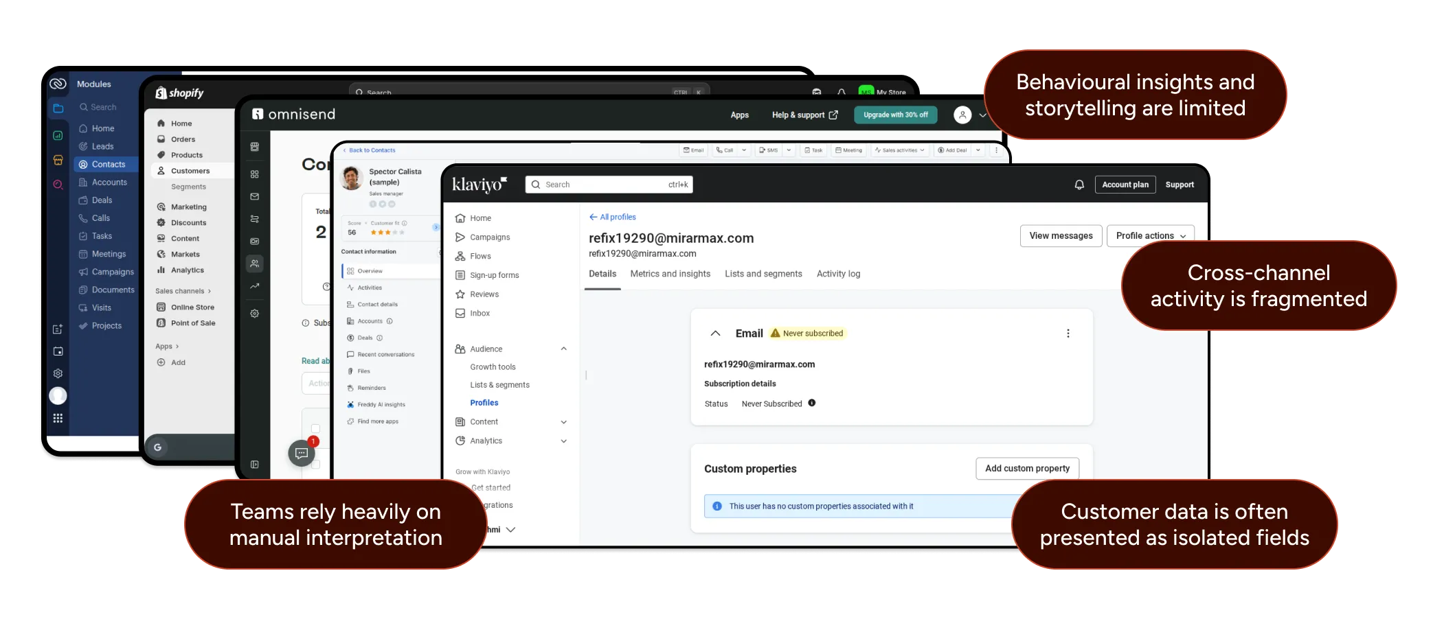
While analyzing existing analytics and reporting platforms, I found that teams have access to large volumes of data but struggle to extract clear, actionable insights from reports.

Existing reporting platforms have:
Limited integrations can’t view all data in one place
Focus on raw data instead of insights
Difficult to scan and interpret quickly
Does not reflect real customer activities or journeys
Customers treated as static data
As a result, teams spend more time searching for information than acting on it.
This is where my design journey began!
Primary User Persona

Role
Head of marketing / E-commerce
Goal
Quickly understand customer context and resolve issues efficiently, especially for high-value customers.
Key Responsibilities
Handle escalations, support agents, and ensure fast, personalized resolutions.
Pain Points
-
Switching between multiple tools during live conversations.
-
No unified view of customer history and behaviour.
-
Difficulty identifying loyal or at-risk customers.
Needs
Unified customer view, AI summaries, clear loyalty indicators, and quick-access actions.
Key Takeaways
This persona guided decisions around information hierarchy, AI insights, and fast-access actions to reduce resolution time and improve support efficiency.
Assumptions & Research Basis
This is a concept project. Since direct access to users was not available, assumptions were made based on:
Studying existing CRM and customer platforms
Reviewing public product demos and documentation
Analyzing common pain points shared in SaaS reviews and forums
The project focuses on UX structure and clarity, not backend data integration or real-time syncing constraints.
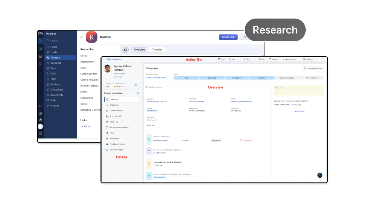
Competitor Analysis & Observations
Before designing the Customer 360 dashboard, I evaluated existing solutions used by e-commerce brands. I analyzed tools like Zoho CRM, Shopify Customer Profile, Klaviyo Profiles and Freshmarketer.
Design Goal

Unified customer view
Bring all customer data into one clear, centralized dashboard.

Quick behavior understanding
Help teams instantly grasp customer actions, patterns, and context.

Faster decision-making
Enable confident, data-backed decisions with minimal effort.
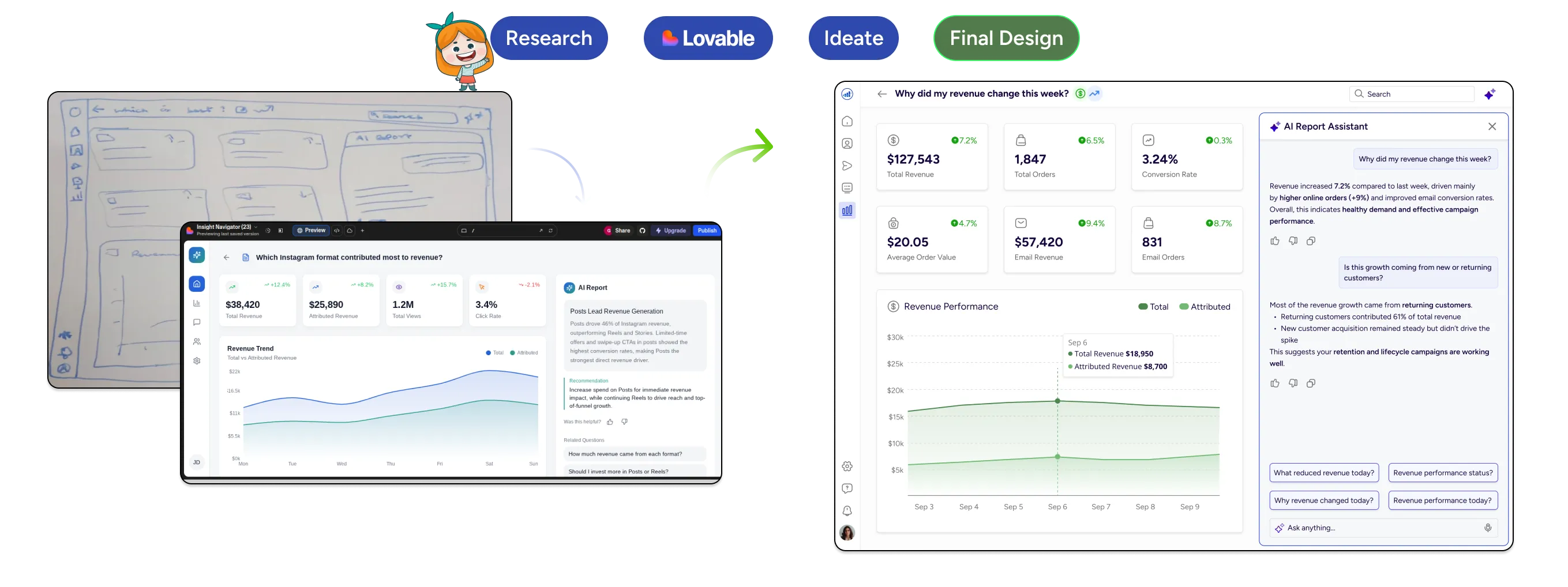
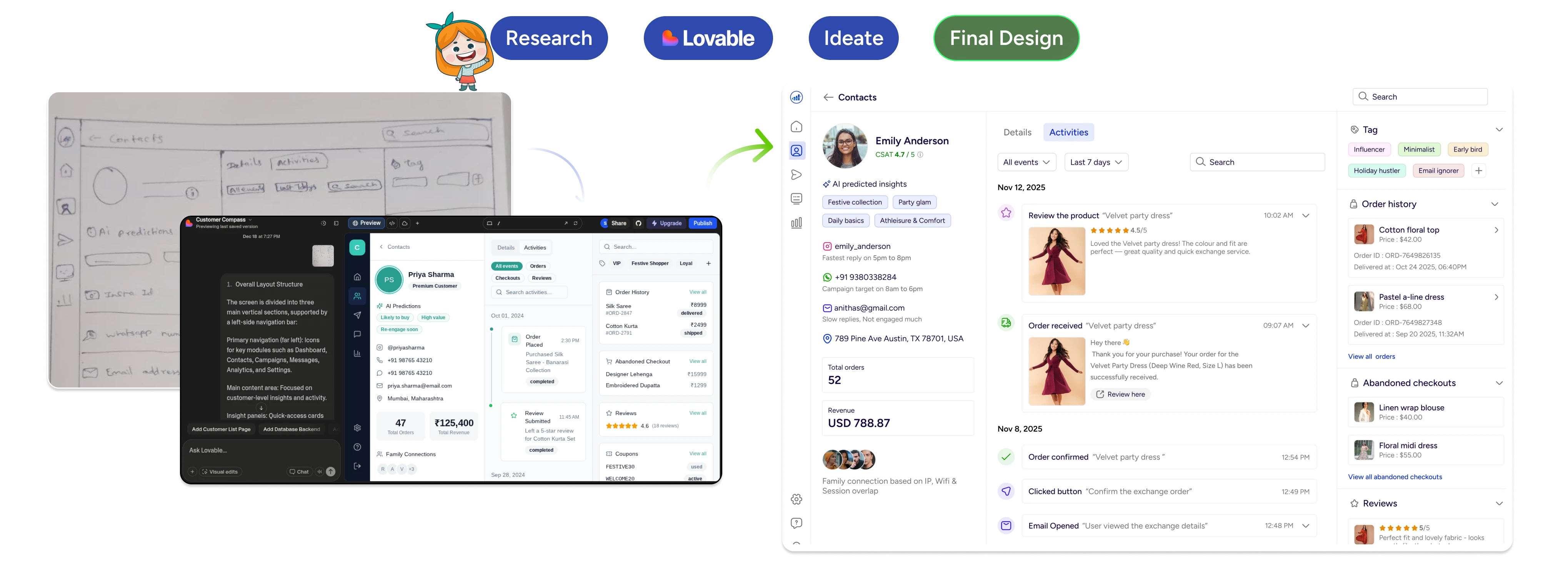
Design Process & Iteration Flow

Competitor Analysis & Data Collection
I reviewed data from existing CRM and e-commerce platforms to see how customer information is organized. This helped uncover patterns, gaps, and areas for improvement.

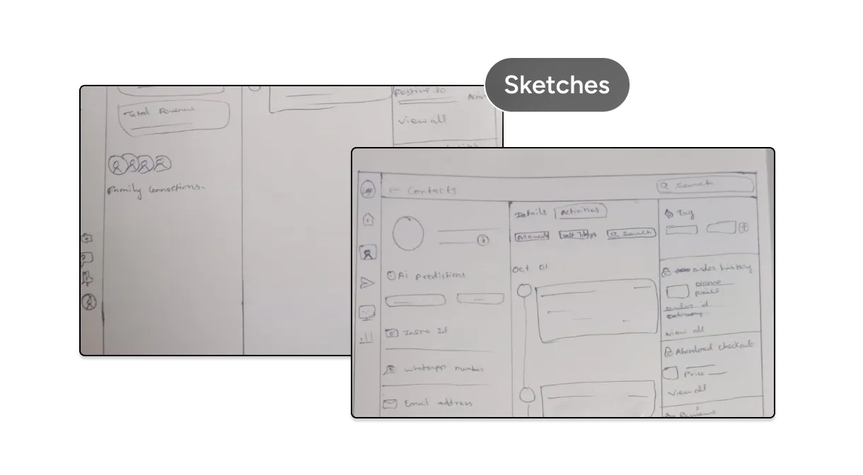
Rough Sketches
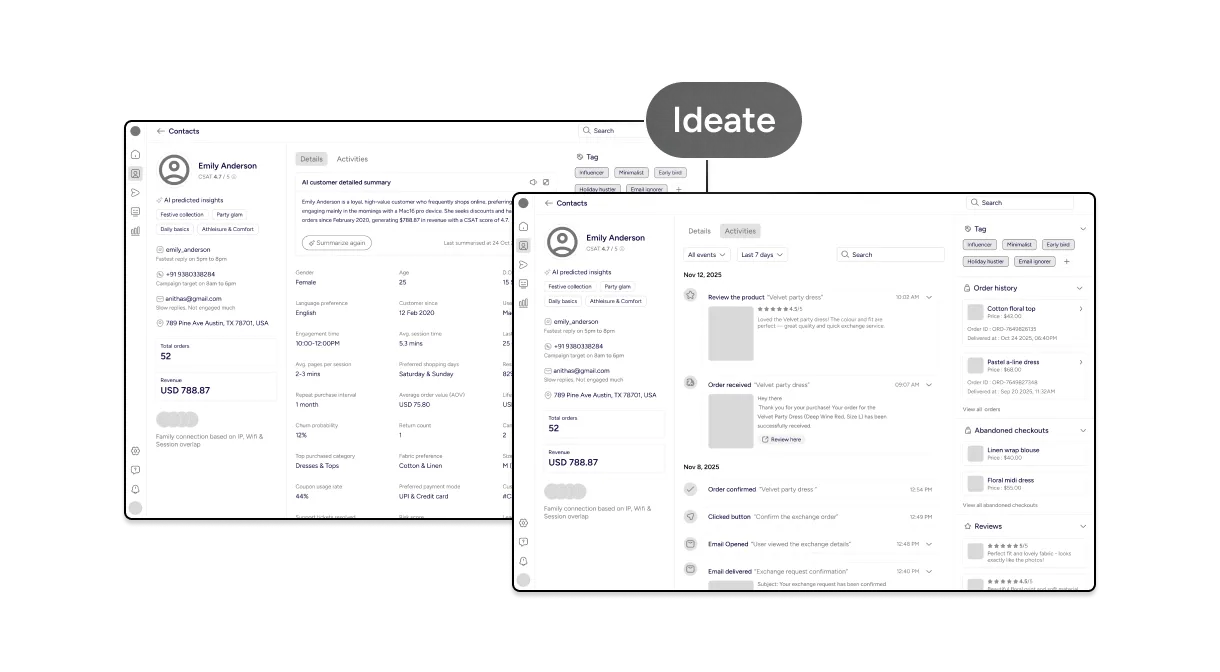
Using insights from competitor analysis, I created rough hand-drawn sketches to explore layout ideas and information hierarchy. At this stage, the focus was on what information matters most, not visual polish.

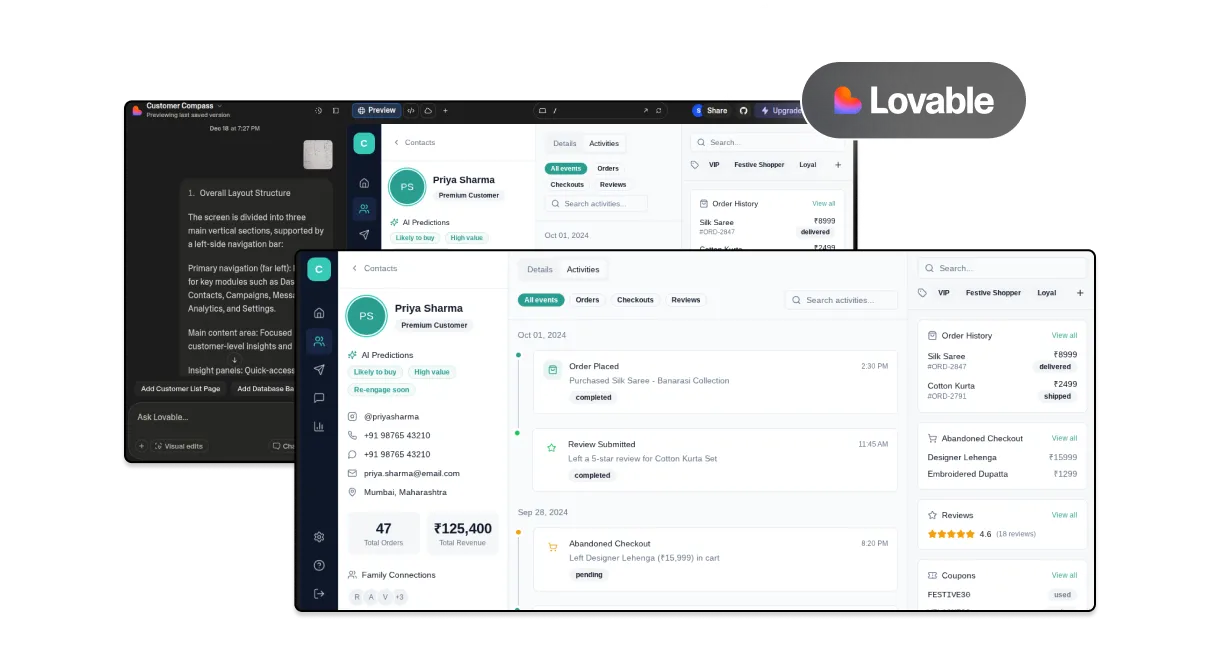
Early Prototype Using Lovable
I used Lovable to quickly turn rough sketches into a basic prototype. This helped test layout and content early before moving to detailed wireframes. Lovable was used as an iteration tool, not a final design generator.

Wireframing & UX Refinement
After validating the structure, I moved into wireframes to refine content hierarchy, component structure, spacing, and overall clarity across the dashboard.

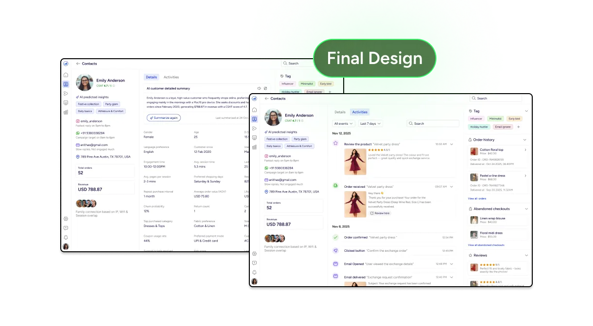
High-Fidelity Design
The refined wireframes were translated into high-fidelity designs using a lightweight design system. Visual decisions were made to support scannability, readability, and consistency in a data-heavy interface.

AI-Assisted
AI tools were used to accelerate execution, not replace design thinking
It was used to turn sketches into early prototypes
It supported research, concept clarification, and UX validation
It helped explore layout variations and interaction ideas
All final decisions were driven by UX judgment and product thinking.
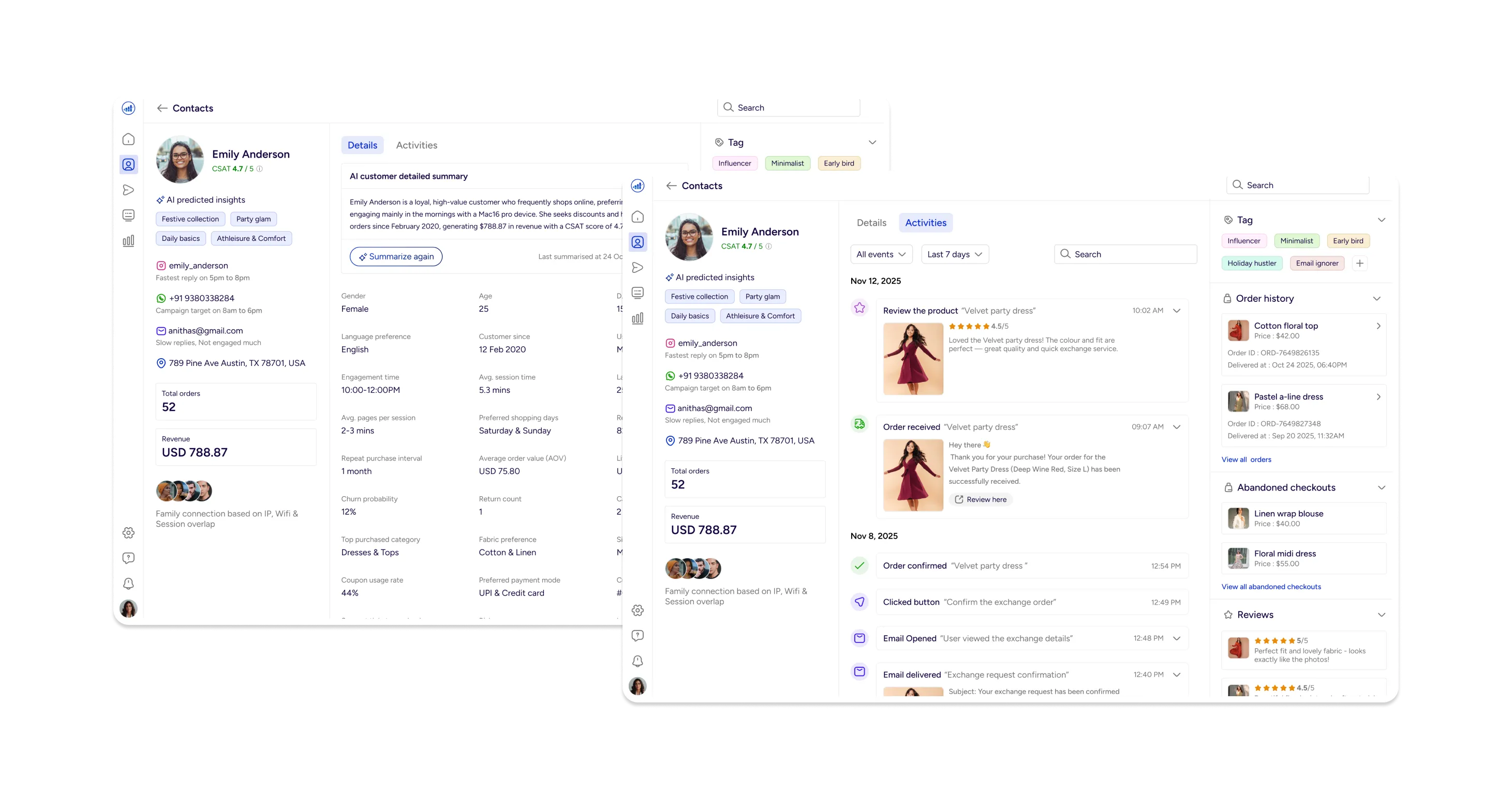
Final Design Solution
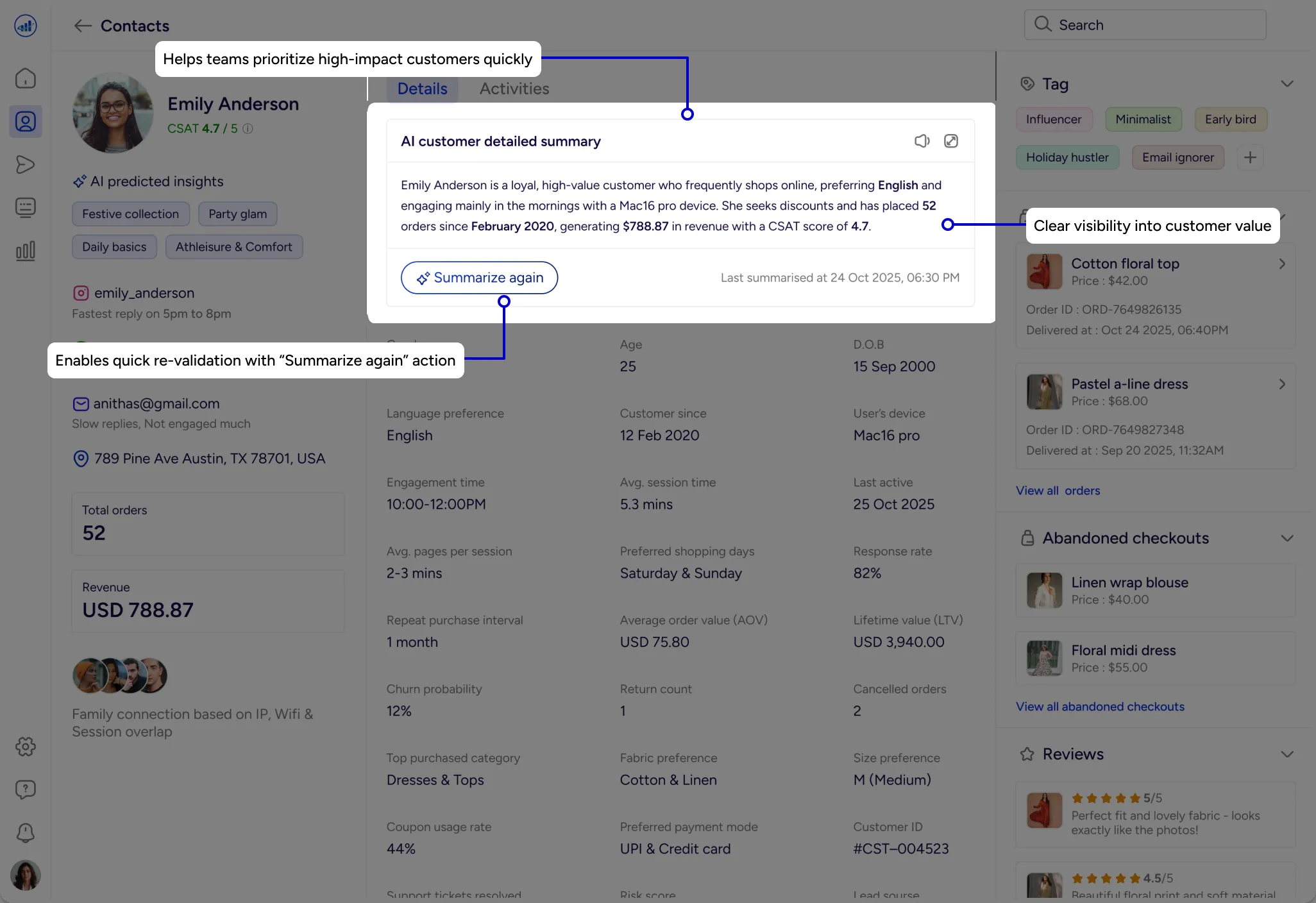
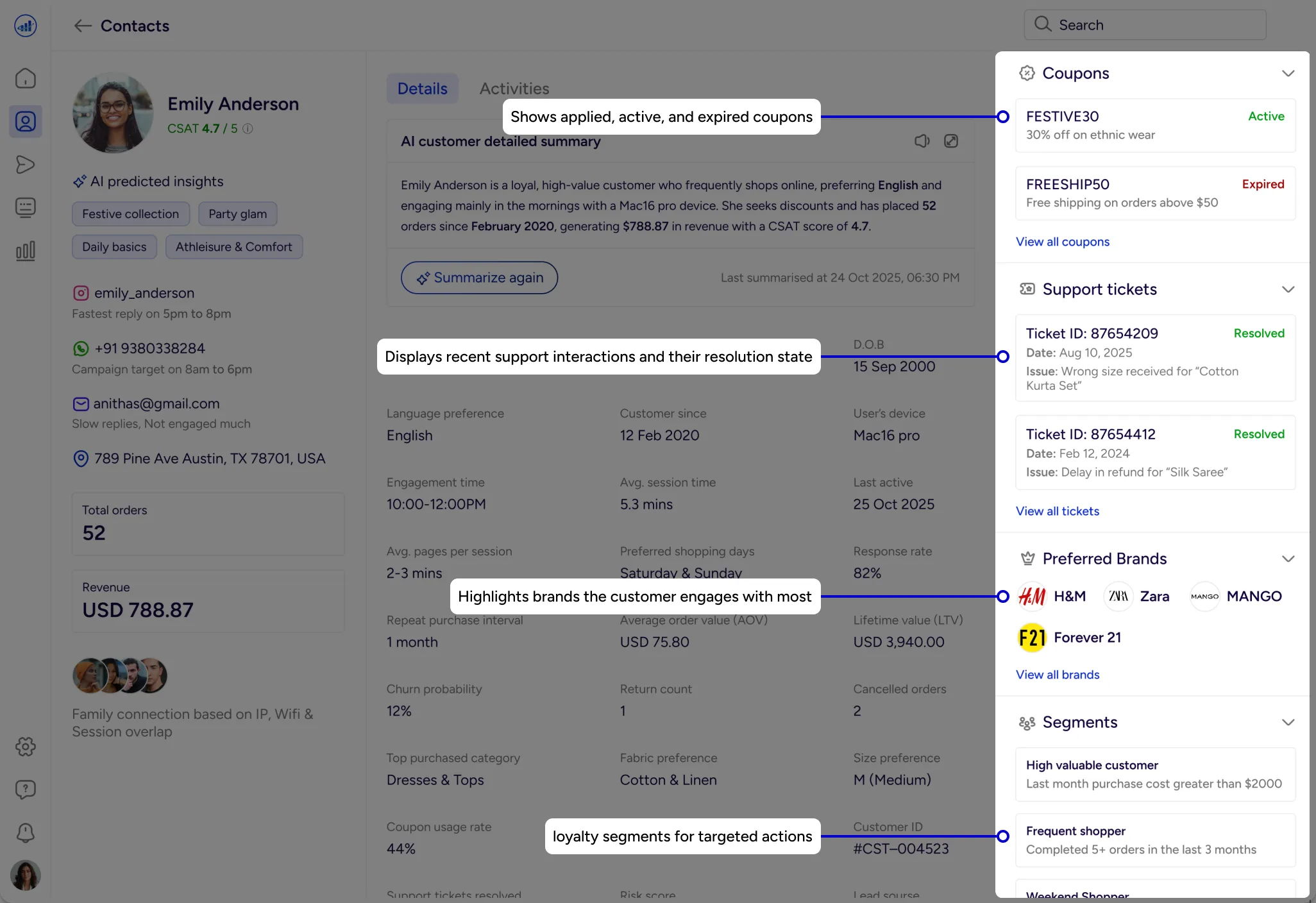
Customer Identity & Overview
Provides an instant snapshot of profile details, customer value, and overall importance.
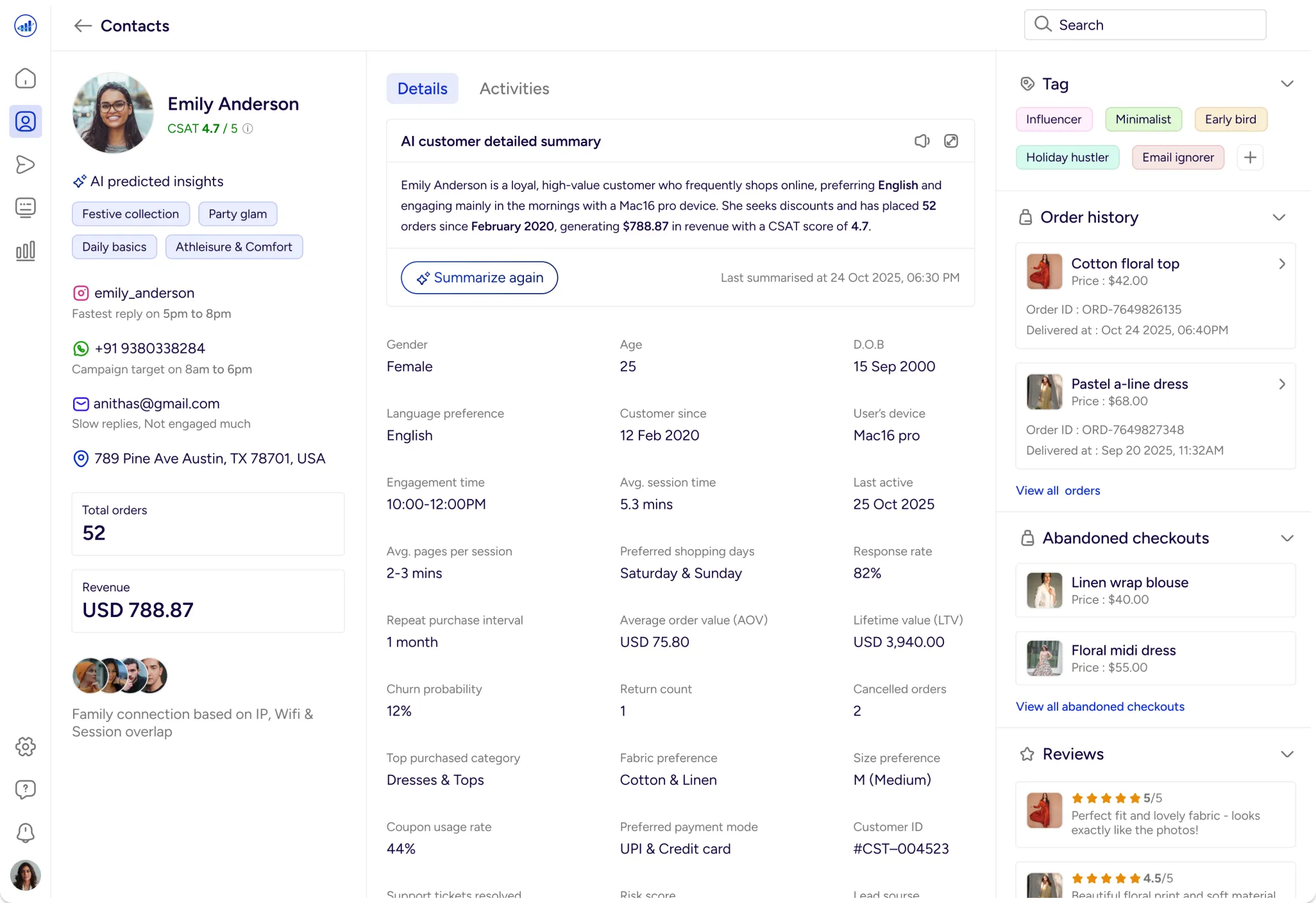
Customer value summary
Provides a unified snapshot of customer identity, value and AI-driven insights in a single view to enable faster, more confident decisions.
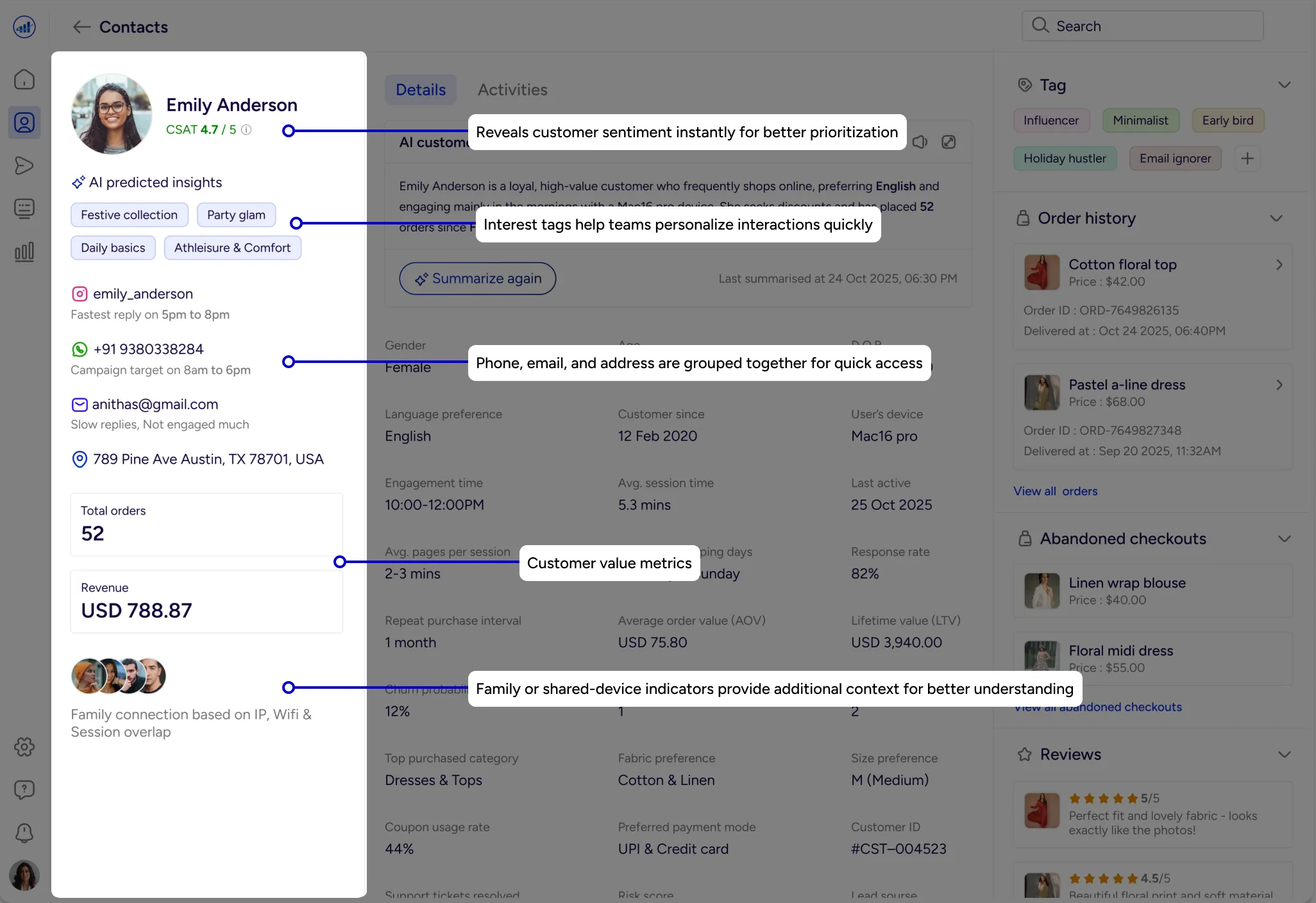
AI-Generated Customer Summary
Highlights key behaviors from recent activity, with supporting data available for quick validation .
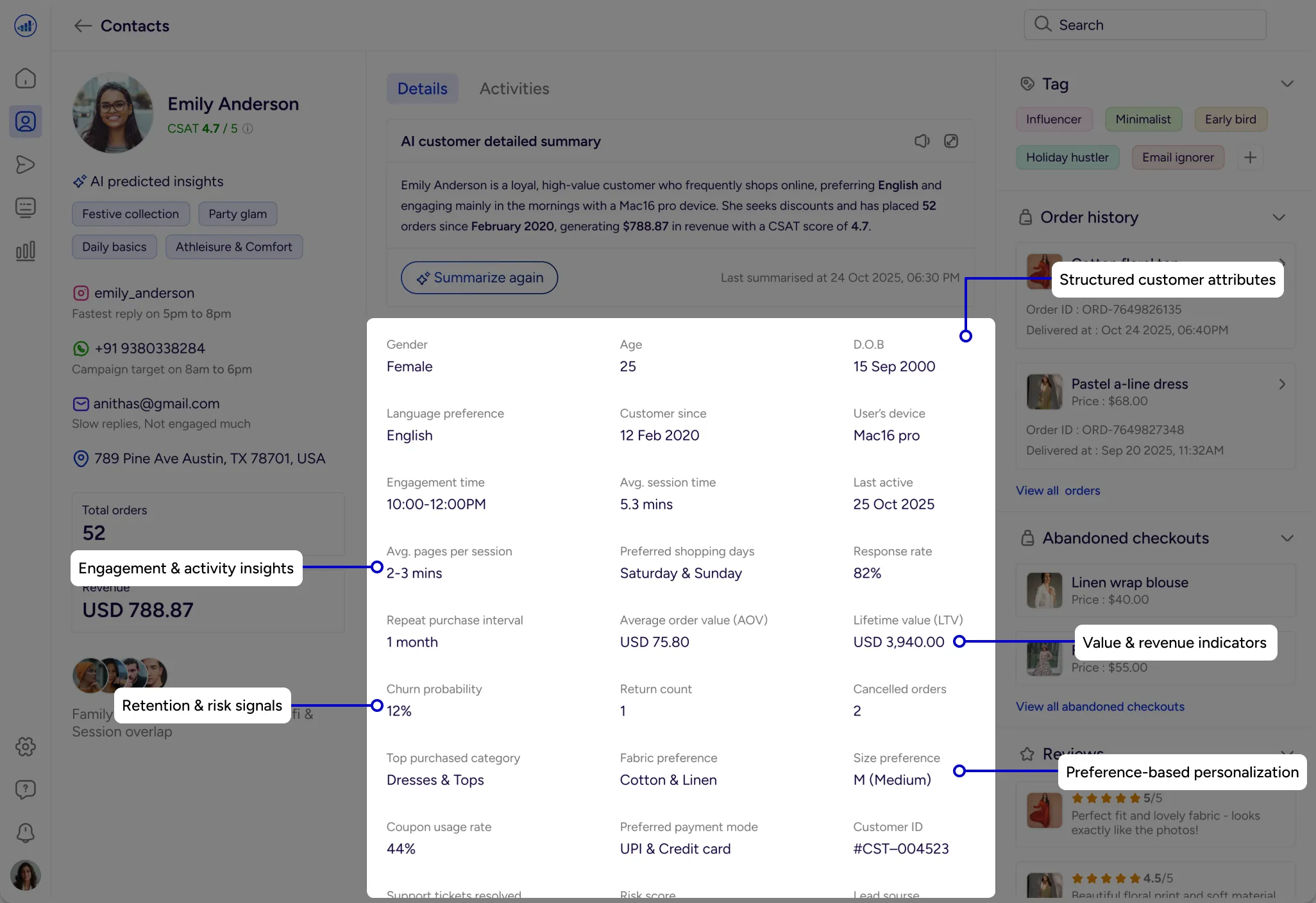
Customer Metrics
AOV, LTV and returns are displayed in a scannable format for quick comparison.
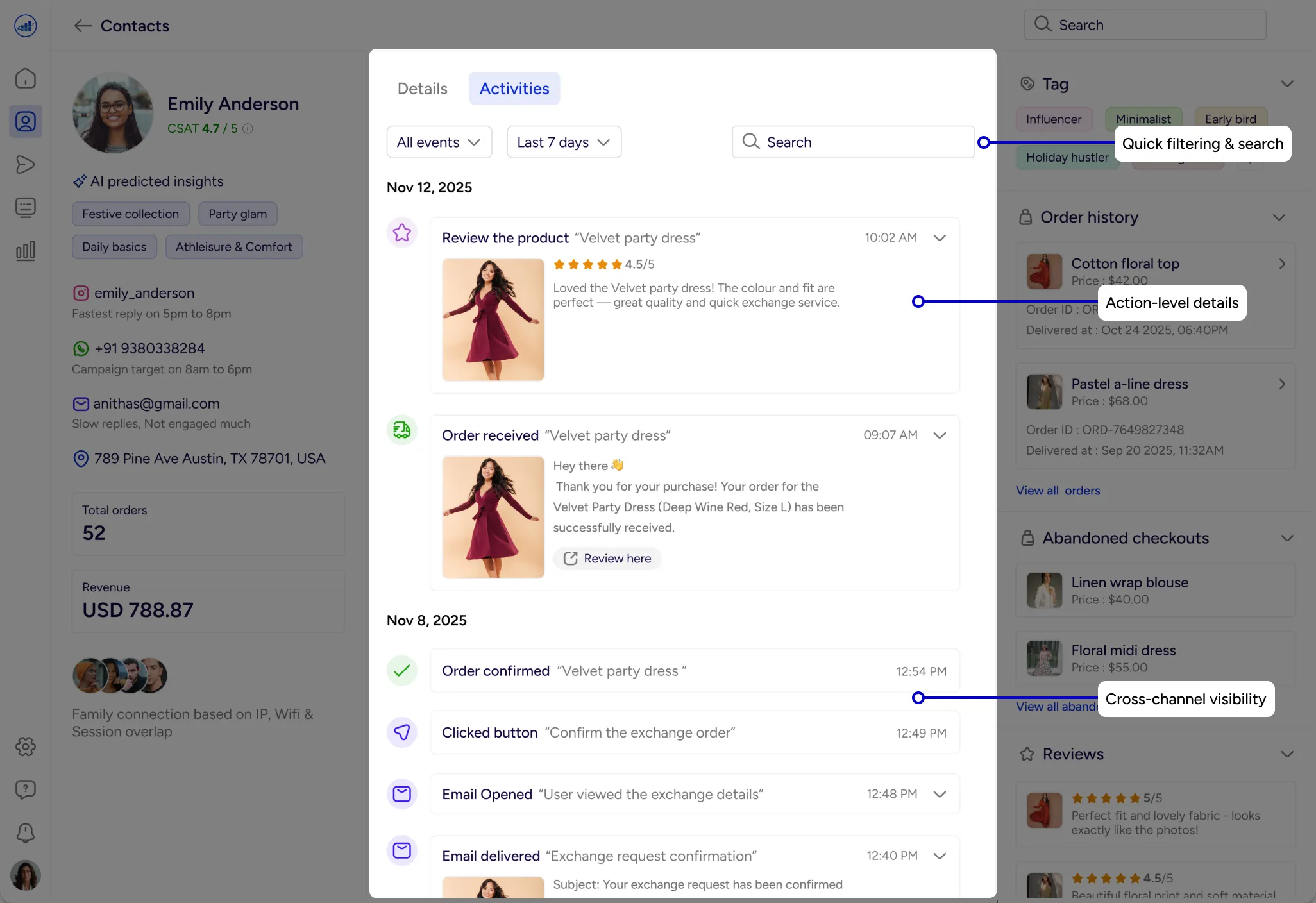
Unified Activity Timeline
A chronological view of cross-channel interactions showing the complete customer journey at a glance.
Actionable Side Panels
Quick access to orders, tickets, reviews, and segments without leaving the dashboard.
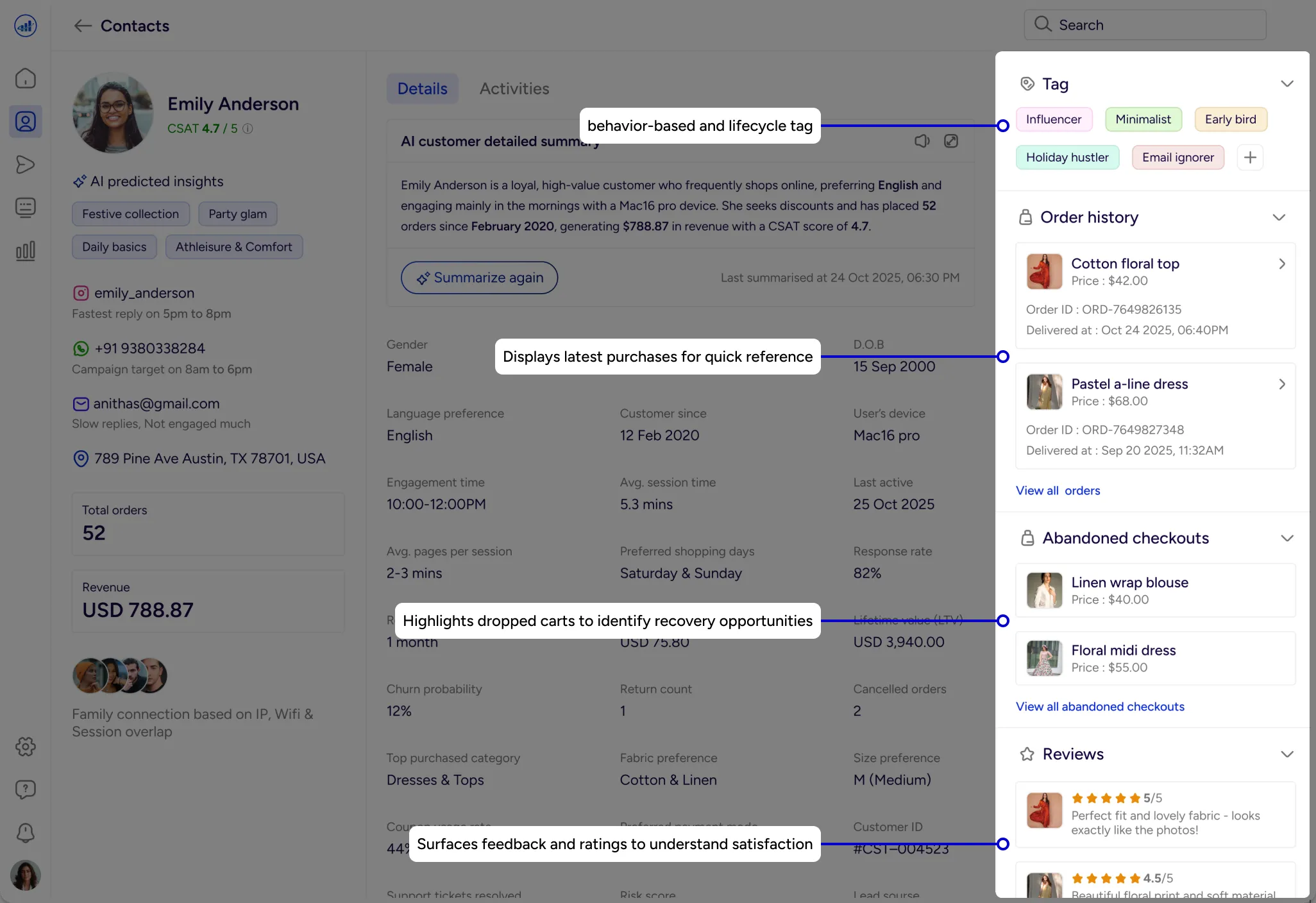
Actionable Side Panels
Quick access to orders, tickets, reviews, and segments without leaving the dashboard.
Expected Business Impact (Assumed)
Faster understanding of customer context
Better personalization opportunities
Reduced time spent switching between tools
Improved support efficiency
Early visibility into loyalty and churn risks

Key Learnings

Strong information hierarchy is essential when designing complex systems
Clarity matters more than visual decoration in data-heavy UX
AI tools accelerate workflows but do not replace design judgment
Storytelling helps teams make sense of customer data
A structured design system reduces long-term complexity

Conclusion
What started as scattered customer data became a clear decision layer.
Through thoughtful UX, structure, and AI support, the dashboard turns complexity into confident, human-centered action.
The goal was to help businesses understand customers as people - not just data points.
I really appreciate you taking the time to check out my case study. I’d be grateful to hear your feedback.