From Old Filters to AI Answers Reimagining Business Analytics
A UX case study on building a conversational analytics experience for faster decision-making.
How I started This?
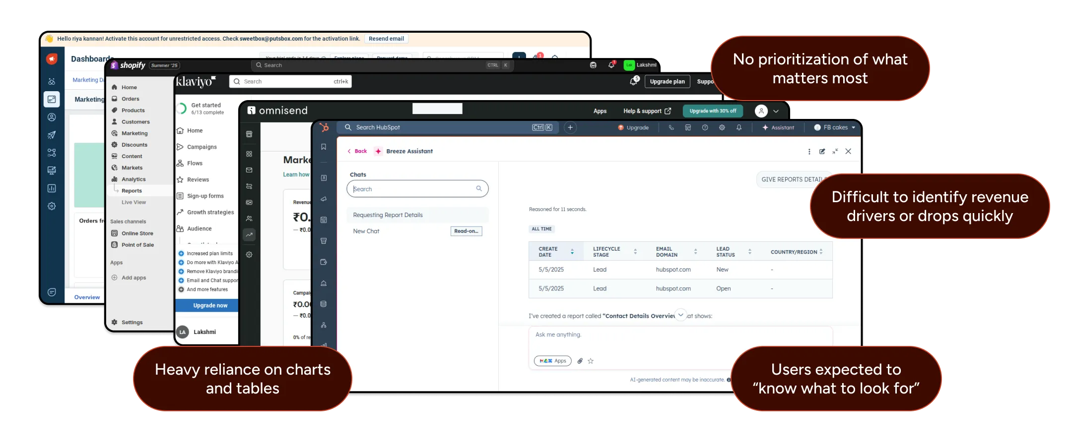
Sales data was spread across multiple platforms — online stores (Shopify, WooCommerce, BigCommerce), offline POS systems, and marketing channels like WhatsApp, Email, and Instagram. Teams relied heavily on dashboards and reports to understand business performance.
E‑commerce teams rely heavily on reports to understand performance revenue, orders, channels, products, and customer behavior.
However, while data is available, insights are not.
This project explores how AI can simplify analytics by letting users ask questions and instantly receive personalized insights. The goal was to design a fast, intuitive experience that helps businesses move from data to decisions in seconds.
Thinking louder!!
While analyzing existing analytics and reporting tools, I noticed a recurring pattern the traditionally, business users need to:

Select filters
Configure reports
Apply date ranges
This process takes time and requires effort, making it hard to get quick answers.
I added this steps but also mainly with this product,the experience changes to:

Users simply ask a question
AI instantly delivers answers and insights
No manual setup or report building needed
This shift moves users away from complicated filtering and report-building toward instant, direct answers powered by AI.
This is where my design journey began!
Primary User Persona

Role
Head of marketing / E-commerce
Goal
-
Quickly understand performance changes
-
Identify revenue drivers and risks
-
Take confident action during reviews
Key Responsibilities
Handle escalations, support agents, and ensure fast, personalized resolutions.
Pain Points
-
Needs fast answers, not complex analysis
-
Reports take time to interpret during reviews
-
Difficult to identify revenue drivers or drops quickly
Needs
-
Clear summaries
-
Guided insights
-
Contextual explanations
Key Takeaways
AI insight cards and a question‑based interaction model help teams quickly prioritize and act on revenue‑impacting metrics with clarity and confidence.

Assumptions & Research Basis
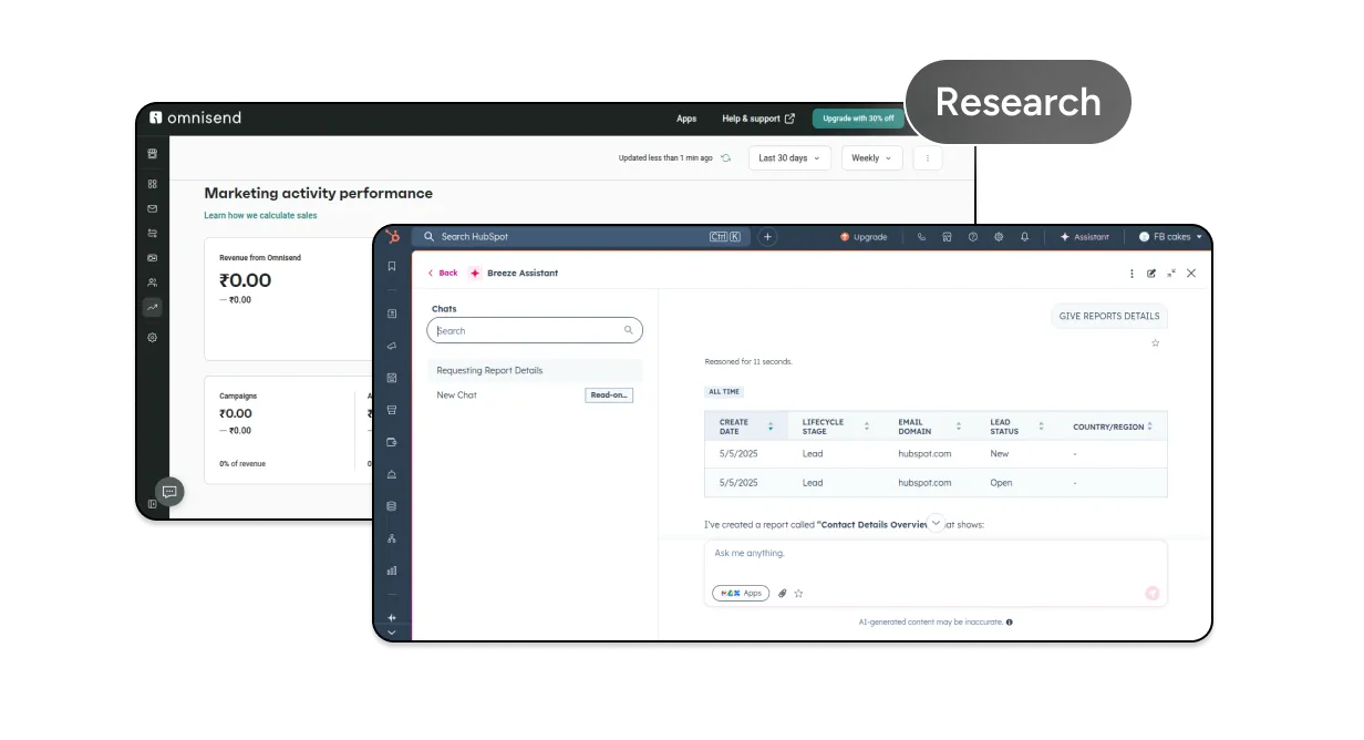
This is a concept project, with assumptions informed by reviewing analytics tools
(Zoho CRM, Shopify, Hubspot, Klaviyo and Freshmarketer), studying product demos and documentation, and analyzing SaaS reviews and product feedback.
The focus was on UX clarity and insight delivery.
Competitor Analysis & Observations
Before designing the Reports, I evaluated existing solutions used by e-commerce brands. I analyzed tools like Zoho CRM, Shopify, Hubspot, Klaviyo and Freshmarketer.
Design Process & Iteration Flow

Competitor Analysis & Data Collection
I analyzed common revenue, order, and channel metrics to understand what users track most often, where confusion occurs, and which questions typically arise after viewing reports.

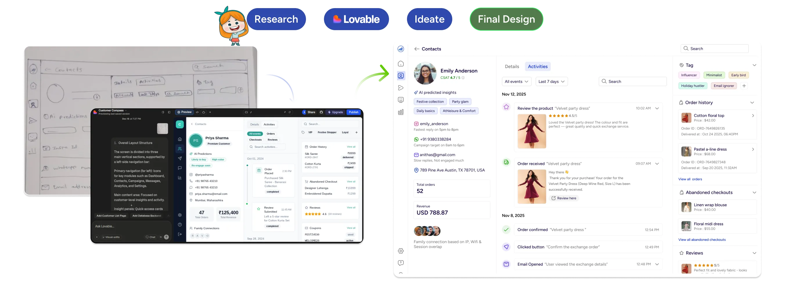
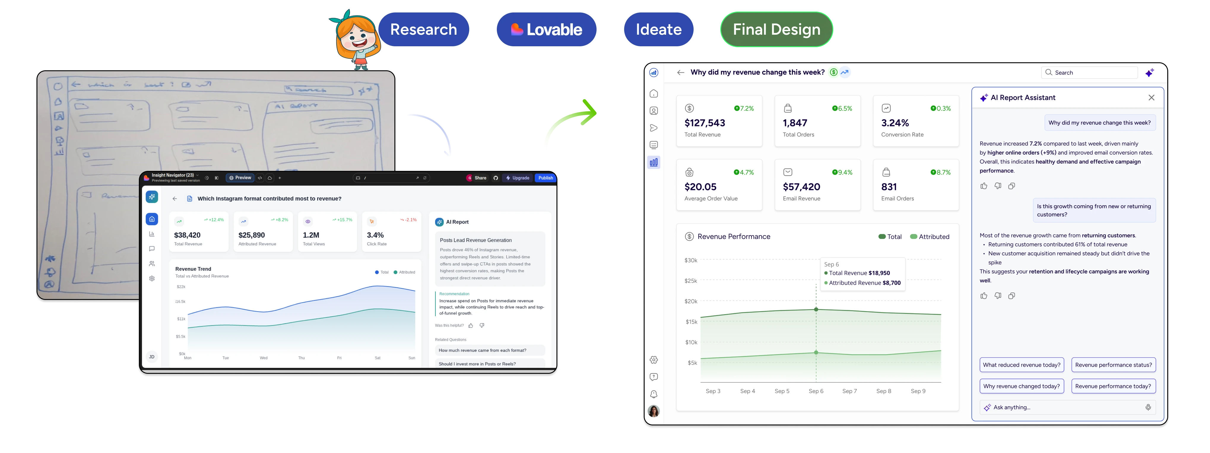
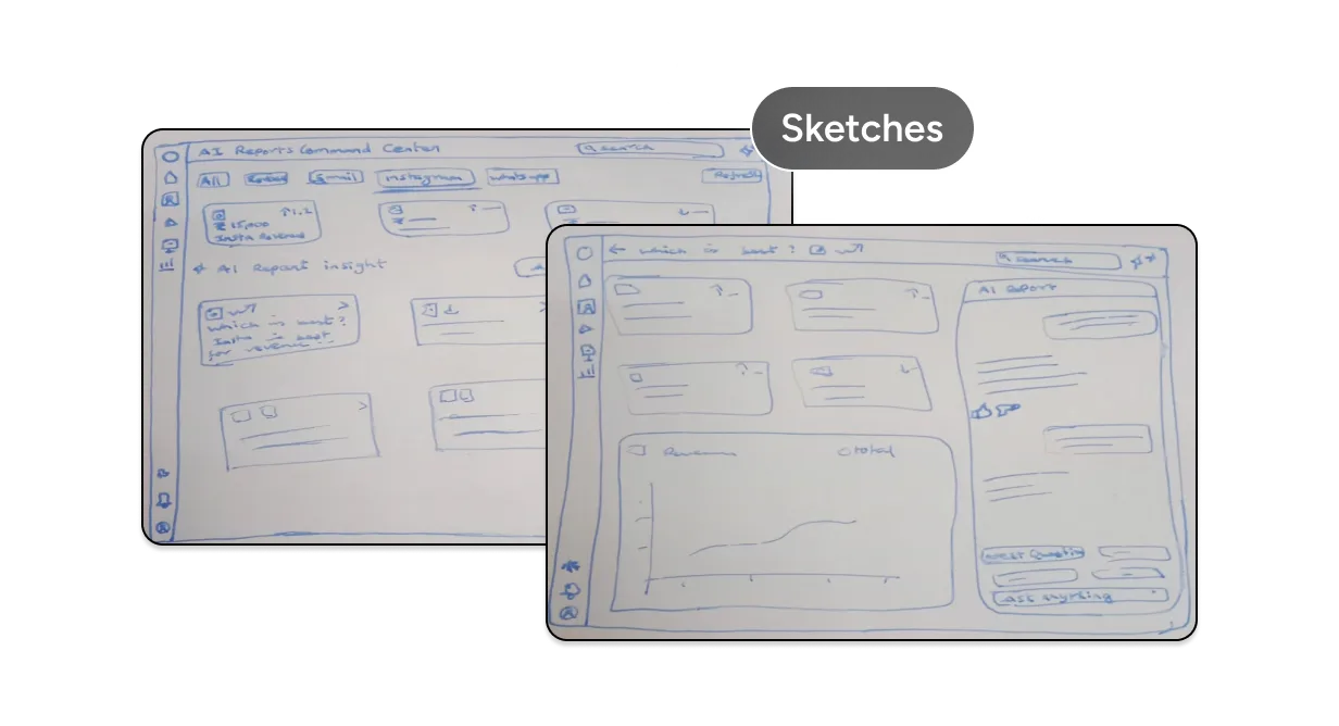
Rough Sketches
Using insights from competitor analysis and common report workflows, I created rough hand‑drawn sketches to explore layout ideas, information hierarchy, and AI‑driven insight placement. At this stage, the focus was on identifying what information and AI insights matter most to users not visual polish.

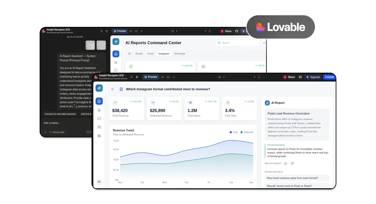
Early Prototype Using Lovable
I used Lovable to quickly turn rough sketches into a basic prototype. This helped test layout and content early before moving to detailed wireframes. Lovable was used as an iteration tool, not a final design generator.

Wireframing & UX Refinement
After validating the structure, I moved into wireframes to refine content hierarchy, component structure, spacing, and overall clarity across the dashboard.

High-Fidelity Design
The refined wireframes were translated into high-fidelity designs using a lightweight design system. Visual decisions were made to support scannability, readability, and consistency in a data-heavy interface.

AI-Assisted Workflow
AI tools were used to accelerate execution, not replace design thinking
It was used to turn sketches into early prototypes
It supported research, concept clarification, and UX validation
It helped explore layout variations and interaction ideas
All final decisions were driven by UX judgment and product thinking.
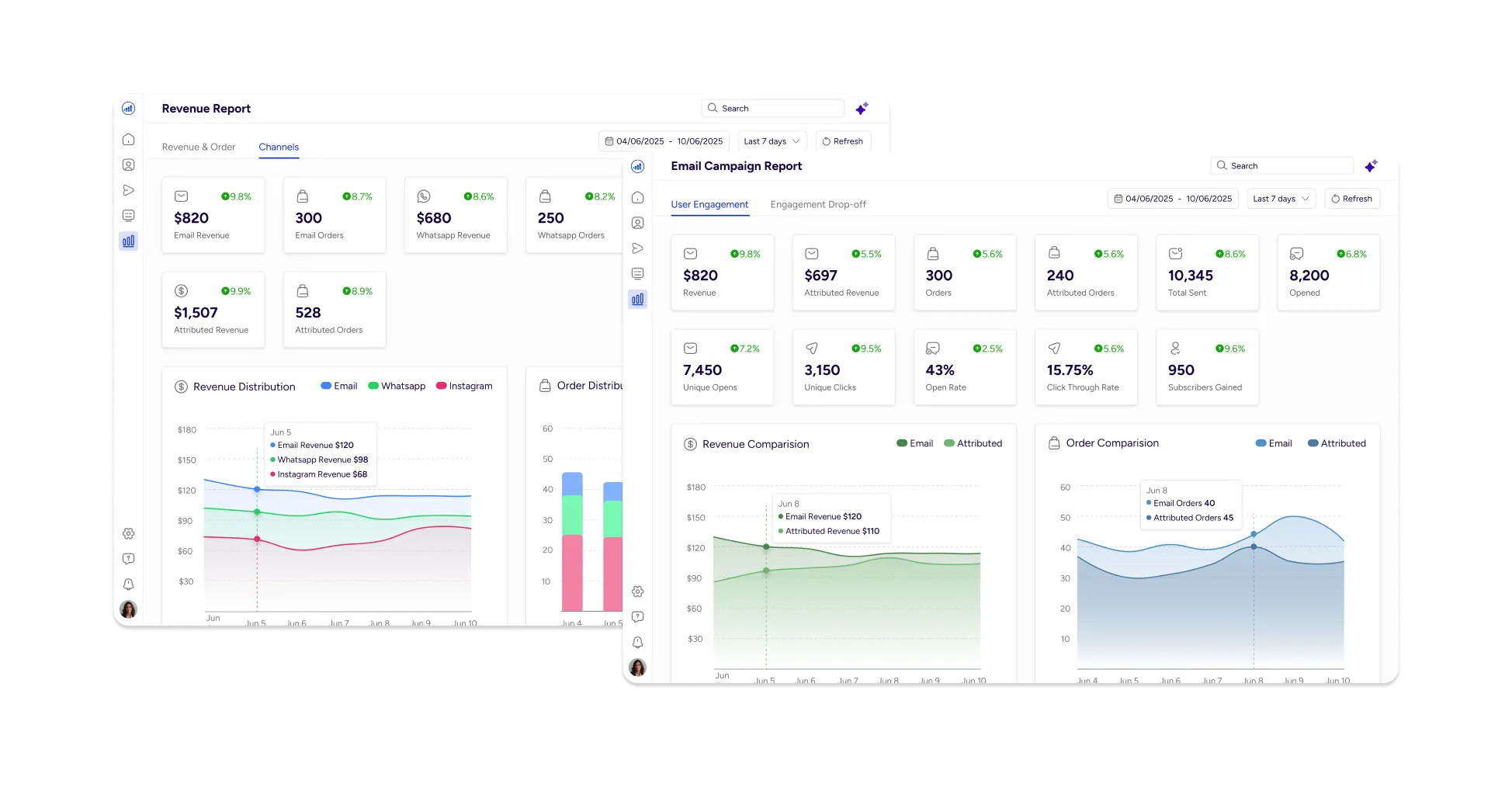
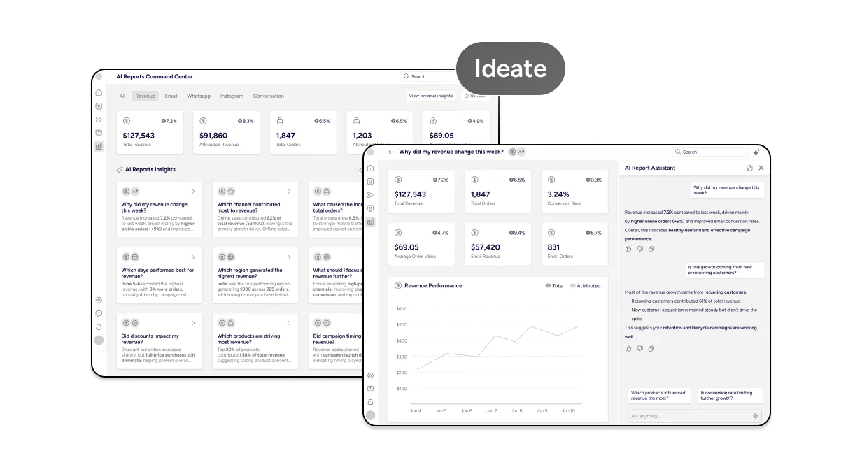
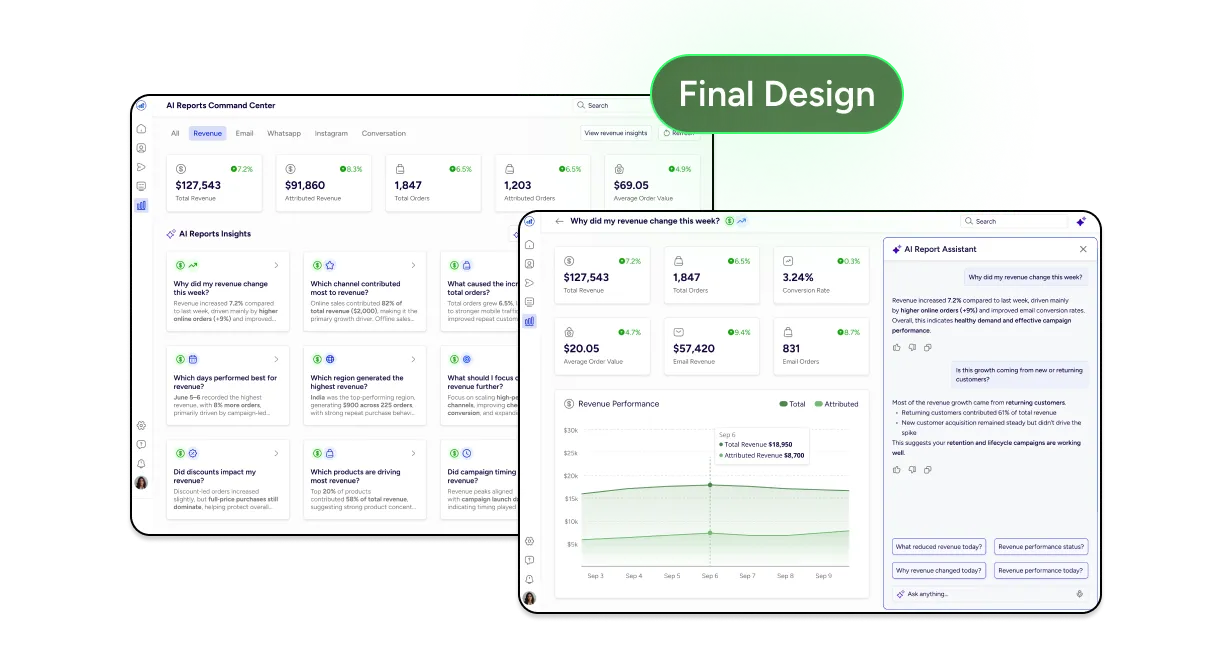
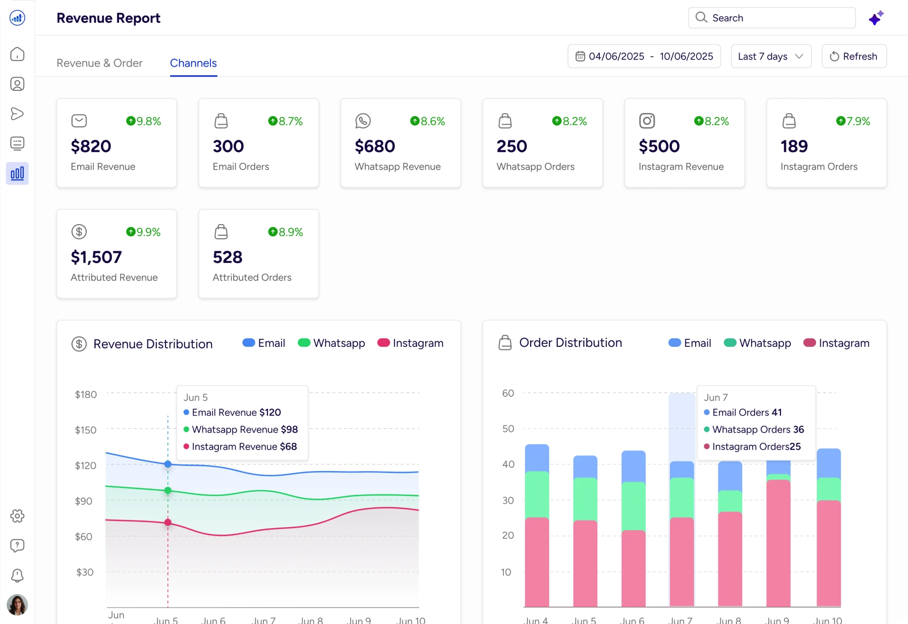
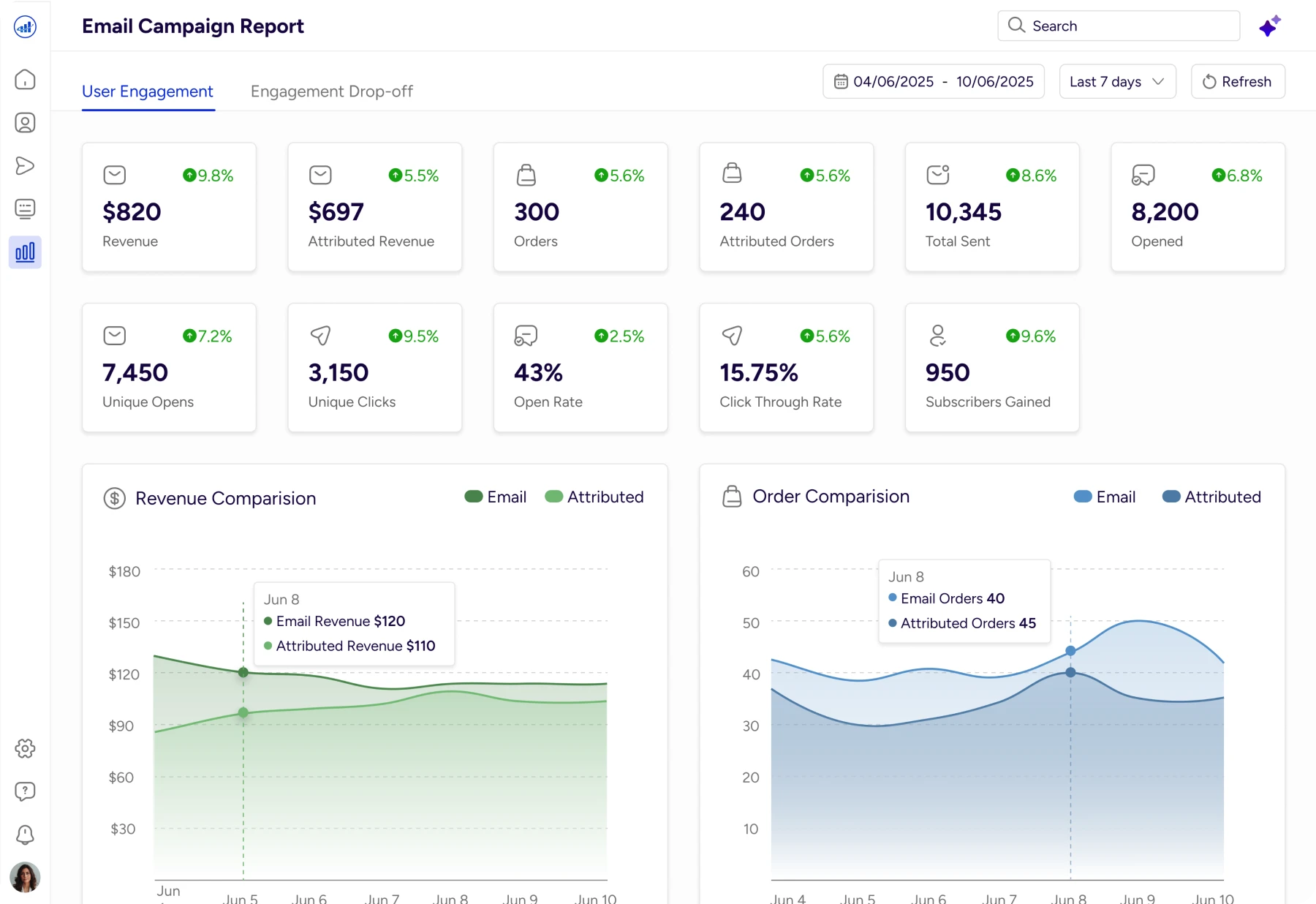
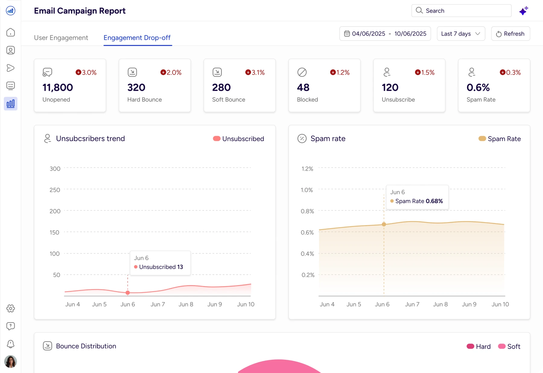
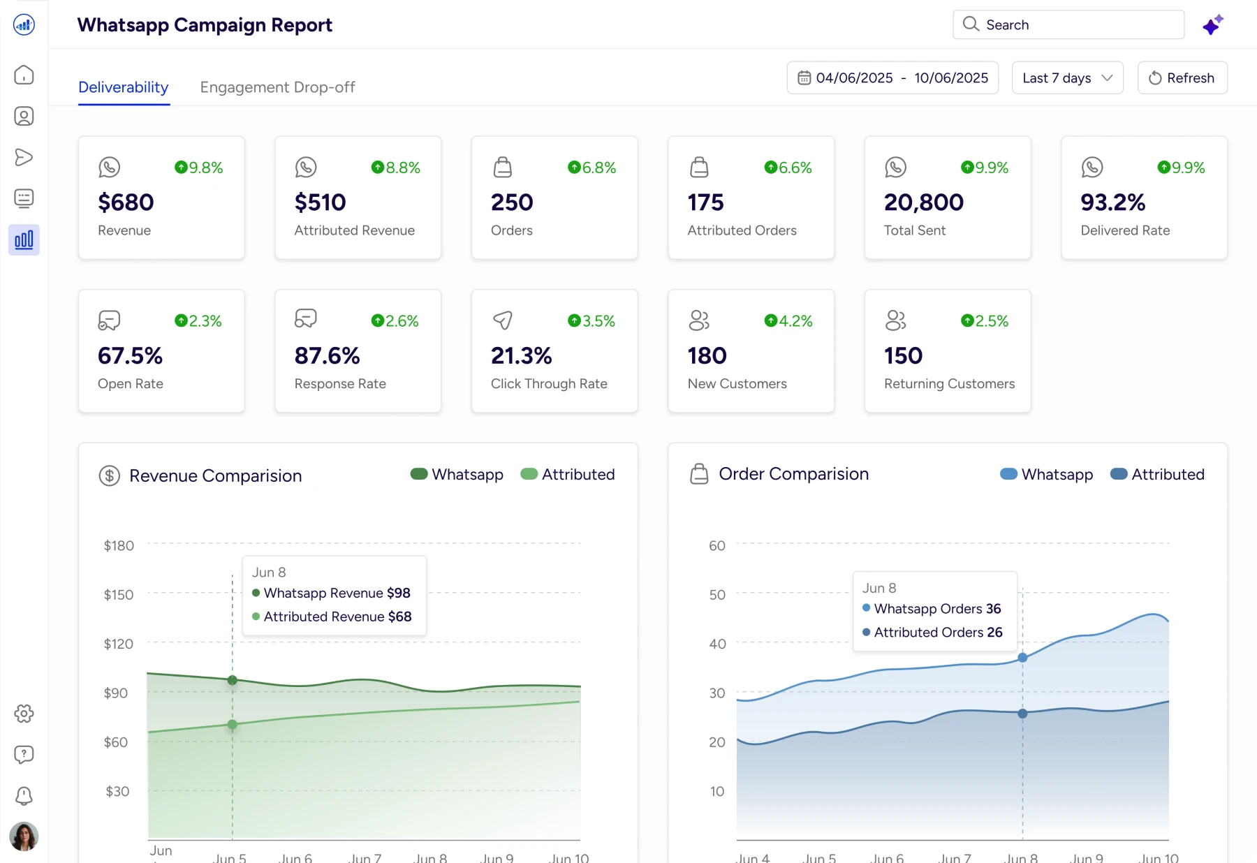
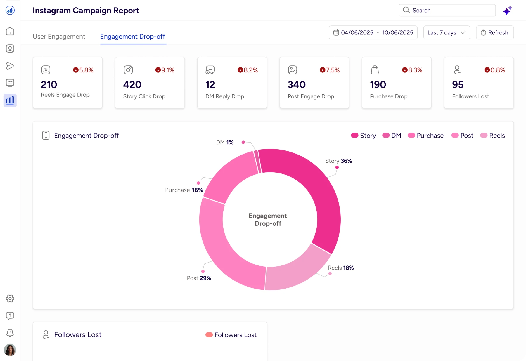
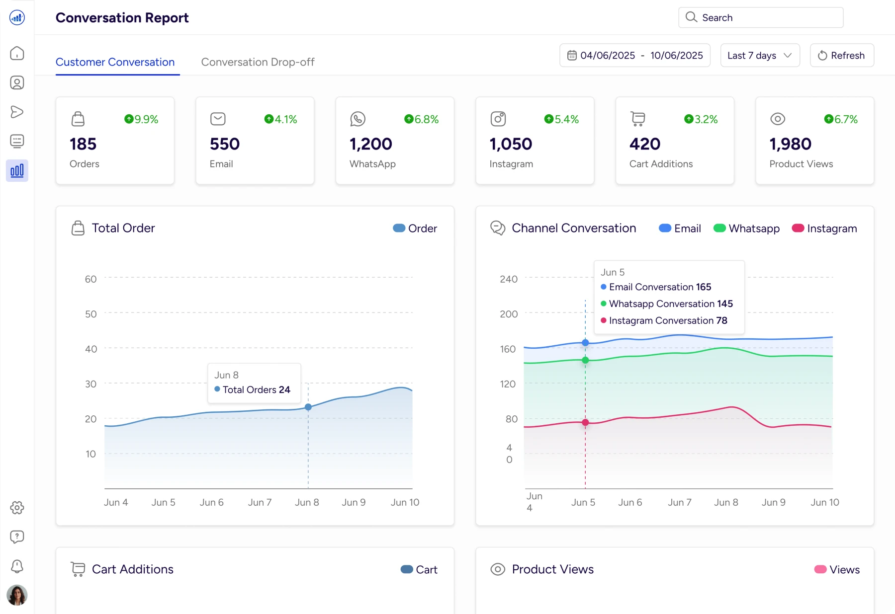
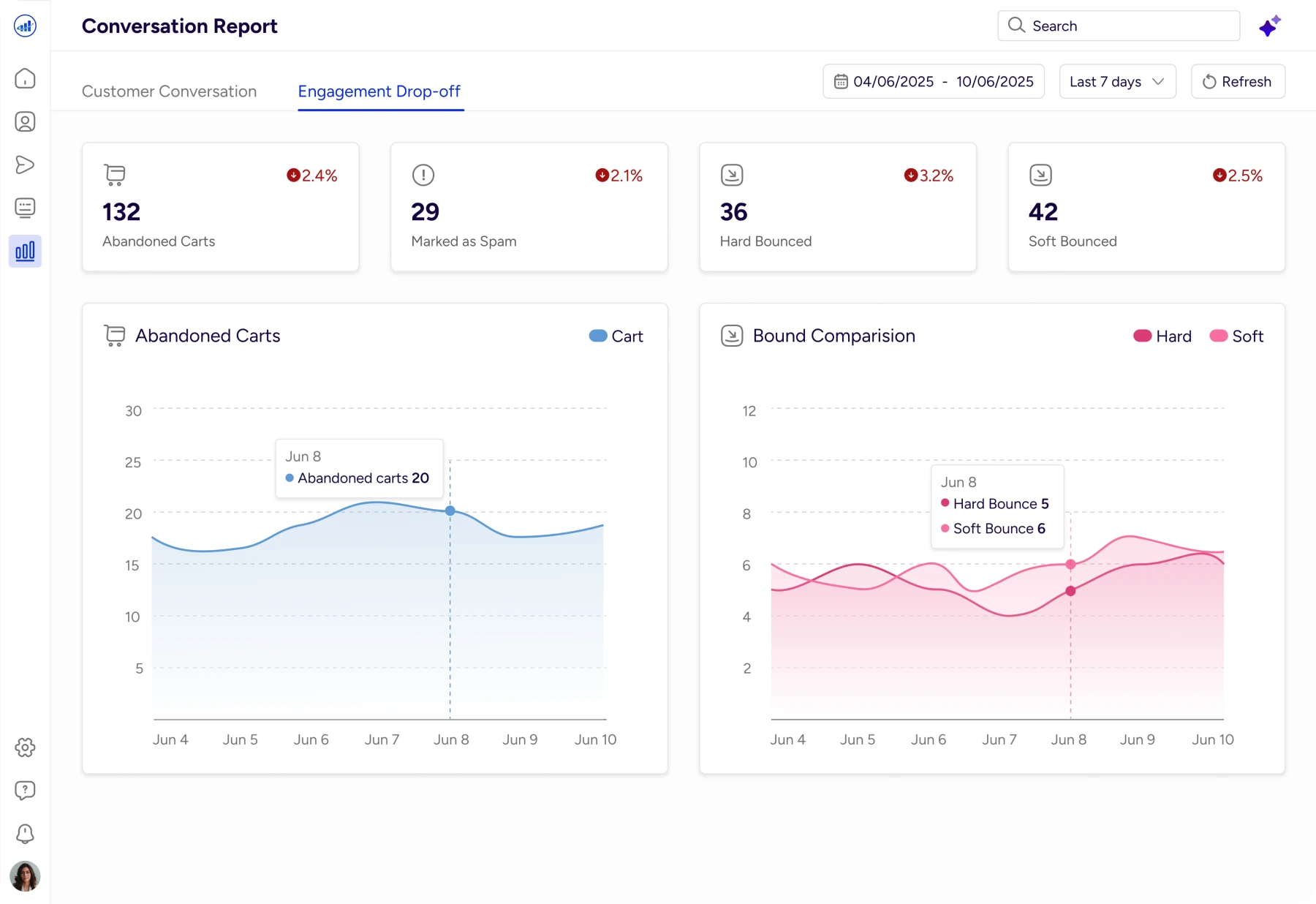
Final Design Solution
AI Reports Command Center
Sets context immediately so users know they’re in an AI-powered insights view.
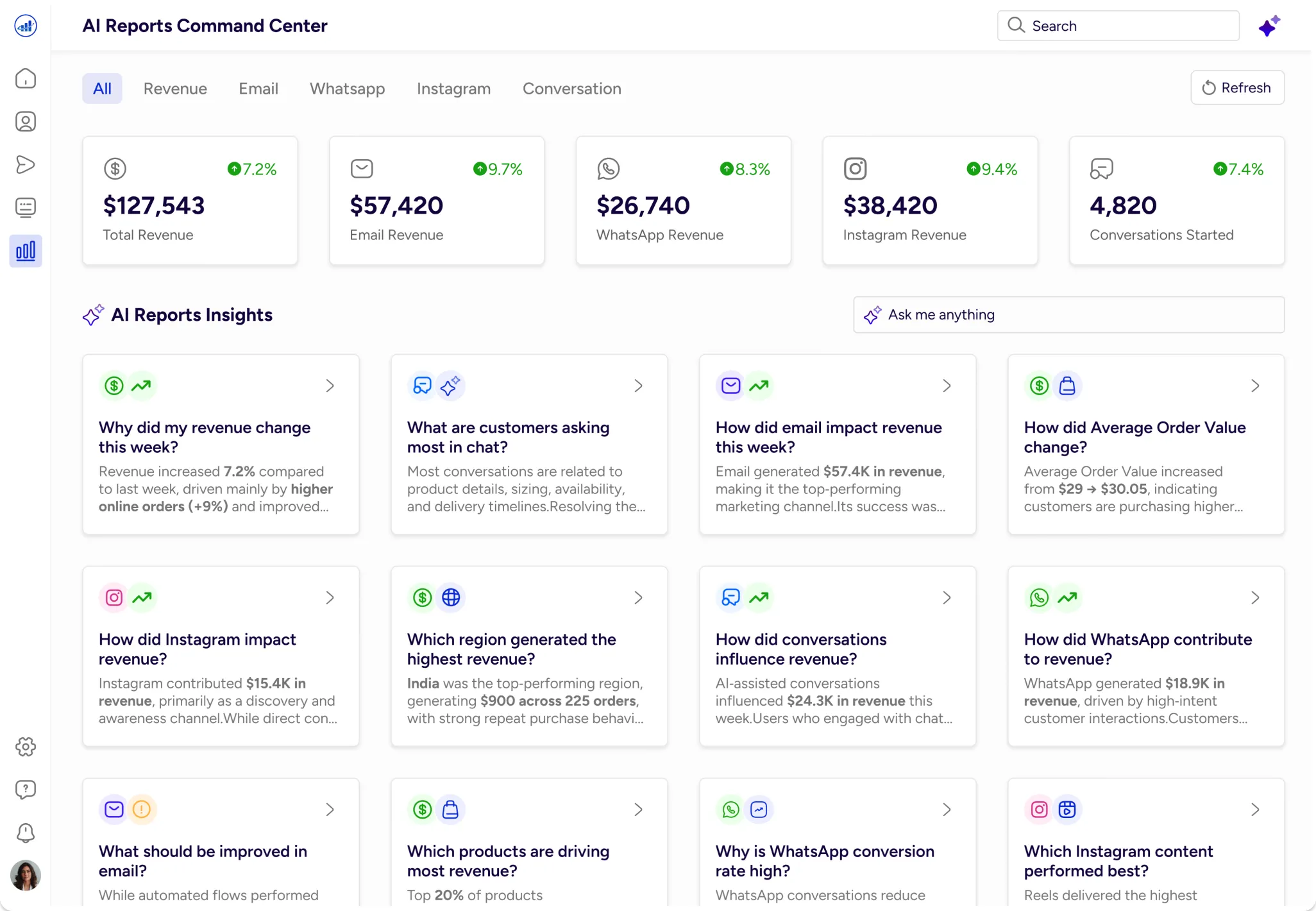
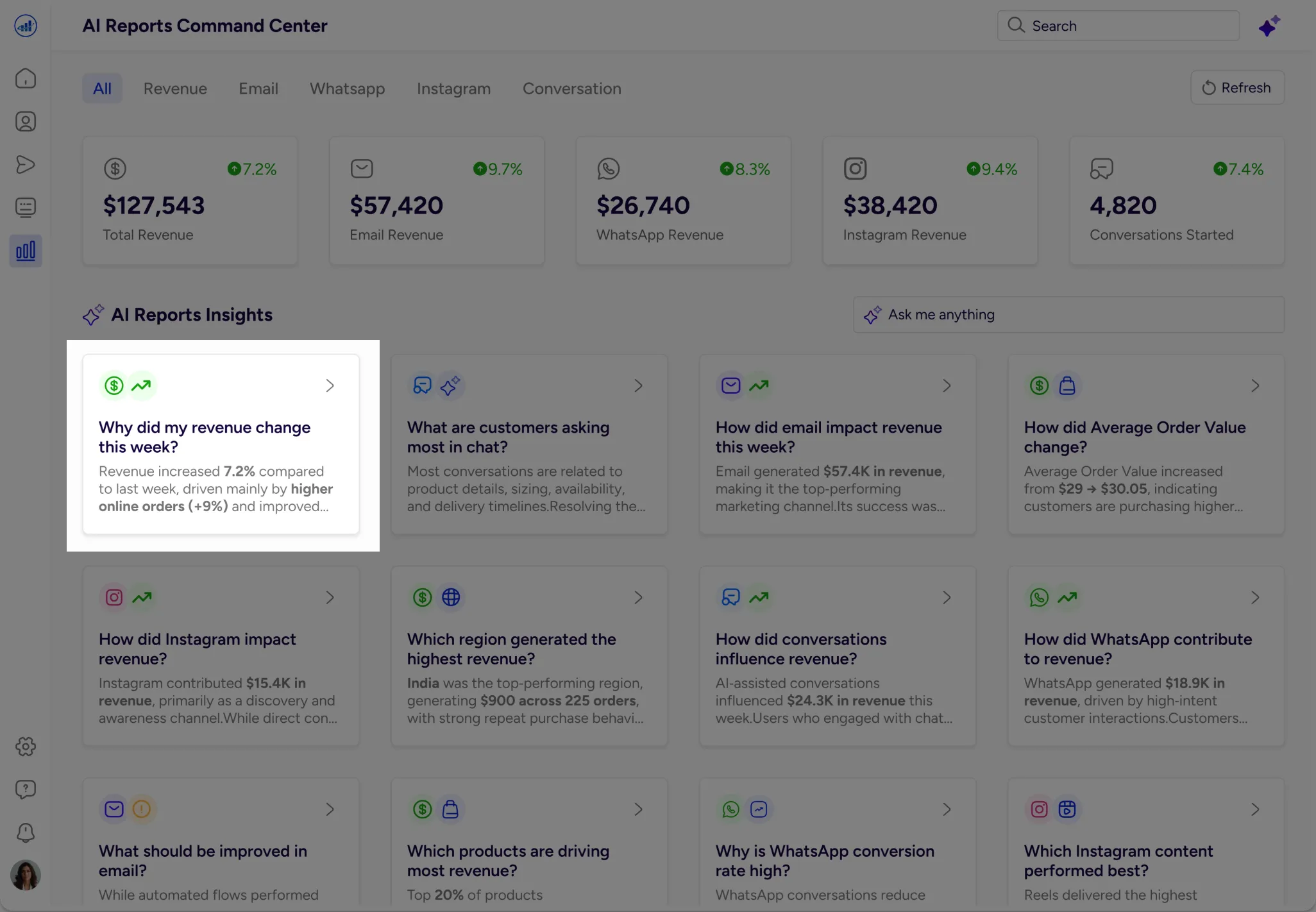
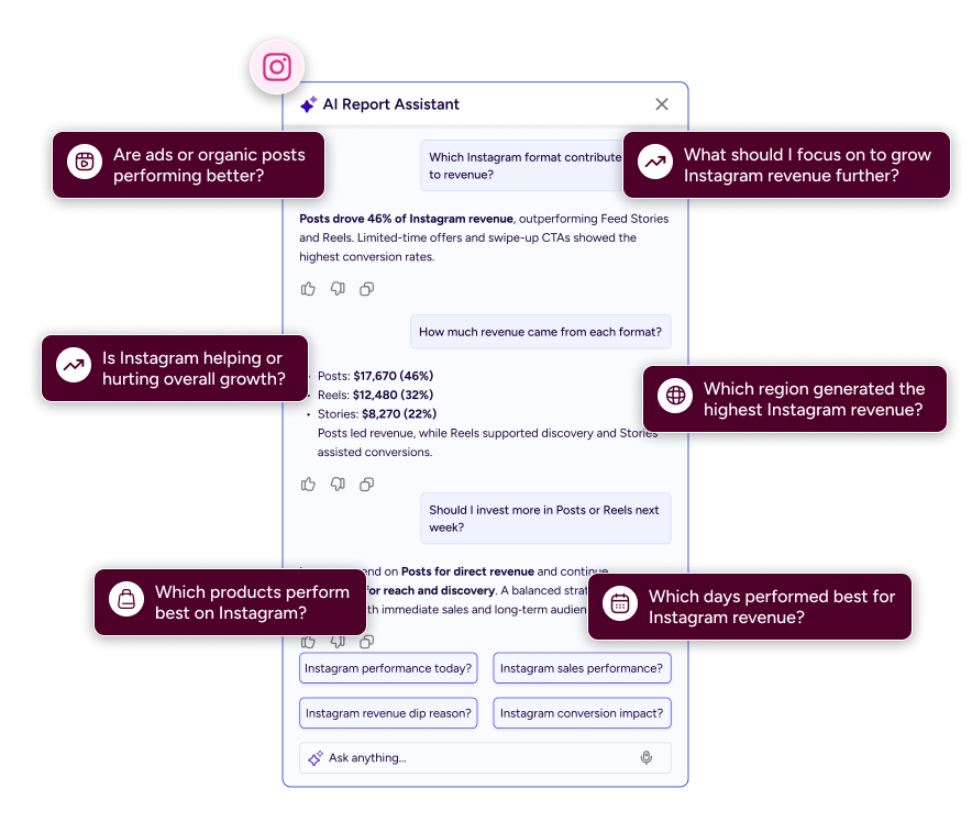
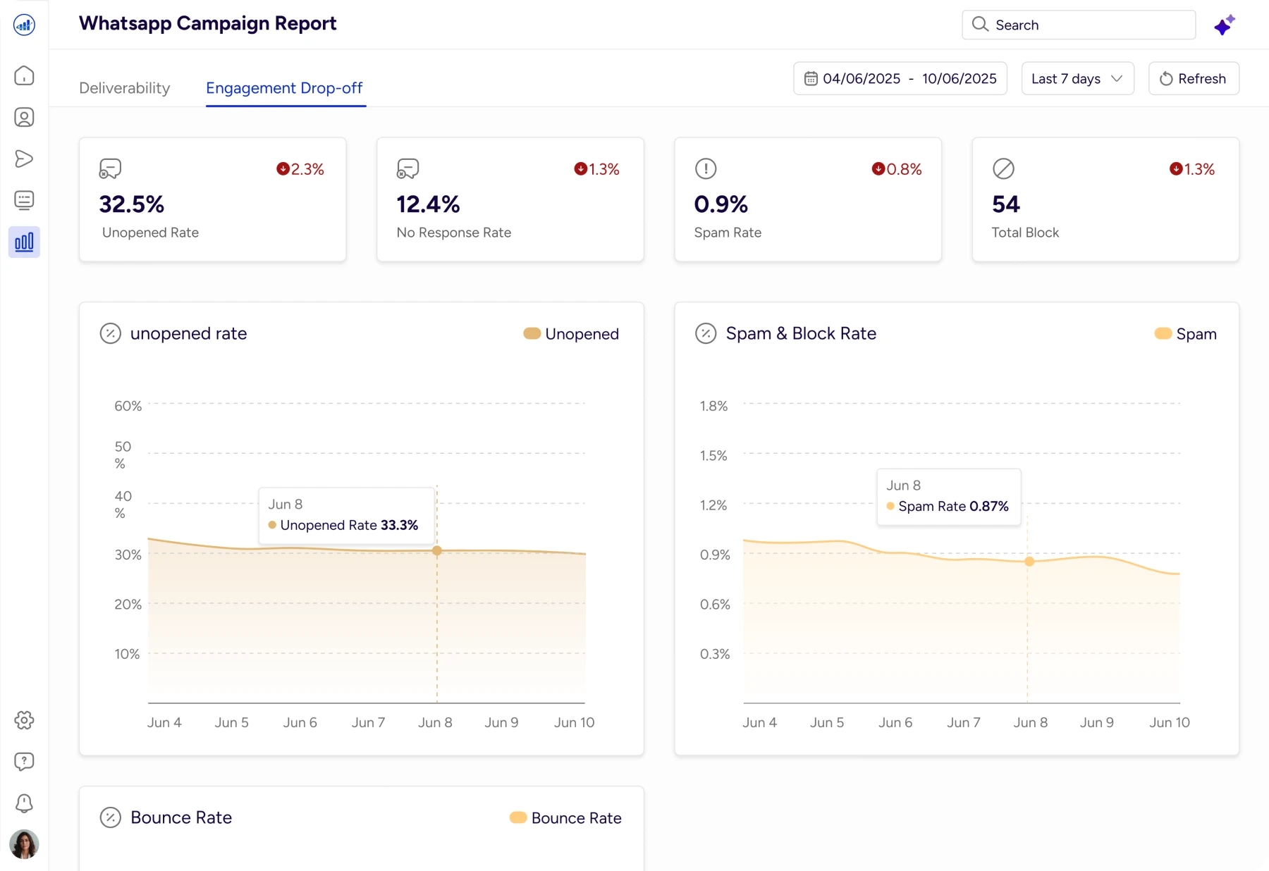
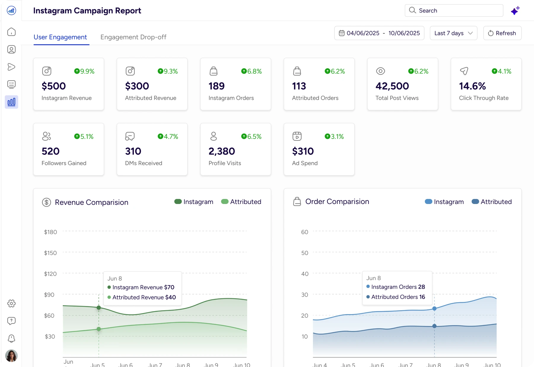
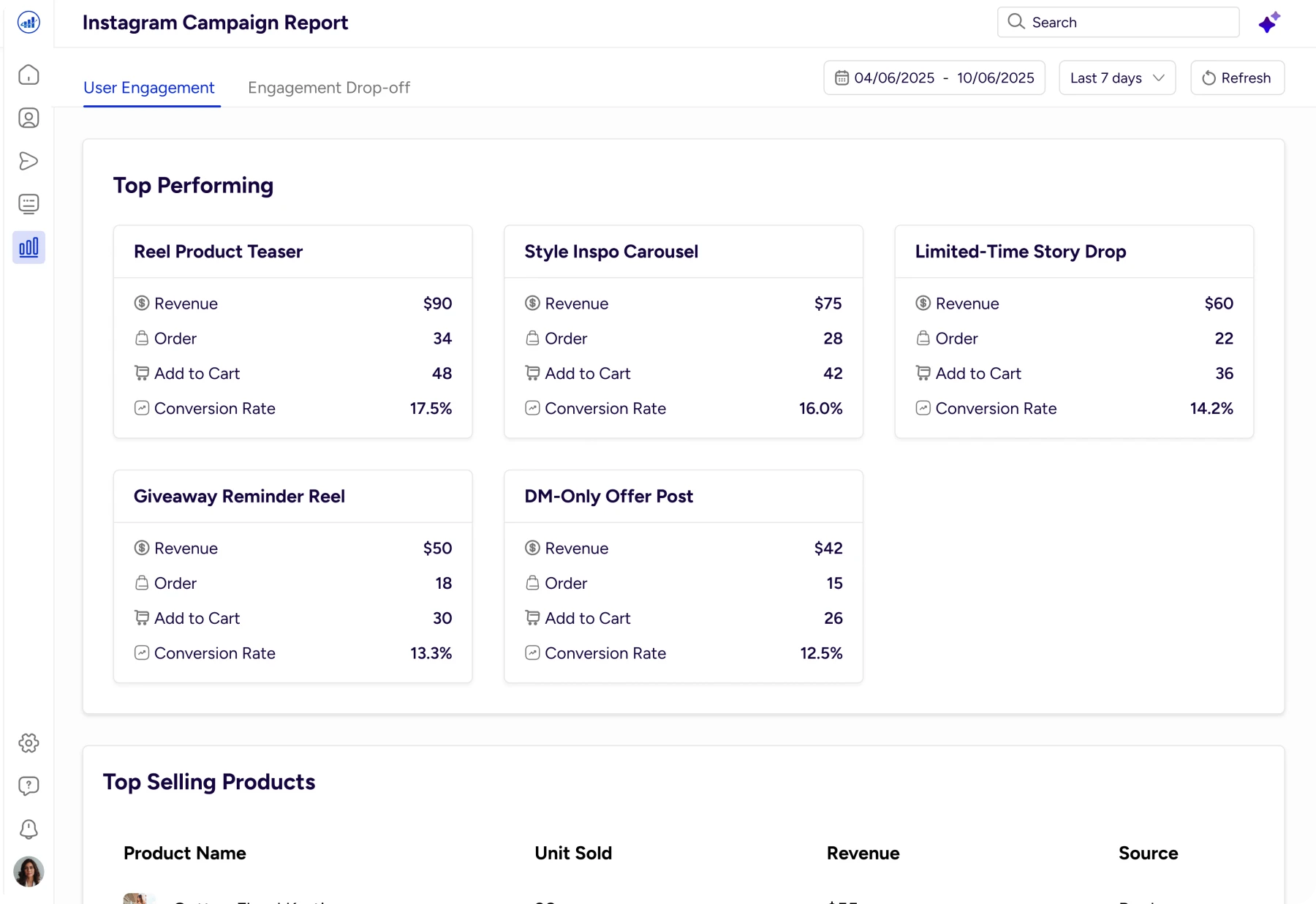
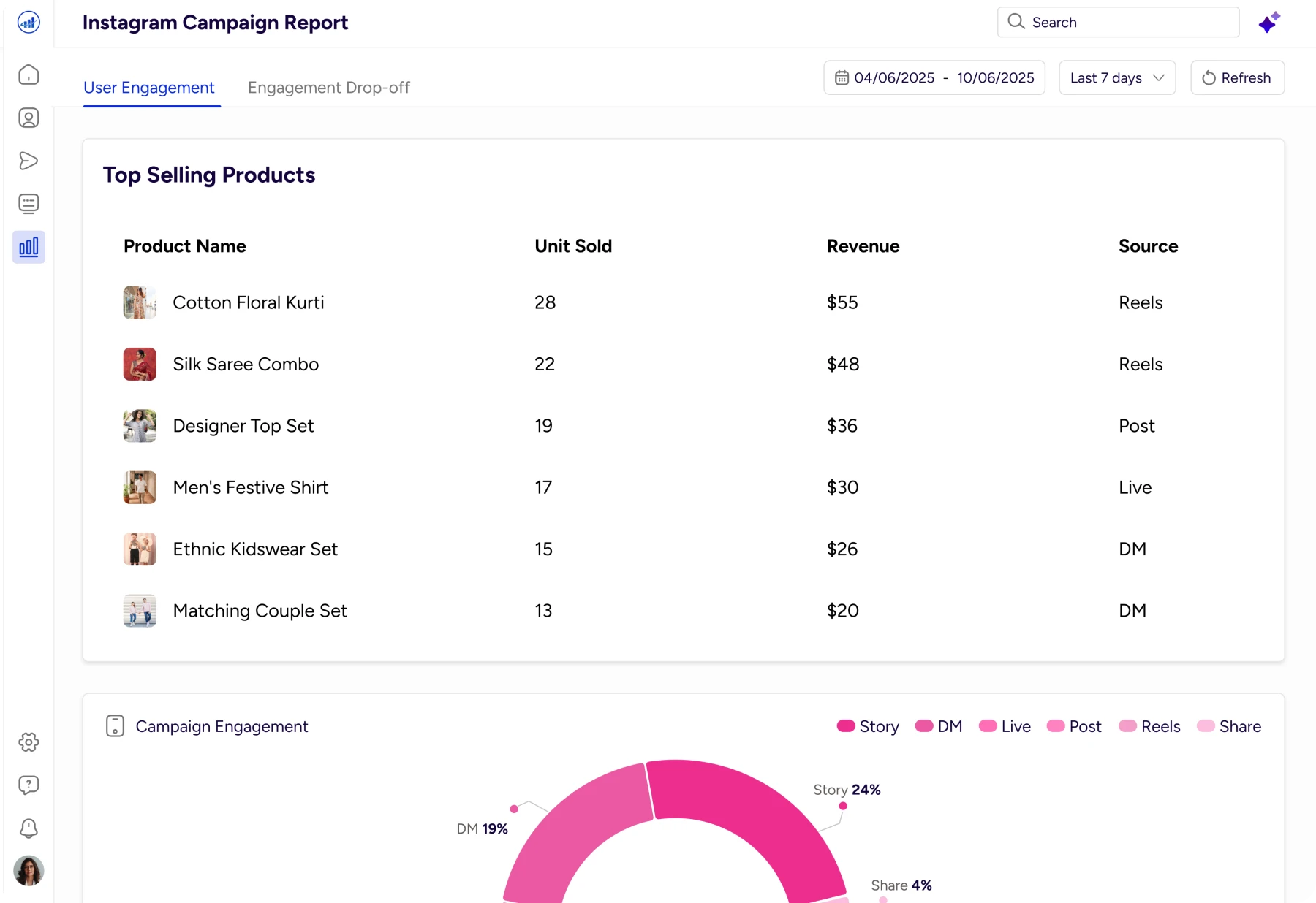
Revenue AI Insights
Each channel view surfaces AI‑driven questions and insights relevant to that touchpoint.
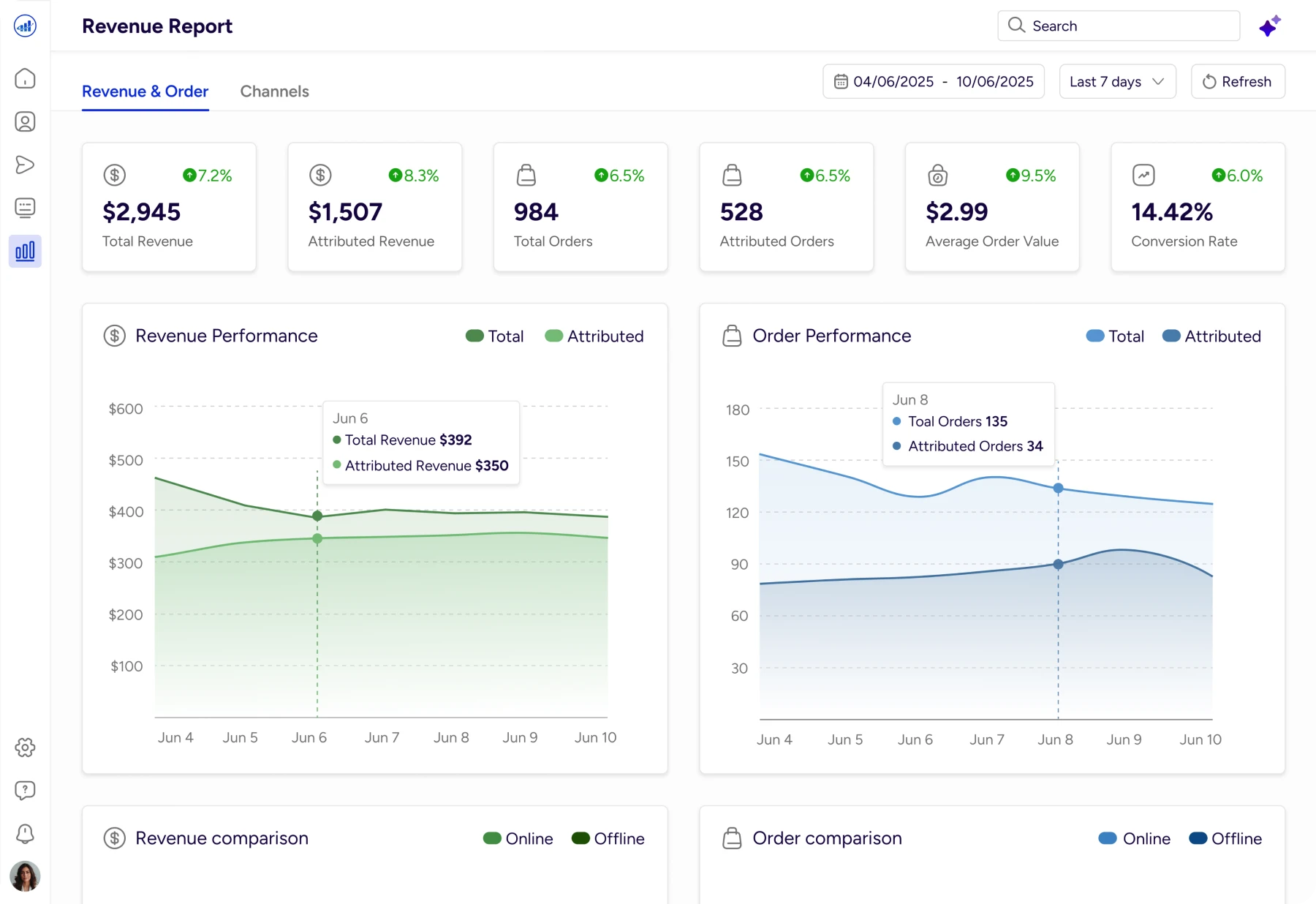
Revenue Insights
Gives an instant snapshot of revenue, orders, and conversion trends, with AI explaining why performance changed.
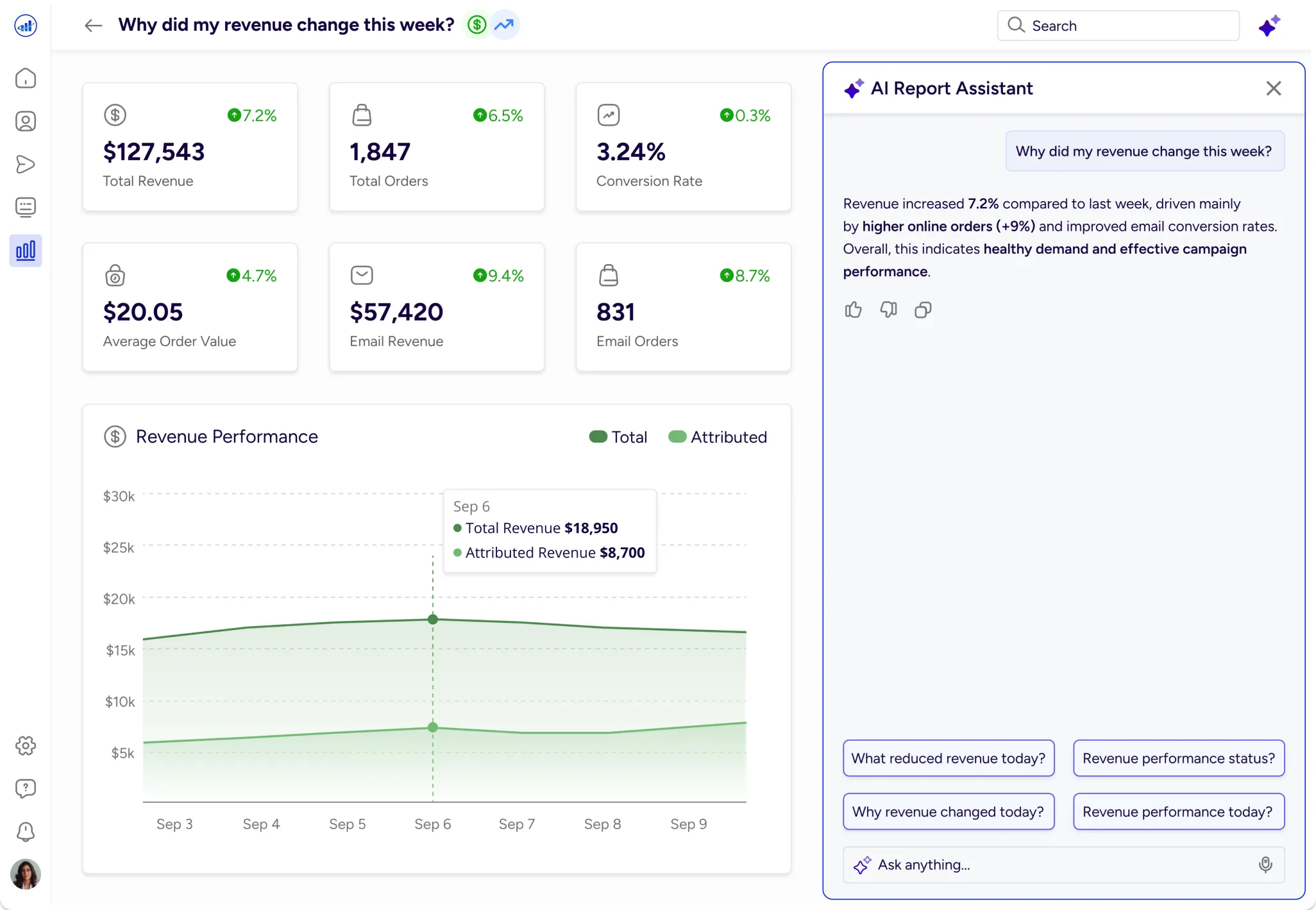
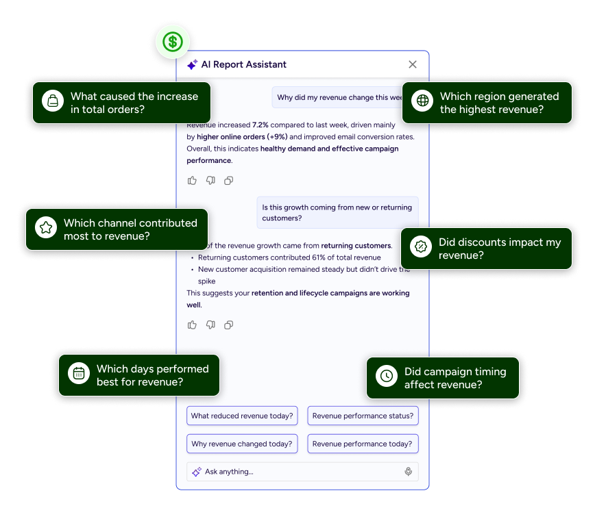
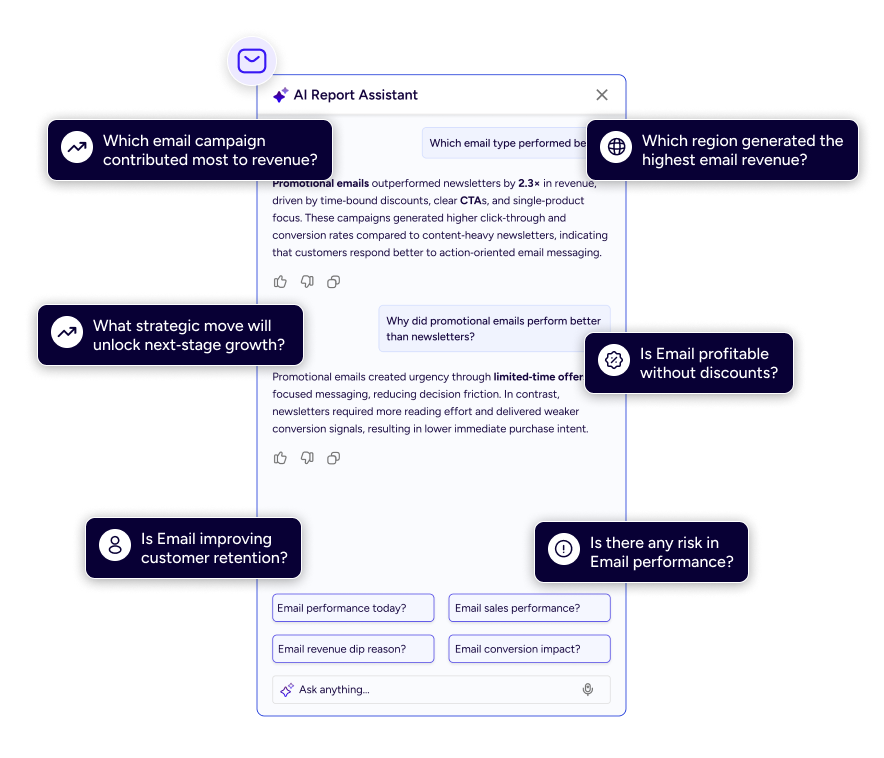
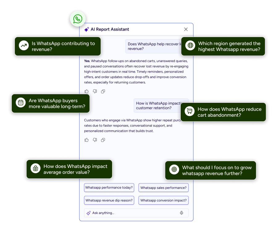
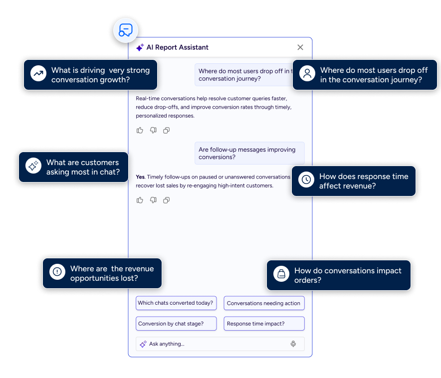
AI Report Assistant
Highlights the role of interactions, not just broadcasts
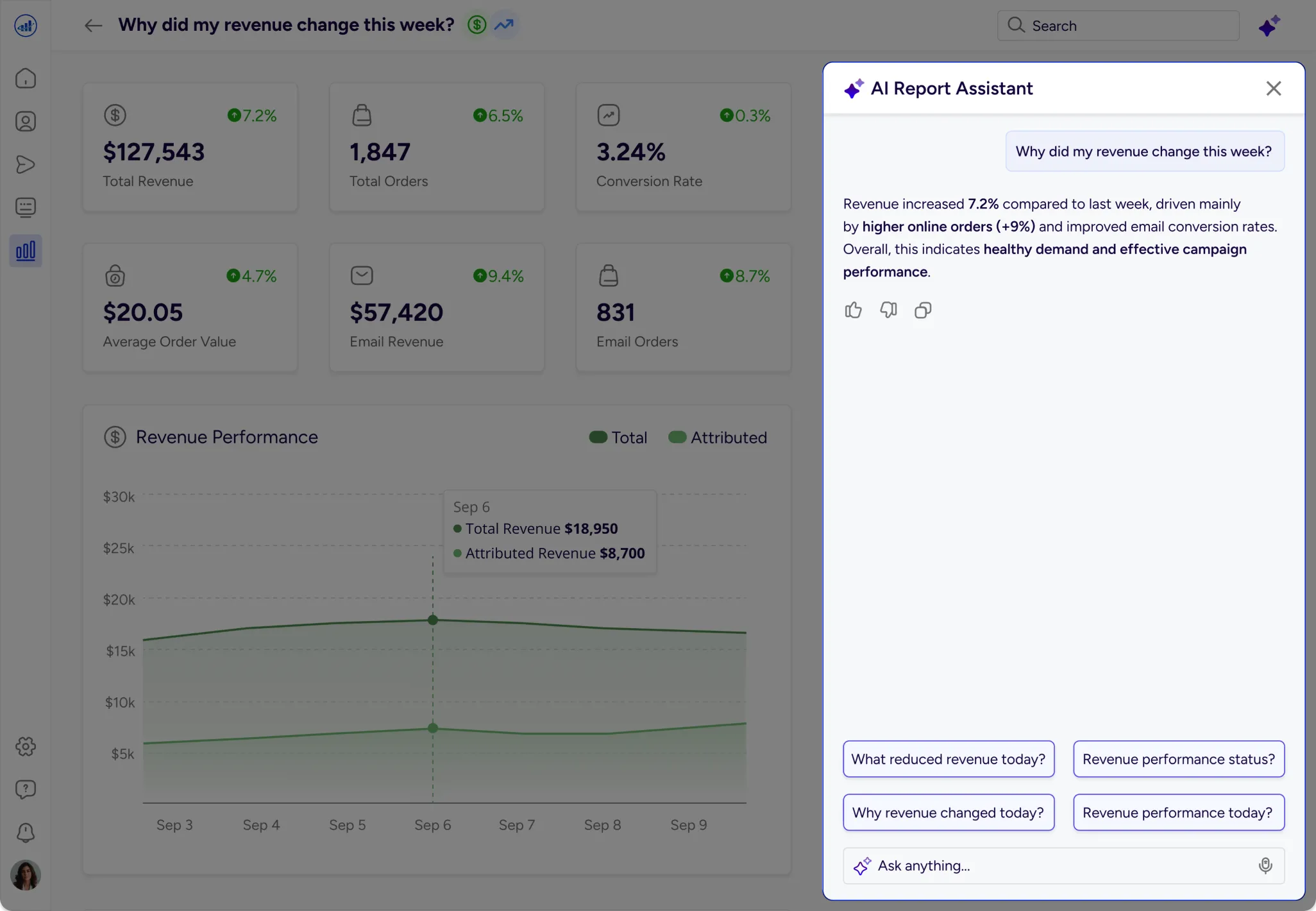
AI Report Assistant
Report Designs

Key Learnings
Reports should explain, not just display
AI is most powerful when it reduces thinking effort
Insight delivery matters more than chart variety
Asking the right questions is better than adding filters
Clear UX makes data accessible to everyone
Conclusion
What began as static reports evolved into an interactive insight layer. By combining structured data, thoughtful UX and AI‑assisted explanations, the design transforms reports from passive dashboards into active decision tools.
The goal was not to add more data but to help teams understand performance faster and act with confidence.
I really appreciate you taking the time to check out my case study. I’d be grateful to hear your feedback.